Mark Firley at The Furniture Record (one of my favorite blogs), sent me these photos of a workbench he encountered in his travels. He was on;y able to snap these photos before the antiques dealer shooed him away.
My first (and fifth) reaction: A Narwhal and some ship’s tackle had a baby. And it didn’t live….
So if you look at the top of the bench, you can see there is probably a vise nut bolted to the underside of the workbench’s top.
The bolts might be (OK, almost certainly are) a later addition to the bench. Judging from the wear and tear on the thing (and the dealer’s guess at the age), that hardware is new.
But then everything goes sideways when we consider the vise. The vise screw itself looks handmade – not manufactured – and could very well be from the same era as the bench itself. The big thing sticking in the air is definitely… sticking in the air.
To my eye it resembles a leg vise chop after a vicious dog attack. And then there’s the second vise nut in front of that. It’s bolted in places (perhaps a repair?).
I wonder if the vise screw is in backwards and its hub is under the bench. And we just have, for some odd reason, two vise nuts. That’s my best guess.
Katy managed to make 34 more tins of soft wax this week. It’s available in her etsy store via this link. She’s hard at work on another batch during the times when she isn’t signing rhymes about Black Phillip from “The VVitch.”
Apologies for the following statement, but “The Woodworker: The Charles Hayward Years” is a gold mine of craft knowledge. Even though we were mired in the project for more than seven years (and I should despise it), the finished books are incredibly useful in my everyday work.
Yesterday proved that point. You might remember this blog entry where I reprinted a 1964 article on making a staked stool that was one of the thousands of articles we sorted through for our two-volume set.
In that article, S.H. Glenister recommended boring mortises for a staked stool before shaping the legs. This is exactly how I work with square mortise-and-tenon projects, but is the opposite of how I work when building post-and-rung assemblies with round tenons and mortises.
I can’t say why it never occurred to me to bore the round mortises first when the stock was square. Just a brain defect, I guess.
So when making the post-and-rung base for a new design for a chest of drawers, I followed Mr. Glenister’s advice. It worked brilliantly and everything turned out perfectly square and centered with little fuss.
The only hiccup was when turning the mortised bits. You need to lighten up your pressure on the tool as you pass the tool by the mortises. I didn’t have any of them catch, but if you use consistent pressure the areas around your mortises will end up a little skinnier.
Give it a try next time.
By the way, we are hard at work at designing the next two volumes of “The Woodworker.” Vol. III on joinery is now completely designed and needs only a final edit. Meghan, the designer, is now laying out Vol. IV, which is on the workshop and furniture. There is still a lot of work ahead, but we are plowing forward.
When John and I started this company in 2007, we each contributed about $1,500 to build our website and purchase the first press run of “The Art of Joinery.”
So when it came to designing a logo, we had exactly $0.00. I ginned up a placeholder logo using the Caslon Antique typeface and we launched our business with that. But as soon as we made some money, we planned to get a real professional logo.
During the last nine years we tried a couple times to get a logo designed, but the project was cursed (like our poster business). Both designers either flaked or were swallowed by a hole in the Earth. So we trudged on with our DIY logo.
This spring we vowed to make a third attempt. I hired Tom Lane, a designer in Liverpool, who I’d been following on Dribble for some time. He specializes in hand-drawn logos, and his aesthetic matched what I was looking for.
The curse had finally been lifted (thanks Marta Madden).
Tom drew a bunch of logos in pencil. He narrowed it down to three solid choices and we began refining things during the last two weeks. And today, it’s done.
I’ve been in the publishing business long enough to know that some of you (all of you?) might prefer the old logo. That’s cool, but this is our logo. We’re happy we got to support an independent designer, promote some handwork and get the logo that I wish we’d had in 2007.
Plate 286. Different Sorts of Sections Appropriate for Infilling Panels
This is an excerpt from “Roubo on Marquetry” by André-Jacob Roubo. Translation by Donald C. Williams, Michele Pietryka-Pagán & Philippe Lafargue. The translators’ additions to the text are in brackets. Roubo’s asides are in parentheses.
Figure 4 represents a composition with dice or cubes, placed on a background of whatever color; these dice or cubes are hexagons, placed side by side, in a manner such that their points touch each other, as you can see in this figure.
Each of these hexagons, or figures with six sides, is composed of three lozenges of any colors assembled together to make the dice or cubes appear in relief. Lozenge C (which is the daylight side) is an example of the shape in question and is made in rosewood. Lozenge D, which is the top of the cube, is of grey or yellow wood. Lozenge E, which is the shade side, is of violet wood. The remaining space [unmarked but primarily horizontal] is of some other wood that one judges appropriate, provided that it differs in the color of wood that forms the cubes. The cubes should not only differ in color from that of the bottom, but also each lozenge comprising the cube should all be different from each other. One accomplishes this by choosing pieces darker in color from one side to the other, or even by passing them over hot sand, as I will teach later.
Figure 5 represents another section, which does not differ from that of which I just spoke, except that it does not have any remaining space or background like the last one. To the contrary, all the dice or cubes fit one inside the other without leaving any void space, which works quite well. However, it is good to observe when making this last type of section, to make a space or background between the cubes on top and on the bottom, as I have shown in this figure, which works much better than to see the ends of cubes cut up, as one does ordinarily, and which I have indicated by line F–G.
In general, whether the sections of which I am speaking are with a background as in Fig. 4, or without a background, as in Fig. 5, it is necessary to take great care when making the section that a whole number of cubes is found on the length, and that the uppermost end of these same cubes reach the banding or stringwork that surrounds them, as I have shown here. This is very easy to do since it is only necessary to adjust the proportions of the cubes according to the need, it not being absolutely necessary that the hexagon of the cubes be perfectly regular. Whatever way it can be done is the better way, and is so much easier to do when the three lozenges that compose the hexagon are of a similar shape, which does not ordinarily happen when the hexagon is of an irregular shape.
If one does not wish to make dice or projecting cubes, as in Fig. 5, one could make sections of cubes to fill the lozenges in a unified wood, which does not work badly when the joints are well made, as one can see in this figure. [This is in fact my favorite manner of preparing a composition such as this. I find the subtlety much more to my taste, especially when using a wood with a fine grain pattern with a noticeable difference from early wood to late wood, such as bald cypress on the radial plane.]
Figure 6 represents a section with mixed stars, which is a section that is very complex in appearance; however, it is only hexagons, as that of H, I, L, M, N, O, which approach and penetrate each other, so that the point of whichever star, becomes the center of another. It is necessary to observe in making these sorts of sections that one finds, as much as possible, a number of hexagons complete in height as is found in this figure, so that the bottom or void remaining at the points of the stars be similar at the bottom as at the top, which could not be if the section bordered by the line P–Q , of which the distance to the top-most stringwork of the section, contains only one-and-a-half hexagons in height. As for the length of this type of section, taken in the direction that is represented in Fig. 6, it is not important only that the number of hexagons be complete. It suffices that no points of the stars be cut along the same line, so that this section be as perfect as is possible to be.
These sorts of sections can be made with a projecting appearance, or be filled with segments of the same wood, which is equal for the form and disposition of the joinery, which is always given by the parallel lines, horizontal and perpendicular, and [rather than being comprised of lozenges] by equilateral triangles, of which the tops are opposite one another. Inspecting this illustration alone is by itself better than all the explanations that one can give.
Figure 7 represents another section, composed of octagons or figures with eight sides, placed in stars with eight sides, which all come to a point in the center. The stars that compose these sections touch each other on their perpendicular and horizontal faces at two points, which produces between them a squared space. This space is filled with the point of a diamond, as in the height of this figure, made from the background veneer. The other squared voids, which produce the return of the points of these same stars, being larger than those of which I just spoke above, are filled in by other stars with four points or some other element placed on the base, which distinguishes them from the rest of the work, as I have shown in the upper part of this figure, of which the stars as much as the points of the diamonds have an obvious [apparent] relief.
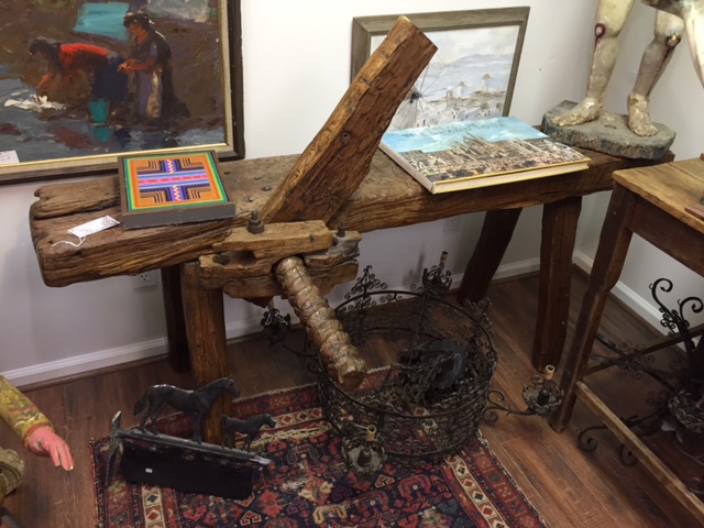
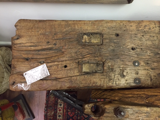
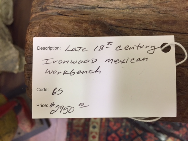
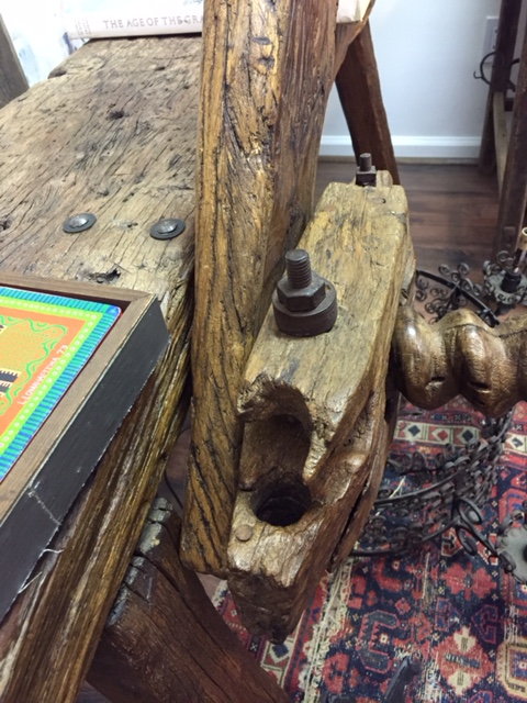
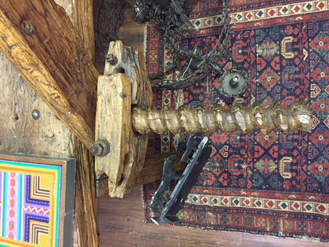
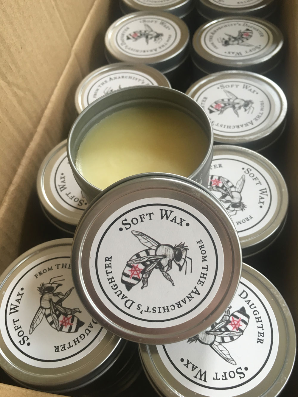
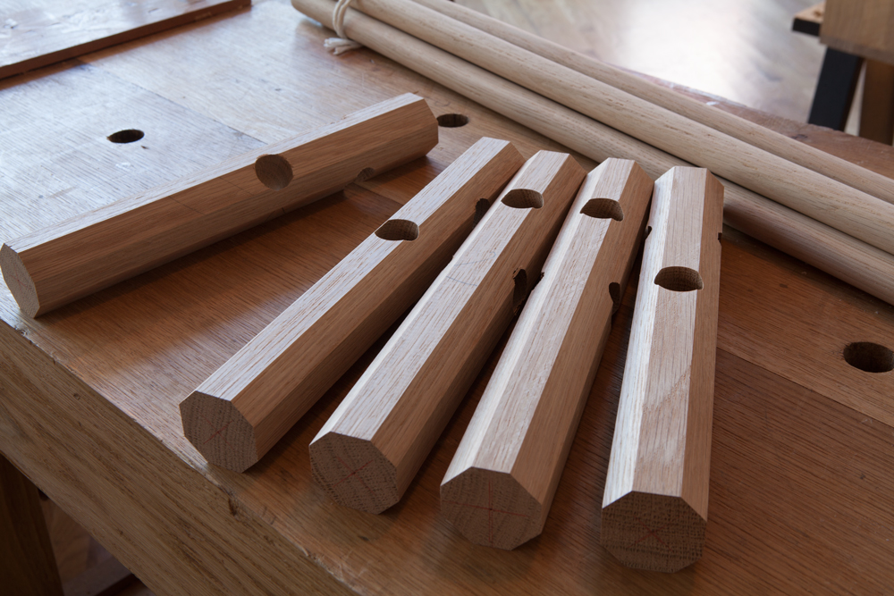
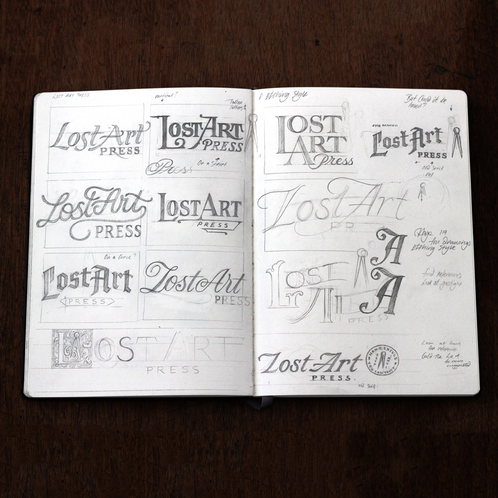

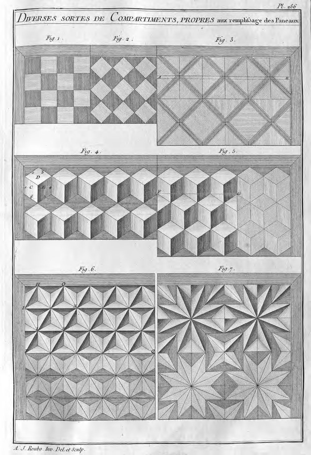
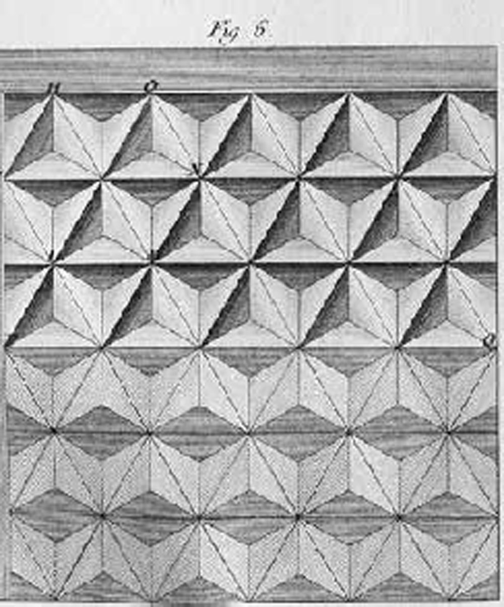
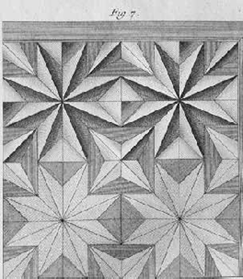 Figure 7 represents another section, composed of octagons or figures with eight sides, placed in stars with eight sides, which all come to a point in the center. The stars that compose these sections touch each other on their perpendicular and horizontal faces at two points, which produces between them a squared space. This space is filled with the point of a diamond, as in the height of this figure, made from the background veneer. The other squared voids, which produce the return of the points of these same stars, being larger than those of which I just spoke above, are filled in by other stars with four points or some other element placed on the base, which distinguishes them from the rest of the work, as I have shown in the upper part of this figure, of which the stars as much as the points of the diamonds have an obvious [apparent] relief.