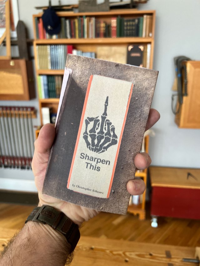
The following is excerpted from “The Intelligent Hand,” by David Binnington Savage. It’s a peek into a woodworking life that’s at a level that most of us can barely imagine. The customers are wealthy and eccentric. The designs have to leap off the page. And the craftsmanship has to be utterly, utterly flawless.
How does one get to this point? And how do you stay there?
One answer to these questions is in this book. Yes, the furniture can be technically difficult to make. But a lot of the hard labor involves some unexpected skills. Listening. Seeing. Drawing.
As you will see, it’s a personal struggle – like the production of this book. On the day David began work on his manuscript, he received a cancer diagnosis with a grim prognosis. He wasn’t sure what the book was going to be about or if he could finish it. But David attacked the work with the fervor of a younger, healthier man. He did finish it, and got to see it in print before he died in 2019. His teaching legacy continues at the school he founded, Rowden Atelier, in Devon, England.
When you were born, the first thing that you could see, a thing of enormous significance to your suckling, dependent, vulnerable mind, was a circle. Slowly it came in to focus, and you came to attend it and see the love of your mother. The circle of the eye is the one thing as we grow old that does not change. The circle is a symbol of that humanity.
Circles and squares are a base – unarguable forms that we Classicists have used in our work since 400 BCE. The essence is to stick to low-integer numbers – whole numbers, if you can. I know – one and a half and a bit – but that’s what happens when you let mathematicians in.
The essence of this is not mathematical, it is visual. Just you and your dividers. Do you think the great masons who built Notre Dame did so with stick, rope and dividers, or with a slide rule and a calculator? Artisans’ intelligent hands throughout history have used visual measure, marking out with dividers proportions that made sense to them. Eight of these that way; five of these this way.
Before I round this section up and discuss how we can use classical proportion, I must give you a few more variants on this theme. We have been playing with it for 2,500 years, so there is a bit more to tell.
I want to return to two of the greatest proponents of classical proportions in Renaissance Italy: Leon Battista Alberti and Andrea Palladio.
I will be brief as I know this can get tedious. However, this is a reference section to revisit when you have a piece of work that doesn’t fit conventions.
This is the diagonal of the square, a ratio of 1:1.414 – a powerful form first outlined to us by Alberti.
Next comes a simple whole-number variation, a square plus one third: 3:4. Then comes another simple whole-number variant, a square plus one-half: 2:3. Finally, we have a square, again solid and reliable, plus two-thirds of a square: 3:5.
These are the systems Alberti and people such as me, have used all our working lives. Palladio, however, went on to develop this further.
There is a wonderful road going inland from Venice to Verona that is punctuated by a series of magnificent Villas by Palladio. The first on this road is Villa La Rotonda, built with more squares and circles than you can shake a stick at. Then comes Palazzo Chiericati.
Palladio’s designs incorporated not two but three proportions encompassing a space. The first is “The Arithmetical Mean.” Take the length, add to it the width and divide the total in half to give you a height.
Next is “The Geometric Mean.” Multiply the lesser extreme (4) by the greater extreme (9) to get 36; take the square root to get 6 and use this for the height.
And the third is the “Harmonic Mean,” which gives you a relationship of 12:6 with a height of 8. I have never bothered with it in 40 years of fiddling with shapes – but you may want to Google it. Palladio was no fool.
Palladio’s work formed the basis of inspiration for later architects including Inigo Jones and Robert Adam, who later in the 17th and 18th centuries went on to develop “Neo Classicism” – the form of the English country house. Those of you in the United States – can you see in these the forms and relationships between these and your nation’s great public buildings in Washington, D.C.?
So, this is your toolkit – a set of ways other builders have used proportion to create a harmonic whole that is in tune with the natural divisions within nature. The difficult thing is that these tricks have been used by designers and makers for 2,500 years, and your fickle, all-seeing Mark One Eyeball has seen all this stuff; it bores her into a torpid sleep.
“Oh Darling, this is all so last season.”
(What’s the Mark One Eyeball? I use the term to describe the critical visual process. The eye has seen it all, has experienced all the visual tricks that designers and artists use. She knows it all and is desperate for something new, something that amuses and challenges her. The issue is to be amusing and new without being silly, without putting square wheels on a car. Most of the designer/maker frivolities of the late 20th century will end up in the Dumpster of History. The challenge is to amuse the Muse but avoid the Dumpster.)
The answer to the Mark One Eyeball is low, wicked cunning, deception and guile. You’ll recall that I described Leonardo as a cunning magician who distracts with a wave of an elegant glove. It took me about two hours to work out those simple proportions – he was so good at sending you the wrong way. You must do the same.
Never start with a proportional system. Start with a sketch, a drawing that you can feel good about. The relationships should be something you really like.
Then draw it again, coming up to scale, enlarging the image and tightening all the relationships. This is the time to test your drawing’s relationships with 8:13 or whatever. If it nearly fits. Hurrah! Now tighten your design so it fits exactly. If nothing fits, and you have been though everything including Palladio’s Harmonic Mean, have a really hard look at your divisions. Are they really as good as you think? Feeling they are OK is great – but are they really right?
This is where I listen to that tiny voice in the back of my head. It’s very different in tone and volume from the negative voice in my left brain. He says in a big voice, “You are Prat.” “You never could do this; why, for God’s sake, aren’t you selling insurance to feed the kids?”
This guy, I can ignore. I know his tone. It’s her tone I want to hear. “David,” she says very quietly, “might you want to think about this again, darling?” That’s the silent killer; she is always right. The more I follow her words the better I get. So, get clever at hiding this proportional stuff.
For example, I have just seen a student’s table elevation. He had wide, lovely cabriole legs on a low table. If he placed a proportional relationship on the outside of the knees, the extreme outside dimension where there are no verticals, that is being a cunning, sneaky woo.
The last thing you want to do is bang up a box with 8″ by 13″ as the outer dimensions. Your eye will not forgive you. It might look OK, but ultimately will be consigned to the “also ran” Dumpster of History. Hitting the numbers dead on and obviously doesn’t often work.
Most of my furniture has curves, and for a damn good reason. Having curves allows me to put the edge of a curve on a Golden Section and a foot just tickling the other side. Sneaky Woo. You be one too, or that miserable bitch will consign your stuff to the “dumpster.”