If you’ve ever wondered how a successful corporation can fall completely apart in just a few years, read on. I’ve watched a few of them do this – from the inside.
Here at Lost Art Press we will soon wrap up the second financial quarter of 2022, and our financial sheet shows our revenue is down 21 percent compared to this time in 2021. Why? We haven’t put out as many books this year because we don’t have strict deadlines with our authors.
Do we care that we are down 21 percent? No. Are we freaked? Not at all. Are we taking any action at all? Nope.
Here’s how John and I look at the business. Are we eating? Yes. Are we doing what we want to do every day? Yes. Are the people we work with happy? Yes (they tell us). Are we happy with the books, tools and apparel we are making? Yes. And is this decline something that will right itself during the next five years? Absolutely yes.
However, in the corporate publishing world, here’s how this problem plays out.
First, the publisher (me) is hauled before the suits (Bespokeus corruptus) and given two options: A) Resign or B) Hit your revenue target by the end of the fourth quarter (typically those targets are 20 percent higher than revenue from the previous year).
If I choose B, here is what I have to do:
Quickly boost revenue by selling inventory to bookstores at a discount. Here’s why that is a deathtrap. In corporate publishing, bookstores are allowed to return unsold inventory within two years for a full refund. So even if I boosted revenue this year (and saved my job), it could all fall apart in two years when bookstores start returning this discounted inventory (a very typical scenario).
In addition to boosting revenue, I need to cut costs to improve our profit margin. Why? If I don’t hit my revenue target but I do improve the profit margin, I could end up keeping my job because I brought in the same amount of money. How do I do this? The easy way is to slash production costs for books. One-third of our expenses are printing – let’s say that’s $1 million. If I moved printing to Korea, that would cut our printing costs to $500,000, and quality would actually stay the same or improve (Korea has a fantastic printing industry). If things get even worse, I can move printing to China and cut printing costs to $300,000 per year. Here’s the problem: There’s nowhere left to go after that. And you will never be able to afford to print in the U.S. again.
At my gauntlet session, the suits point out that our “point of sale” revenue is up a shocking 4,219 percent. (This is because we had an open day in the spring and we didn’t have any open days in 2021 because of the pandemic.) “Clearly this is where the growth is,” according to the suits. “Do more of that!” So we open the store every weekend, forcing me and Megan to work more hours and taking us away from making books. But it works! We double the “point of sale” revenue from $6,200 to $12,400 per year! In real terms, this money is meaningless to the total revenue picture.
[Megan’s Editor’s Note: At _my_ gauntlet session(s), the suits point out that I could stand to lose a staff member. That’s a huge savings! I refuse. A few months later, I’m the one who gets “lost.” Thank goodness. Now I’m found.]
As you can see, this is why I’d always choose A (resign) over B (gut the business). And then I’d start my own business (with a friend) that isn’t about growth. It’s about stability, making objects that are useful and that we are proud of. And it’s about living well.
— Christopher Schwarz
P.S. I’m not trying to get you to buy anything here – we are totally fine (I *wish* I were that clever of a marketer). Is it dumb to tell your readers your revenue is down? Probably. But I don’t care because we aren’t trying to sell the business or impress anyone.
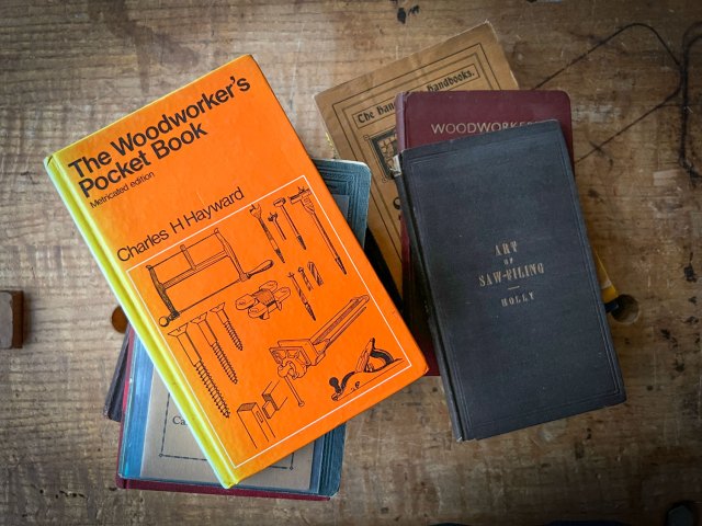
Ever since I encountered an original copy of “The Joiner and Cabinet Maker,” I have been a little obsessed with little books.
These small folios – roughly 4” x 6-1/2” – can fit into your pocket. And when properly written, they are filled with ideas that can change your life. In 2020, we reissued “The Woodworker’s Pocket Book,” which is a gold mine of information on the craft, from finishing recipes to nails to identifying hardware and understanding furniture styles.
We’ve sold more than 20,000 copies of this book in the last two years. And in the spirit of this small but mighty book, we are working on two more pocket books that we hope will blow your mind (but not your wallet).
The first is a book called “Sharpen This.” It’s a book that woodworker Tim Henriksen told me 10 years ago that I should write. It’s a no-nonsense 120-page treatise on grinding, honing and polishing edges. It is what woodworkers need to know to get great edges regardless of the sharpening system they use. It’s the kind of instruction I got in 1993 when I learned to sharpen. Before the internet.
If you are a great sharpener, you probably don’t need this book. But your daughter or nephew might. In any case, it was huge fun to boil down everything I know about sharpening into 120 compact pages, plus 50 photos and hand-drawn illustrations. Every word in this book counts.
The third title in this series is a book that I cannot believe has never been written: “Workshop Wound Care” by Dr. Jeffrey Hill. If you think there is a lot of disinformation out there about sharpening and finishing, then wait until you cut yourself.
The first aid industry has filled our minds and shelves with products that we don’t really need. Including some that are less than helpful. Dr. Hill is an emergency room physician and a woodworker who cuts through the misinformation with a scalpel.
As Megan and I read his text we were shocked by all the things we were doing to treat wounds that were unnecessary or (worse) counter-productive. This is a book that I have personally longed for in our craft. You might think “Meh, I don’t need this. I can take care of my scratches.”
But if you take an afternoon to read it, you will most certainly become better at treating your scrapes, contusions and what-nots. And you will likely have a better outcome, which is where you are back to woodworking much faster.
These two new books will both be the same size and have the same high-quality manufacturing as “The Woodworker’s Pocket Book.” And they will be reasonably priced – about $16-$18. Look for “Sharpen This” in the fall and “Workshop Wound Care” soon after that.
And we have a couple more pocket books in the works for 2023.
The first of these two stools, (#59.537) is the stool that Alexander first studied in detail, leading the way into the lost craft of joinery. A table now at the Historical Society of Old Newbury (Massachusetts) is directly related to this stool in its construction and decoration. The table is believed to have been made by Stephen Jaques of Newbury, late in the 17th century. Thus the stool is attributed to him as well. It is clearly made of riven stock; the interior surfaces show evidence of riving and hewing, and in places retain their wedge-shaped cross-section. The pins securing the mortise-and-tenon joints are proud on the exterior and not trimmed on the inside at the apron height. These pins show their faceted shape on the inside. Layout lines struck with a marking gauge, fore-plane marks, hewing strokes and more are among the many traces of tool use Alexander found in abundance on this stool. This object literally paved the way for this book. Photo Courtesy of Winterthur Garden, Museum & Library
For more than two decades, this unlikely pair – an attorney in Baltimore and a joiner at Plimoth Plantation in Massachusetts – pieced together how this early furniture was constructed using a handful of written sources, the tool marks on surviving examples and endless experimentation in their workshops.
The result of their labor was “Make a Joint Stool from a Tree: An Introduction to 17th-century Joinery.” This book starts in the woodlot, wedging open a piece of green oak, and it ends in the shop with mixing your own paint using pigment and linseed oil. It’s an almost-breathtaking journey because it covers aspects of the craft that most modern woodworkers would never consider. And yet Alexander and Follansbee cover every detail of construction with such clarity that even beginning woodworkers will have the confidence to build a joint stool, an iconic piece of furniture from the 17th century.
In 17th-century New England, joiners made chairs, tables, chests, stools, cupboards, wall paneling and various other products all based on a few basic principles. Their oak was split, or “riven,” from a freshly felled log, and worked up at the bench with a few simple hand tools. Although the configuration of the pieces varied, the essence was always the same: a frame joined at its corners with drawbored mortise-and-tenon joints fastened with wooden pins. Sometimes these frames had panels fitted into their inner edges, as in a chest; other times they were open, as in the stool that is the subject of this book.
Our work in studying joined furniture has its roots in the post-and-rung chairs made by John (now Jennie) Alexander, whose 1978 book Make a Chair from a Tree: An Introduction to Working Green Wood was pivotal in the revival of the traditional techniques regarding working wood riven or split from a log. This background became a key element in our study of 17th-century-style New England joinery.
The second Winterthur stool (#59.538) reinforces the things we learned from the first. In one sense, it is a better example than the Jaques stool, this one having even more of its original height. The aprons have two rows of moulding: a “crease” moulding, and one along the lower edge as well. The turnings are less detailed than those of the Jaques stool, but of a similar form. The two stools are both discussed and illustrated in Benno Forman’s American Seating Furniture 1630-1730 (Norton) pp. 180, 181. Photo Courtesy of Winterthur Garden, Museum & Library
Alexander’s experience from chairmaking was the necessary foundation that helped her recognize that the preparation of joinery stock was based upon the same green woodworking techniques as the chairs. In 1980, Charles Hummel of the Winterthur Museum, Garden & Library showed Alexander the interior of a joined oak chest in the collection. It was immediately clear that the rear stiles had been riven, not sawn, and that the stiles were bookmatched sections split from each other. This commenced a journey into the lost craft of joinery. With the patient kindness of Hummel, Benno M. Forman, Robert St. George, Robert Trent and many others, Alexander was able to closely study examples of 17th-century New England joined furniture.
Also in 1980, I saw an advertisement for a week-long class in chairmaking being held at Drew Langsner’s craft school Country Workshops taught by Alexander. I didn’t drive at the time, had practically never been out of New England and I wasn’t much of a woodworker. Plus, I was terminally shy. Regardless, I wrote to the address, signed up for the class and made plans to get to western North Carolina.
This little joined stool is a partial survivor from the 17th century. The turnings, the moulding profiles on the aprons and stretchers, and the chisel-chopped dentil decoration all indicate a strong relationship between this stool and numerous other furniture pieces from the entire 17th century in Plymouth Colony. The frame, although refinished long ago, is intact and original. The seat/top board is an early replacement, having been pictured in Wallace Nutting’s books in the 1920s in essentially the same condition. The stool originally had turned feet below the stretchers, so adding perhaps 3″ or 4″ more to its height. There is very little “rake” or splay to the side frames of this stool. Some of the rails on this stool are riven so slim that the tenons are “scant” in places. This means that the tenons are not necessarily full thickness throughout. This stool is the first place we noted the inner chamfer on the stiles. It occurs throughout almost all other Plymouth Colony joined chairs and tables as well. Photo Courtesy of the Museum of Fine arts, Boston
After stumbling along on my own for a few years, I returned to Country Workshops in the mid-1980s, and was for the next five years or more a regular attendee at classes – timber framing, white oak basketry, spoon carving, and coopering, as well as post-and-rung chairs with Alexander and American-style Windsor chairs. Sometime about 1986, Alexander showed a class at Country Workshops a slide presentation about 17th-century oak furniture made in New England.
Thus I was caught, and Alexander and I began an informal study together, yet we were 500 miles apart. Alexander lived and worked in Baltimore, Md., and I lived at the time in Hingham, Mass. Our “work” together consisted of lengthy correspondence and weekly phone calls. We would each spend some time studying original artifacts at Winterthur’s museum and the Museum of Fine Arts, Boston. We’d take numerous slides and notes, compile these and send them off to each other in the mail. We would each work in our shops, experimenting with our ideas based on what we had seen on the surviving furniture. It was a cumbersome undertaking by today’s standards, but one benefit was that the need to write it down forced a sense of clarity upon our thinking. Each year we spent a week or two together, both in the workshop and at times studying artifacts.
This joined stool is worn, but intact; it has been repaired and re-pinned at some point. The one-board seat is cracked along its length and has been reinforced. Originally, it was pinned only into the stiles. Like the MFA stool, the joiner planed a chamfer on the inner corner of the stiles. The crease moulding used here is one of our favorites – a wide convex moulding flanked by two pointed fillets. We used it on several of our reproductions. It also is found on a large group of joined chests from Braintree, Mass., that we wrote about in American Furniture in 1996. In that article, we even linked the stool to the chests, based on the moulding, the stock preparation and joinery. These days, we’d be more cautious about making such an attribution. See Frances Gruber Safford’s American Furniture in the Metropolitan Museum of Art (Metropolitan Museum of Art) for a detailed discussion of this stool. Photo Courtesy of the Metropolitan Museum of Art
Our artifact study was supplemented by the study of the tool history, as well as the documentary study of the period. To learn about the tool kit of the 17th century, we started with Joseph Moxon’s Mechanick Exercises: Or the Doctrine of Handy-works Applied to the Arts of Smithing, Joinery, Carpentry, Turning, Bricklaying. This book was published in serial form between 1678 and 1683 in London, and the chapters on joinery and turning were a critical first step in our study of tool history. (For more on the sources we used for tool research, see “The Historical Evidence for Tool Selection and Use” on page 25.)
Additionally, we studied probate inventories in great detail for craftsmen’s tools. Learning of the period tool kit and understanding the traditional use of bench tools such as planes, saws, chisels and carving tools helped us to see that to assemble a tool kit that functioned like a 17th-century kit was not that difficult. The forms and functions of hand tools have not changed much over time.
Throughout our studies, our friendship with Robert Trent, the leading American scholar on 17th-century furniture, was a great benefit. Trent led us through the process of researching the artifacts, their histories and the formation of an attribution for a group of furniture. This amounted to a private internship, though quite informal. The first results of this collaboration with Trent were published as “Seventeenth-Century Joinery from Braintree, Massachusetts: The Savell Shop Tradition” in the 1996 edition of the journal American Furniture. (1)
This joined stool [above] and form [below]share a decorative element that is simple and effective. Instead of turned decoration between the joinery on the stiles, the maker shaved stopped chamfers. In the case of the form – an elongated joined stool, stretched out to bench-length – the “stops” form a pattern often now called a “lamb’s tongue.” Similar treatments are commonly found on the interior parts of 17th-century New England framed houses. Note also the breakthrough on the upper corner of one front stile. Here the mortise for the end apron was chopped just a little too deep in one spot, leaving a hole in the face of the stile. It has still held up for the past 350 years or so. Photos Courtesy of Sotheby’s
In the end, what we learned was a discipline in two related crafts: that of the joiner/turner in the shop, and that of the furniture historian, using artifacts, archives and documents to better understand these 17th-century trades.
Early on, we decided to focus on the joint stool as an introductory project that encompasses most of the basics of joinery. The stool requires only short lengths of timber, and except for the seat board, narrow dimensioned stock. This makes it easy enough to acquire the necessary timber, without a great expenditure of time and effort. The principle elements of joinery – riving and working the stock directly from the log, and cutting and fitting the drawbored mortise-and-tenon joints – are well represented in this project. After a few stools, the progression to more involved joinery featuring paneled work is not a huge leap.
This stool was bought at auction in 2011, with no known history. It certainly appears to be a New England joined stool, although it is hard to link it to known works at this time. All its rails are riven and wedge-shaped; some are hewn, others are just as they came from the log. The pine seat is no doubt a replacement, but like several of the museum pieces here, the stool retains much of its turned feet. The shape of these feet differs from the top of the stiles’ turnings; usually the feet repeat what happens above. The stretchers are planed with the same crease moulding as the aprons, but the aprons have the additional run of an edge moulding also. The stool has been stripped of its finish, but traces of red paint remain throughout. Private collection
(1) Peter Follansbee and John Alexander, “Seventeenth-Century Joinery from Braintree, Massachusetts: the Savell Shop Tradition” in American Furniture, ed., Luke Beckerdite, (Hanover, N.H.: University Press of New England for the Chipstone Foundation, 1996) pp. 81-104.
Editor’s note: I was reviewing some notes from 2012 and stumbled on this abandoned introduction to a book that I rewrote entirely. When I write a book, I usually end up writing about two books worth of material and then winnow the ideas down until it doesn’t make me want to vomit when I read it (the mark of quality literature).
“The Anarchist’s Design Book” started out as “The Furniture of Necessity” and then I switched gears somewhere while working in the village of Sheepwash, Devon. The original thrust of “The Furniture of Necessity” is still interesting to me, and I might come back and tinker with it in the future. Note that the below is unedited. And there are some missing parts here and there.
But you’ll get the idea.
— Christopher Schwarz
Furniture of Necessity
Introduction
It’s Wednesday night at the Marc Adams School of Woodworking, and I’m thinking about quickly stealing some images from the Ethan Allen web site.
Steve Latta, a fellow instructor at the school, is at the front of the room showing the students photos of his work. Projected on the wall and bigger than life, each orchestration of mahogany, inlay, carving and perfect form elicits “oohs” and “aahs” like we’re at a fireworks show.
In a few minutes, Steve will wrap up his orgy of pateras, cartouches and ogee bracket feet, and I’m going to show pictures of my work. Ahem. Here’s one that’s a box – kinda boxy, I know. Here’s a cabinet design I stole from the Shakers – yes, the door is built clenched using nails. And a workbench I made from framing lumber.
This moment feels like a turning point in my furniture-making career. If I am going to be taken seriously as a designer and builder, then I need to step up my game and build the high-style 18th-century pieces from New England. It’s time to get in bed with Queen Anne. Learn the moves of the Chippendales. Do some wife-swapping with William & Mary.
As I make this private resolve, Steve ends his presentation by showing an astonishing cabinet with glass doors above and inlaid doors below. It took a year to build.
I think to myself: “I can do this.”
Then Steve interrupts my thought. “While I really love this stuff,” he says, pointing to his final image on the wall, “I could never live with it. Our house is filled with much simpler stuff.”
And… my jaw goes slack.
I get up and give the lamest presentation of my career so far. But I don’t feel bad about it. In fact, all I can think about is Steve’s last line. “While I really love this stuff, I could never live with it.”
In the years since that evening, I’ve done a lot of reading and thinking about the history of furniture and its role in society. I’ve been looking at tens of thousands of pieces of furniture from the 1500s to the present – actual pieces in museums, image databases maintained by museums and an endless stream of auction results maintained at Prices4Antiques.com.
At first I looked for the proportional rules that governed individual forms of furniture. I really liked anthropology in college, so I thought I would look for the genetic ancestor for all chests of drawers, all chairs, all tables – that sort of thing. I wanted to show that high-style and low-born pieces had the same bones, and their differences were just material, ornament and surface finish.
There still might be something to that idea, but I became sidetracked and then obsessed with a style of furniture that doesn’t really have a proper name. But it is something we can all live with.
As I scanned through all these images and built spreadsheets (yup, that’s the secret to my writing), I noticed things that surprised me. When looking at six-board chests, I was amazed at how hard it was to date them from their appearance. Chests from the 1700s looked a lot like chests from the 1900s. The only real difference was the wear and tear – the older chests looked older because they’d had 200 more years of use.
What if I could remove the age from all these pieces and present them like they looked when they were new? So I started sketching these pieces, both old and new. And on the computer screen it became even harder to assign a date to these chests.
This exercise worked only with certain pieces that had remained consistent for hundreds of years. High-style tall chests are easy to date because of all their ornament – experienced auction houses and researchers can even recognize a single carver’s work. Plus, if you have ever studied furniture history, you know that furniture was very much a part of fashionable life in the 18th, 19th and early 20th centuries. Furniture styles changed rapidly and radically at times, just compare the XXX with the XXX for a taste of this change.
The differences between fancy pieces doesn’t interest me, nor is it an area that lack scholars. There have been thousands of careers built upon discerning the fine differences between periods of fine furniture built for fine individuals.
Instead, I would like to make the case that there is an often-ignored tradition of furniture that has been with us for centuries that has been right under our noses. It consists of generally well-made, well-proportioned and unornamented pieces. This is the furniture that was in the warming room of the slave quarters in the Aiken-Rhett House in Charleston, S.C., the meeting house of the White Water Shaker Village in Ohio and on the green shag carpet of 2019 Wedgewood Blvd., where I grew up.
I call this the “furniture of necessity” because I don’t care for the other names people use. “Country furniture” is one name, but you can find these pieces in the city. “Vernacular” furniture is a better term, as it is supposed to describe the stuff of domestic life. But too often the word is innocently applied to pieces that were made by an unskilled hand, or are bizarre low-style adaptations of high-brow stuff (someone who made a bonnet-top highboy out of bottle caps, for instance).
So I’ve decided to make up a name and write the definition as well.
The goal of this book is to identify about a dozen different forms of the furniture of necessity, from the six-board chest to the Windsor stool to the chest of drawers. I want to show you historical pieces from many time periods for each of these forms so you can see they are indeed consistent and begin to understand their language. And then I want to explore the variations in their proportions and joinery.
Why? This isn’t a project book. While I’m certain you could build replicas of the pieces in this book using the dimensions provided, I would rather teach you the language – for lack of a better word – of each of these furniture forms so you can build your own versions. Here’s how:
As I’ve been collecting images of furniture, I’ve also been recording their dimensions. So when we discuss drop-leaf tables, we’ll also discuss their dimensions that are nearly immutable (such as the height of the tabletop) and those that vary (such as the length and width of the top). I want us to understand the envelope of space that these pieces typically occupy and still look good. Why are chests of drawers typically about 40″ wide and 40″ high? They look good to our eye.
If we can understand the spatial limits of these pieces, then we will know how to avoid designing pieces that are awkward – without having to go to design school.
With the outside shape drawn, we need to design the joinery. These pieces used simple joints for very particular reasons. For example, six-board chests are traditionally nailed together, even though the chest’s front and back are oriented cross-grain to the end pieces. This is usually a joinery no-no when making furniture.
But thousands of these chests have survived. And I would argue that it is actually because of the nails that these pieces are so robust. A six-board chest that was dovetailed together would actually be weaker.
Next comes the ornament. I argue that most furniture has some ornament – even a simple bevel on a tabletop or a quirk between the base and top – is ornament. A tapered leg on a table is ornament. Six-board chests, for example, usually have two points of ornament: a cutout on the end pieces that turns a slab into two legs, and perhaps a simple moulding or two. These pieces aren’t devoid of ornament, they just use it with restraint.
And finally, the finish. Furniture that is designed for use and not for show should have a finish that is simple, easy to apply, easy to repair and durable. That is why so many of these pieces were painted. So we’ll discuss paint at some length, but we’ll also discuss how to make your own film finish from inexpensive materials (it’s as easy as making a shaken martini).
Before we get down to business, I want to make an apology. This book encompasses pieces from the Western world only – mostly North American and English. I’ve done some research on these same forms in Europe, but it is not extensive. The Eastern world and its furniture forms are still a mystery to me.
So this book is about the furniture of necessity as seen from the Western world. And it begins in my sister’s room with her Barbie collection.
“This past weekend, I knew I needed to test a new pasta board design…but hadn’t had time to sort out what I’d do with the pasta. Then when I’m out running errands, I spot some beautiful in-season asparagus at the local farm, which was nice and thick, just about the diameter of the cavatelli I was going to be making! Quick blanch and ice water bath on the asparagus, simple butter sauce with lemon juice and splash of white wine, finished with burrata, lemon zest, and of course an olive oil drizzle. Late spring on a plate!”
This paragraph from a recent Instagram post pretty much explains why I wanted to interview John Welch for the blog. John is a guy who primarily makes beautiful things out of wood for the preparation and serving of food. He’s not a furniture maker (though he certainly could be); his posts are not about dovetails, or techniques for finishing. Rather, he is motivated by a desire to “take something ordinary and make it special.”
The photo that accompanied the quotation at the head of this post.
The love of food has always been there.
When asked what brought him to the world of pasta molds and boards, he answered simply “I love food. I love cooking food, eating, all kinds of food.” Add to this his observation that “too many people have beautiful things that are too precious [to use],” and you’re on your way to understanding what drives this man to finish most days at the office with several hours of work in his shop. What could be simpler than pasta – a basic dough of flour, salt and water? But roll a pinch of that mix across a board carved with decorative patterns, and you’ve elevated the plainest of pastas to an art form – as pleasing to the eye as it is effective at capturing a spoonful of saucy goodness and conveying it to the mouth.
Texture aplenty in pasta made with parsley and saffron, respectively.
Evidence that food and woodworking belong together: A third-year birthday cake in the shape of a handsaw.
The origin of his interest was basically curiosity, John said in reply to my question about what got him started.
“I wanted to know if pasta could take and hold an impression. I assumed it would but had never seen a textured ravioli. I made my own mold first, then I did some Googling to see if anyone already made something like that.” John could have ordered a mold to use as an example but decided against doing so for a few reasons. “I am always very afraid of inadvertently ‘borrowing’ someone else’s idea, so I thought that the less I looked at them, the less likely I would happen upon a similar pattern or idea. Also, the motivation to make them was…a curiosity [as to whether] it’d work, then how to make it work; if I had one in hand, it’d be easier for me to reverse-engineer and that would have taken all the fun out of it! I didn’t make them with the intention to sell. It was just a fun project.” It took John a few attempts to figure out how deep the carving would have to be to show up on the pasta and remain sharp after cooking.
The first one he was happy with featured a wheat pattern loosely based on an example of Art Deco ironwork. Made in walnut, it had leaves in the corners; he put stars between them.
Early pasta mold.
A savory pumpkin ravioli. To see how John served it, go to the end of the post.Food preparation images by Jenn Bakos Photo.
The filling is pumpkin-based.
Flattening a small piece of dough with an old-fashioned rolling pin before running it through the pasta mangle.
Woodworking This is not a story about someone born into a family of woodworkers or generations who have made their own pasta from scratch. John’s forebears are not Italian; most are Irish mixed with French-Canadian. The “Francis” in his business name is his middle name; he’s John Francis Welch V.
The first spoon John carved, in process. The bowls for his ravioli molds are done with a router and jig.
John, the eldest of three siblings, grew up in a late-1800s house where his father always seemed to be engaged in repairs and maintenance. Although his dad didn’t compel or even expect John’s help, he exposed his older son to many aspects of home repair and restoration simply by carrying out household repairs and improvements.
As a woodworker, John is self-taught. When he was a kid his family didn’t have cable, but John could watch PBS, where he became a regular viewer of “The Woodwright’s Shop” and “The New Yankee Workshop.” He found the content interesting but had no intention of ever applying what he learned in real life. Even so, some of it sank in.
Teddy bear chair.
His parents loved handmade gifts, things from the heart. John dabbled in woodworking during high school; he was going to give his girlfriend a teddy bear and had decided to make an oak chair for it. His dad helped him cut the parts to size; then John built the chair with mortise-and-tenon joints. His mother had woven some baskets, so based on her example, he decided to weave a seat.
After that, woodworking went on the back burner as his interests shifted to motorcycles, fast cars and weight lifting, which led him to certification as a personal trainer. On his website you’ll find a portrait of John with bulging biceps that might lead you to wonder whether he’s more interested in appearances than substance. Not a bit of it. In middle school, other students had pushed him around, grabbing his books. His dad encouraged him to develop his muscles saying, “If you were strong enough to hold onto those books, they wouldn’t be able to rip them out of your hands.” So, as with most things that piqued his interest, John picked up that ball and ran with it.
The obligatory motorcycle.
He worked as a personal trainer in college, then, in his late 20s, he got into competitive power lifting. “I tend to be very goal oriented,” he explains. “I was losing focus – ‘Why am I going to the gym at 5 a.m?’ I’ve always been a very curious person, both [in terms of] ‘how does that work’ and ‘can I do that?’ Power lifting was very different from anything I’d done before.” The goal of competition provided just the oomph he needed, not just to keep going, but to excel. He won his first competition.
When John bought a townhouse in 2009, he had some home improvement projects in mind. He bought a miter saw and put up crown moulding, then replaced some doors. After the first few projects, he ran out of things to do. John was godfather to the daughter of a good friend; for her first birthday, her mother put in a request for a toy box. “I think she was expecting me to throw something together with plywood,” he remembers. “But if I’m going to do something, I’m going to do it well.” The toy box became his focus that summer. John had bought some handplanes on eBay; his brother deals in antiques, and John had tagged along on some of his adventures, which exposed him to more tools. He learned to sharpen. He bought some rough-sawn lumber and got started, building the toy box with stub tenons and solid wood panels. If it lasted, he figured, someday it could be used as a chest to store things other than toys. He worked in the garage, with a pair of sawhorses, a router, miter saw, circular saw and set of Kobalt chisels from Lowe’s.
A toy chest John made for his goddaughter.
The toy chest with finish.
In his day job, John designs extrusion dies for pasta at De Mari Pasta Dies. He was the first employee in the business who was not related to the founding family. Most of their products are in large chain grocery stores around the United States. “Every cartoon [mac and cheese made by one of the nation’s largest food corporations] for the last 15 years, I have personally designed all of those.”
While he appreciates his work and gives it his level best, he says, “I work my 8 hours and leave. With woodworking I can make what I want to make. It gives me the freedom to do what I want to do.”
For a time, he used his garage as a woodshop. He had to come up with some items to make that would need little space and very few tools. Spoons were one candidate, a handmade item that would “add a lot of love and care” in the preparation of a meal. His business took off from there.
As part of his day job for a time, John oversaw the installation of major pasta-making machinery at facilities around the North American continent, mostly in the Midwest, but with a few trips to Washington State and Canada. The travel for work underscored that his decision to buy a townhouse with his wife, Kara, a training specialist for a property management company, had been sound; their home required far less work than would have been required by a house with multiple rooms and a yard to maintain. While traveling for work, he had to use the garage for his car, not woodworking.
When the travel for work slowed down and John again had time for woodworking, he needed a studio space to rent – either that, or he and Kara would have to move to another house. The first studio he rented and the couple he rented after that were at Western Avenue in Lowell, Mass.; in June of 2021 he moved to his current space, 240 square feet in a repurposed textile mill that had been turned into artist studios. As he later learned, the building is the same one where his great-grandfather had worked decades before as a “grease monkey,” maintaining machinery for one of the mills that made Lowell, Mass., such a late-19th-century economic powerhouse that many still think of it as “the birthplace of the Industrial Revolution” (at least in North America). John’s great-grandfather also did some woodworking on the side. He built the house where John’s paternal grandmother grew up, followed by his own father, and where John’s parents continue to live. His great-grandfather had made a grandmother clock as a gift for John’s parents; today John keeps it in his studio.
The grandmother clock.
At this point, he says, “My goal was to pay the rent for my studio. If money was no object, I would make mirrors, wall sculptures, hand-carved tabletops. But the ravioli molds caught on.” When he started, charcuterie boards were a transition after the toy box for his goddaughter.
John is constantly looking for ways to improve his processes – to carve the ravioli molds, he’s upgraded his tool chest with some chisels from Japan, and he now makes some of the decorative patterns with a router. “As much as I love carving,” he acknowledges, “it gets to a point where it’s not financially feasible. I don’t really make spoons anymore; it’s partly because I can’t charge enough to make it worth it.”
This concern with workflow is a holdover from his day job, where he’s required to maximize efficiency. “I’ve always been more Type A,” John remarks. “The other artists at my former studio would tell me ‘You’re not a real artist,’ because my studio was so clean. I’ve always been like that: If something could be better, why not make it [so]?”
Some might have burned out after 300 ravioli molds, the number he sold in 2021. Not John. He plans to keep making them. “Part of what’s kept me going is that with the internet, a lot of people who buy them make these incredible dishes. I can’t tell you the rewarding feeling it gives me to see people feeding their friends and family with molds I’ve made.” He hopes to do more carving – art pieces, textured mirrors and more – but acknowledges the struggle involved in “going from ‘practical’ things to things that are meant [primarily] to be looked at. I blame it on my Yankee upbringing not to engage in ‘frivolous’ things.’”
He also continues to make a smaller number of other wares, such as charcuterie trays and pasta boards.
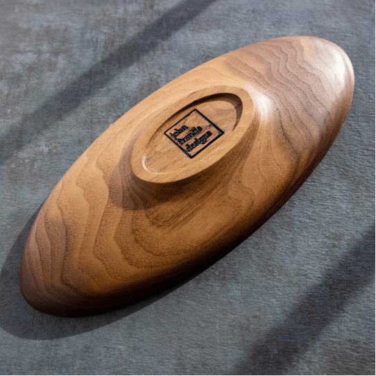
Carved bookend.
Carved platter.
Carved platter, underside.
Carved platter, detail.
Side table with carved top.
“I mentioned that I like to cook, but I LOVE to cook, and most of all explore with food. I love that the possibilities are endless, there is so much to learn, so much freedom of expression allowed. I love that you can travel to distant lands that you may never otherwise get to experience, all through flavors,” says John. “So with that said, my kitchen adventures have been pretty thorough: sausage making, curing meats, smoking, bread baking, pasta making (obviously), pâté and terrines, sous vide cooking, etc… About the only thing I don’t dabble in are baked sweets!”
Selfishly, I’d like to think it’s just a matter of time.
Spinach-ricotta filling.
Crispy prosciutto tops the pumpkin ravioli with brown butter sauce.