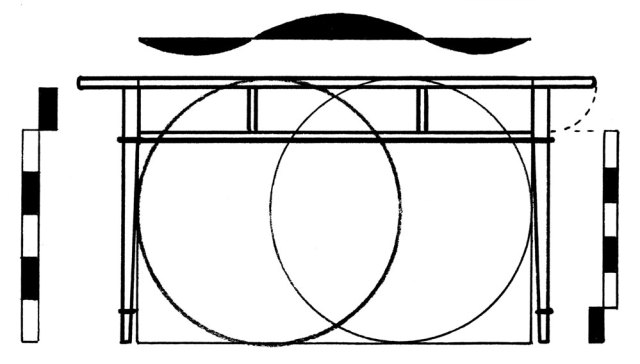
We (and our kids) were all inoculated with enough Geometry during middle school to “know” the Pythagorean theorem. You know, the one that enables us to rattle off: “A squared plus B squared equals C squared.” But that particular manifestation of the underlying geometric truth of our particular universe isn’t limited to squares. In the above drawing, we have three hexagons built upon the three legs (labeled A, B and C) of a right triangle. Just like squares, if you add the area of the two little shapes they will equal the area of the biggest one. In other words: A hexagoned plus B hexagoned equals C hexagoned. This works for all similarly shaped polygons by the way.
Want the “proof?” All you need is a couple sticks and a bit of string as in the photo below. Have your 4-year-old lend you a hand…she’ll immediately intuit what an equation is really all about! (No, this is not your rigorous algebraic proof, or even a Euclidean logic proof…Instead it’s what me bandmates used to call: “Good enough for rock and roll.”)
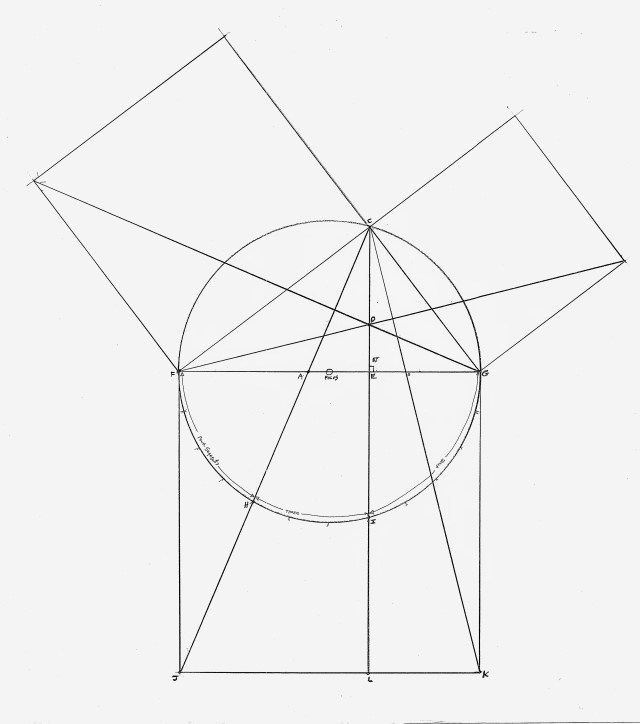
In this sketch I did of a Masonic “Past-Master’s Jewels” medal, notice the representation of the pythagorean theorem. It is reported that its presence on the owner’s medal indicates that person was what we would likely now call a crew foreman. One of his many responsibilities was to ensure that all the layout tools were true – a clue as to why there’s the homage to Pythagoras. This theorem, codified later by Euclid into his “Proposition 47,” offers a logic proof that the area of the squares erected on the legs of a right triangle would equal the area of the square erected on its hypotenuse. That’s all well and good, but why would that particular equation be of vital interest to the foreman of a joiner’s or mason’s crew? To try to find out, I decided to construct an exact-as-possible, large-scale drawing of the graphic upon which I could explore with a pair of dividers.
The first thing I discovered was that the vertical line CL, which is fixed by the inherent baseline’s intersection points C and D, forms a right angle with the hypotenuse. Even though this result is likely nothing more than symbolic (there are a lot easier ways to generate a right angle with a compass and a straightedge), I believe this right angle – hidden in plain sight – is probably as important to the medal (and its wearer) as the theorem itself. The right angle (“recto” in Greek) is simply the right way to set a vertical post. (Wood’s superb resistance to compression happens when, and only when, the post is set at a right angle to level – an orientation that aligns the grain parallel to the force of gravity). It’s also the right angle to create symmetry to a baseline in common rectilinear structures (think cathedrals).
No reason to stop there, though. Exploring further revealed other attributes of this graphic that offer additional symbolic (and real) representations of the truths inherent in Geometry (note the traditional capital G). Print out the template (you’ll find it offered for free on the shopping page of www.byhandandeye.com) and take a look around on it for yourself. You’ll discover triangles with perfect 2:3 base-to-height proportions (one of the fundamental harmonics in music and architecture of the Medieval era); you’ll find sequences of the infamous triplet (the 3-4-5 triangle) revealed in the hypotenuse and even in the circumference of the circle that started it all; and you may find the module upon which the entire construction revolves. Have fun with this – I sure did!
This is an excerpt from “By Hand and Eye” by Geo R. Walker and Jim Tolpin.
On the southern shore of Lake Erie lies a narrow strip of cottonwood bramble called Magee Marsh. It’s the last bit of shelter for migrating songbirds before they take flight across the open water. Stiff headwinds can cause a massive pileup with thousands of birds hunkered down, and hundreds of bird watchers converging to witness the spectacle. It’s called a fallout. To a birder, a fallout is an event on par with a solar eclipse.
The first time my wife, Barb, and I stumbled into one, I wasn’t prepared for it. The air bristled with brightly colored warblers as we stepped under the shelter of the tree canopy. I felt a puff of air on my cheek as a blur of yellow feathers darted close to my ear. Veteran birders around me ooh-ed and aah-ed, “There’s a black-throated blue, and just above it, 5′ back at 2 o’clock is a redstart!”
But my eyes weren’t quick enough and I didn’t know how to look, or what I was looking at. Over and over I just missed something wonderful and rare. A 9-year-old boy wearing a T-shirt proclaiming “Birding is not for Sissies” tried in vain to help me, but after a few minutes, politely slipped away. That first morning I wondered to myself if I’d ever get this. I didn’t seem to have the eye for it. In spite of early doubts, gradually my eyes and brain started to mesh. As the day wore on, I began to see clearly those winged jewels I’d only read about in books.
This book is the equivalent of a “fallout” to awaken your designer’s eye. Despite any doubts you might have, you already possess the inherent ability to see with your inner eye. It is, in fact, simply waiting for you to awaken it. You’ll see what once seemed impossible and quickly gain the condence to spread your creative wings. With some practice, the ability to see and unpack a design will become as natural as breathing.
Looking for Clues in all the Right Places We live in a media-saturated world filled with images bombarding us every waking moment. Yet, as Vitruvius observed, we’re still plagued with a common dilemma: A layman looks while a designer sees. My own craft background, molded by modern industrial practice, left me dependent on measured drawings. The ability to visualize seemed beyond my grasp in spite of a lifetime of building things with my hands. Granted, I had strong opinions about furniture, art, cars and guns, and I knew immediately what I liked or considered ugly. But truth be told, I could only detect the glaringly obvious. Even then, I struggled to pin down what caught my eye. I could admire a masterpiece, but could not explain what tipped the scales in its favor. I’d look at a chair and think, “It’s off; there’s something awkward or clumsy about it,” but rarely could I voice with certainty what looked awry. This is a little embarrassing to admit, but even if I started a project with clear pictures and plans, the image I formed in my head never seemed to match the actual parts as they came together. This reinforced the feeling that I couldn’t trust my eye. Not that I couldn’t “make to print”; I couldn’t “see to print.”
Our modern industrial approach doesn’t awaken the eye. It’s just the opposite; the aim is duplication, and that’s achieved by removing the human element. I started my professional life in the trades as a machinist. Blueprints were my world and point of reference; drawings, measurements and tolerances were my comfort zone. Mistakenly I assumed that’s what artisans had always relied on, just with a more primitive set of tools. I had no idea that the artisan age used drawings in a completely different way than anything I’d been taught.In spite of my misconceptions, my own background in the trades gave me subtle clues that something had been broken. My apprenticeship as a machinist began in the 1970s, right at the sunset of the hand-drafting era. Apprentices got a taste of drafting in the engineering shop, a massive open room with row upon row of tilted drafting tables. Just a few years passed and those big drafting boards disappeared as computer-aided design (CAD) technology emerged. Down in the factory, those dog-eared paper drawings were stored away in a vault and replaced by crisp, freshly printed computer drawings with immaculate graphics. A few years later, machines came equipped with a monitor, eliminating the need for a paper drawing. The next step allowed machines to download the drawing directly into the machine controller and eventually, no image of the actual part was required, just data. Oddly enough we still called them “drawings” even though they contained no pictures, just code. Industrial drawings reached a new pinnacle; they could speak directly to machines in their own native tongue. What a success. It took nearly 200 years from the dawn of the Industrial Revolution for technology to finally and entirely remove the human worker from the equation.
Now don’t get me wrong; this isn’t a rant against technology. The ability to mass-produce and duplicate things with precision is crucial to our modern society. From safe baby food jars to fail-proof landing gear on an airplane, our world today is unimaginable without it. But at its core, measured drawings and the way we use them in our modern industrial approach focuses on duplication. It removes human error but at the expense of creativity by limiting choices and dictating rigid commands. Worst of all, by emphasizing measurements and ignoring proportions, it masks relationships between parts and how they relate to the whole. We look at a historic drawing and conclude the details shown to build it are sketchy. Conversely, an artisan-age craftsman might conclude that our modern drawings contain everything but the kitchen sink, yet they obscure the essence of the design. The creative spark requires a different set of conditions to ignite. It feeds on choices, options and the ability to see. In short, it needs the human element restored so that a dance can emerge between the play of hands, eye and the wood itself.
To develop the curves in the various brackets – here the support for the back fence on the lid of a desk – I followed the ancient practice of melding arcs of a circle along a straight line.
I begin by making a few concept sketches to get an intuitive feel for the curve I would like to see transition the horizontal lid surface to the vertical back fence. I’m going to go with the shape in the first drawing.
From the sketch, it reveals that the overall form suits that of a 1:2 rectangle. (An octave, by the way – but that’s another story). Next, I divide the horizontal length into four equal segments. The first of these segments defines the flat at the top of the curve. I then draw a baseline for the sine curve from this segment point to the lower right hand corner, then divide that baseline into three equal segments.
To find the focal point of the arcs – which will each be one-sixth of a circle’s circumference – I set the dividers to the length of the segment (which is the chord of the arc) and swing out intersections to locate the focal point of the arc. Next, without changing the span of the dividers (because the chord equals the radius for sixth sector arcs as you may remember from Mr. Hammersmacker’s seventh grade geometry class), I swing the arc from the focal point to each segment point. The transition between the two arcs is seamless – proven to be so because a line connecting the two focal points will pass through the arc’s transition point.
While I mostly use the sector for doing design and layout work in my shop, I realized recently that it’s also a great tool for showing someone (especially your kids) an intuitive approach to understanding fractions. Here’s how I’d describe what’s going on in the drawing above:
Because I want to find out where a point four-sevenths of the width of a board would come to, I set the legs of the sector to touch each edge of the board to denominate (i.e. to name) the kind of divisions I’m looking for. Here, that would be seven – the denominator. Now I want to enumerate (i.e. give a number) to how many of those sevens I’m looking for – in this case the numerator is four. The job of the dividers is to grab this numerator above the denominator value on the legs of the sector in order to transfer the setting to the face of the board. For me (and my kid), this drawing offers a decent visualization of why the numerator goes over the denominator. You can learn more about the sector in excruciating detail in “By Hand and Eye;” and in a somewhat less excruciating matter in “By Hound and Eye.”