
– Jonathan Fisher Memorial.
Excerpted from “Hands Employed Aright: The Furniture Making of Jonathan Fisher (1768-1847),” by Joshua A. Klein.
After graduation, [Jonathan] Fisher married Dolly Battle of Dedham, Mass., and accepted a call to minister to the frontier town of Blue Hill in the District of Maine. Situated about halfway up the Maine coast, Blue Hill is the subject of many idyllic landscape paintings. The jagged and rocky shoreline, salty ocean air and lush forests have long attracted tourists looking to get away from city life.

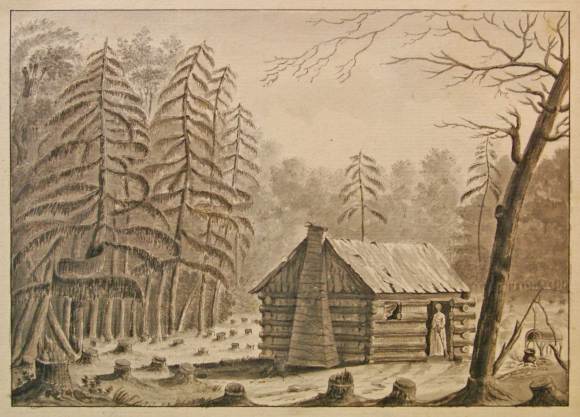
As welcome a vacation spot as midcoast Maine is today, in the first half of the 19th century it was inhospitable frontier wilderness. Between the notoriously recalcitrant populace and the lack of resources, the isolated frontier was a daunting mission. Kevin Murphy described Blue Hill in the 1790s as “a clutch of rude dwellings surrounded by some rickety tidal mills.” (2) The benefits of serving in a well-established town were not lost on Fisher. Before accepting the call to rural Blue Hill, he also considered a pastorate in Ashby, Mass., “in the heart of a well settled country,” which offered closer proximity to family, better compensation, assistance from fellow ministers and more “temporal conveniences.” For a Harvard-trained minister, the allure of urban ministry was real. Despite this temptation, Fisher felt a divine call to serve in this frontier setting – the “infant part of the country” – because “it [was] difficult for them to find a sufficient number of candidates, who [were] willing even to come and preach among them, and much less to settle.” (3) As one man said, “We are so as it wore out of the wourld that we don’t hardly know wether we do rite or rong but we mean to do as well as we can.” (4)

– Courtesy, David Rumsey Map Collection, David Rumsey Map Center, Stanford Libraries, https://purl.stanford.edu/sr253bc9505.
Late 19th-century Blue Hill historian, R.G.F. Candage, recalled: “In personal appearance Father Fisher was below medium height; he dressed in ancient style, with small clothes, knee buckles and shoes, and a long waisted coat, his head bald and thrown slightly forward, with his whole demeanor and appearance clerical and grave; no one could see him and doubt his profession.” This image of the publicly austere reverend concurs with other contemporary descriptions of him, but reading his journals and personal correspondence one can’t help but be impressed with his warmth and piety. Kevin Murphy’s assessment of Fisher’s demeanor concurs with my own: “Fisher’s public persona – serious, and probably overbearing and too exacting for his parishioners – overshadowed the private Fisher, who emerges from his letters and diaries and from the words of his family as sensitive, intelligent, and inspiring.” (5) Or as Mary Ellen Chase put it: “He mingled authority with love.” (6)
Jonathan Fisher’s life was far from easy. He regularly dealt with migraine headaches, stomach pains, diarrhea and serious injuries from manual labor. Despite these trials, Fisher resigned himself under the hand of Providence. Accounts such as that of August 28th, 1818, are common: “Came on for Bluehill exercised with pain in my side, back and bowels and with diarrhoea. Called at Phin. Osgood’s, Jr. Reached home 10 P.M. Took sop pills and mullein tea. Found the family well, except Josiah, wounded by an ax. Have reason to bless God that we are all yet spared in life, that we have so many comforts indulged us.” Even in the midst of debilitating physical pain, Fisher carried on with the work at hand. On March 17, 1826, his journal reads, “High N.W. scattering clouds, cold. From 9 A.M. ‘till about 5 P.M. exercised with earache, some of the time severely. Tried first camphor on wool, then hot tobacco smoke, then had several drops of West Indian Rum dropped in. This in the first trial gave a little relief; in the second removed the severity of the pain. At intervals through the day planed out stuff for a common ruler, a pair of parallel rulers and modern dividers, finished the latter, A part of the time walked the room in great pain. It is easy to bear pain when we do not feel it, but when it is acute, then to bear it with patience is something.” He was a resilient man. Not owning a horse until late in his life, he was known to regularly travel long distances on foot, even as far as Bangor, 40 miles away.
Fisher’s most active furniture-making years were between 1796 (when he settled in Blue Hill) and 1820 (when he paid off all his home- and farm-building debt). The years between the Revolutionary War and 1820 (when Maine achieved statehood) were formative years for the new nation. This was especially true for the “easternmost countries” of Massachusetts, which were then called the District of Maine. Maine’s struggle for independence during these years can be seen as a “microcosm of the larger quest for national identity.” (7) Politically, demographically and socially, the District of Maine had been an “outpost” of Massachusetts since the late 17th century.
Maine derived most of its cultural influence from Boston in the same way that Bostonians looked to London for the latest fashions. Despite this deep-rooted “Boston prestige” during Fisher’s life, Maine was developing an identity apart from Massachusetts. It is not surprising, then, that Maine’s art during the Federal era often reflects this emerging sense of identity, blending vernacular/folk traditions with the sophistication of academic training.
(2) Murphy, Kevin D., Jonathan Fisher of Blue Hill, Maine: Commerce, Culture, and Community on the Eastern Frontier, University of Massachusetts Press, 2010, p 3.
(3) Letter to Ashby from Fisher, October 26, 1795.
(4) Harding, Samuel B., The Contest over the Ratification of the Federal Constitution in the State of Massachusetts, New York: Longmans-Green, 1896, p 8, quoted in Banks, Ronald F., Maine Becomes a State: The Movement to Separate Maine from Massachusetts, 1785-1820, New Hampshire Publishing Co.; Wesleyan/Maine Historical Society, 1973, 4, p 9.
(5) Murphy, Kevin D., Jonathan Fisher of Blue Hill, Maine: Commerce, Culture, and Community on the Eastern Frontier, University of Massachusetts Press, 2010, p 13.
(6) Chase, Mary Ellen Jonathan Fisher, Maine Parson 1768-1847, The MacMillan Co., 1948, p 279.
(7) Clarke, Charles E.; Leamon, James S. and Bowden, Karen, Maine in the Early Republic, Maine Historical Society and Maine Humanities Council, 1988, p 12.


