Unfortunately, my drawings don’t (yet) live up to the images inside my head. While I am able to make acceptable small-scale drawings, I usually hire an illustrator to help with the complex stuff. Until I become a better illustrator, I take photos, trace the parts I like, then shade them with hatching.
It’s a simple process and produces acceptable results. Here are the details if you’d like to try it yourself.
For the paper, I use 100 percent rag vellum. It’s expensive, but it smudges the least of any “tracing” paper I’ve used. You can get the stuff at good stationery stores.
I manipulate the photo I’m tracing in Photoshop, usually to lighten it so I can see little details. Sometimes I bump up the contrast, too. Then I scale the photo so it’s 110 percent of the finished size I want on the page. This scaling is important. If I don’t scale all the chair photos the same, then the line thicknesses will be inconsistent from drawing to drawing. The reason I draw the image at 110 percent is that the slight reduction of the image (to 100 percent on the page) tends to sharpen up the lines a bit.
I print out the photo on cheap copy paper and tape it to the backside of the vellum. Then I get out my LED lightbox. This is an inexpensive apparatus that makes tracing easy. You can get them at art supply stores. Mine is made by Artograph; there are much cheaper alternatives. Before I owned one of these I would tape the vellum to a window and use the daylight to illuminate things. The lightbox makes life easier. And I can work at night.
I use three sizes of mechanical pencils: .9mm for the thick, exterior lines in the foreground; .7mm for shading, interior lines and exterior lines that are distant; and .3mm for details and fine shading (like inside a spindle).
The only drawing tool I use is a translucent plastic 6″ rule. No templates for curves or ellipses. I tried working with those years ago and preferred drawing without them. The straightedge rule is great, even for chairs. You learn to draw entasis and shallow curves with a straight ruler after a while. The other hard-won lesson was this: Move your arm when you draw, not your hand. Your lines will be much smoother as a result.
All my shading is done with straight lines. It’s a bit comic-book-y, but I like comic books.
I take liberties with the tracing. I fix broken spindles, repair splits in seats and restore chunks that have been taken out of the legs. And the shading is used for two things: to show value, of course, but also to emphasize key parts of the construction, such as through-tenons and seat saddling.
So far for “The Stick Chair Book” I’ve made about 40 drawings and have many more to go. If you’d like to see the results of the tracing, you can download this sample chapter.
Please note that the text is a draft. There is still a lot of editing and peer-review to do. I mostly wanted to see how the images and text looked together. So, if you don’t mind, please blunt that sharp tongue of yours.
— Christopher Schwarz
Read other posts from the “Making Book” series here.
The north wall of the bench room at The Krenov School. The school’s mascot is an elephant, after an early habit of meeting after school to drink Carlsberg Elephant malt liquor. The walls of the school are covered in elephant mementos and decades of memories, jokes and relics. Photo by David Welter.
When I talk with other woodworkers about my own trajectory, nearly everyone asks about what it was like to be a student at the College of the Redwoods Fine Woodworking program (now aptly renamed The Krenov School), so I now have a spiel about my time there. It was an incredible space and monastic in focus on the craft, and I was surrounded by capable instructors, enthusiastic peers and beautiful Northern California.
When I was writing “James Krenov: Leave Fingerprints,” I posed the same questions I have so often fielded to other alumni, in particular to those students who studied while Krenov was still in residence: from the school’s 1981 inception to his 2002 retirement. There were common experiences from everyone: camaraderie, self-improvement and personal development, and an excitement at prospects of continuing a creative practice. While the book concerns itself with Krenov, nearly 100 of its 300 or so pages are about his time establishing and working at the school. Integral to that research were those interviews with alumni; they not only illuminated their experiences with the school, but also opened a window into its founding and to Krenov’s intentions as a teacher.
I won’t venture to summarize a hundred pages of writing in a few paragraphs; I’ll also avoid my tendency toward voluminous blog posts. Instead, I’ll share a short excerpt from the afterword. In it, I included my own experience – something that I avoided to that point. But the afterword was a good place to help the reader – now versed in Krenov’s life and work – understand how James Krenov, his school and the process of writing the book has shaped my own life as a craftsperson.
From page 245 of “James Krenov: Leave Fingerprints”:
Like so many students who attend the College of the Redwoods Fine Woodworking Program, I was in my 20s when I upended my life to move to Fort Bragg, California. My father, Robert Gaffney, was an amateur cabinetmaker, and after my stint in academia, I was hoping to explore and train the curiosity in wood that my father had instilled in me. I was also, perhaps, looking for a different path and pursuit than the one I was on.
My classmates in 2014, during a drawing class led by Laura Mays, the school’s director since Michael Burns’ retirement in 2011. Photo by David Welter.
A year or so earlier, when I was home to visit during graduate school, my father and I had talked about my prospects of a formal woodworking education. I had been working with him in his shop for years, but with a harrowing prognosis for his pancreatic cancer, we both wondered if I might be able to work with him when I returned East. Like so many other hobbyists, I had spent years poring over the projects in the “Reader’s Gallery” of Fine Woodworking, and noted that a large number of these projects seemed to come from a small town in Northern California. When my father opened the family computer and saw that I was looking at the admission requirements for the woodworking program at College of the Redwoods, he was thrilled at the prospect. He even helped put the few amateurish woodworking projects I had to show into a portfolio for my application to the school. By the time I was there, he wasn’t around to wish me well, but I had arrived with some of his tools and a knowledge that he had been excited for my next chapter.
Krenov died several years prior to my arrival, but as so many others in the years after his retirement have attested, his presence in the curriculum and the pedagogy of his successors was undeniable. I had picked out my father’s copy of “The Fine Art of Cabinetmaking” from his books and read it the week prior to arriving. The tool list handed to new students noted it as a requirement. I didn’t read “A Cabinetmaker’s Notebook” until I was a month or two into my schooling, and by then I already found its philosophy and approach a familiar take.
My first piece at the school, the “Madrone Stender,” a flagrant abuse of the guidelines for first projects in complexity and size. Photo by David Welter.
The height/tilt adjustment mechanism inside the “Madrone Stender.” I was thrilled with how it works; I’m not sure I was always thinking about how it looked. Photo by David Welter.
I shudder to think what Krenov might have thought about my first project, a desk that is undoubtedly “engineer art” with a brass and wood mechanism that allows for an adjustable-height worksurface. Or what he’d say about my Tage Frid stool and the odd zither I built later in the year. But just as so many students emerged from the school with differing aesthetics and shared roots, the school and Krenov’s words had shown me what I could make when I held myself to the highest standards and shunned the prospects of efficiency or limitations. It took me years to find a workshop and situation that might allow me to work again with wide shop-sawn veneers (and I still don’t have a proper horizontal mortiser) but I never looked back. Woodworking, more specifically this quiet and mindful flavor, was a new path.
The school I attended was nearly that which Krenov had departed a decade earlier. In the years since Krenov’s retirement, it has seen only a few changes in its staff. When Michael Burns retired in 2011, after 30 years at the school, he was replaced by Laura Mays, who helmed the school during my time there, and still does. A few years after my time, David Welter retired after 30 years; he was replaced by Todd Sorenson, a graduate of the classes of ’01 and ’02. Jim Budlong is still a core member of the faculty and a fundamental presence since joining it in the fall of 1989. Ejler Hjorth-Westh and Greg Smith are there, having taken Krenov’s position in 2002, and they bring their own skills and perspectives to the curriculum. Under Mays’ directorship the school hasn’t missed a beat. A wave of passion, ever-refreshed with new perspectives, meets returning alumni and visitors alike at the door.
Perhaps the most amazing thing I saw in my time at the school was the strength of its community. During my cohort’s midwinter show (a show that has been held every year since the early 1980s), a hundred or so alumni came to see the work on display, some flying from distant cities for the chance to reconnect with old friends and check in on the school. Britta Krenov, then in her 90s, came to visit; she made sure to commune with the student work and encourage the makers. By the year of my attendance, there were more than 500 graduates of the program. I don’t know many schools that can bring back a fifth of its alumni for a yearly gathering.
Editor’s note: We present to you today an early chair made out of wood. It is brown and has four legs but there may be more to it. Read on if you would like to know more about early French chairs with back rests. As always, please do not read on if you are offended, intimidated, or otherwise bothered by pathetic immature toilet humor and early fart jokes.
Rudy: OK, I’ve got another one. Perhaps you might not want to see this one. Here we go:
Klaus: Hahahahahahahahahahahaha
Chris: BWAHAHAHAHA
Rudy: It’s French.
Klaus: A pallet chair.
Chris: It’s like that chair made a ladder to escape itself.
Klaus: What the hell?!
Rudy: Staked meets ladderback.
Klaus : Staked meets pallet. The legs are SO wrong compared to the rest.
Rudy: And the rest is so wrong compared to every chair in the world.
Chris: More snakes-eating-a-big-rat shape. Just look at those legs.
Klaus: But are those chunky two-by-fours actually mortised into the seat? I mean the back posts?
Chris: The back is really interesting. The slats are notched into the back uprights.
Klaus: Yeah, that’s a nice detail. I wonder why he didn’t just nail the slats on with 4″-long nails.
Rudy: I have more pictures. Or shall we do the armchair?
Chris: This is good.
Klaus: Nah, this is great
Rudy: OK, on y va:
Rudy: The initials “PV” obviously stand for Penis Vagina.
Klaus: Or Pallet Vood
Chris: Somebody went to a LOT of work for very little benefit here.
Klaus: I don’t even know where to start.
Rudy: How about the wooden nails?
Klaus: I just noticed them.
Chris: This feels like something you would see on a movie set.
Klaus: Really, how?
Chris: No evidence of real wear. All the same color.
Klaus: Good point.
Chris: Lots and lots of work on something that is supposed to look primitive.
Rudy: DESCRIPTION: A primitive handmade ladderback Alpine chair in solid ash. France, early 1900s. Dimension: H74cm (29-1/8″) x W51cm (20-1/16″) x D35cm (13-3/4″) Color: brown Materials: wood Style: vintage
Klaus: Just the squareness of it all…makes it look so bad.
Chris: Or something you would see at a store that specialized in primitive furniture from third-world countries.
Rudy: Color: brown.
Klaus : Style vintage…nice.
Rudy: Material: wood.
Klaus: Oh, it’s made of wood!
Chris: Also: Is a chair. Really. We swears it.
Rudy: And it has legs!
Klaus: Well, that can be debated.
Chris: Legs: Number, four.
Rudy: Back rest: It has one.
Chris: I know I’m a suspicious lad, but this one smells. But I don’t know why anyone would fake this.
Klaus: Looks like the seat is rounded off at the corners with an axe.
Rudy: The maker really did his best with all the facets on the seat.
Chris: And then colored everything perfectly brown.
Klaus: It does look like it has never been sat in.
Chris: Or someone took a GIANT SHART on it. Once.
Klaus: After eating snails.
Chris: And then they put polyurethane on the shart.
Rudy: Like any good French person would do.
Chris: I think it’s something to fool the tourists.
Rudy: You may be right about that.
Klaus: It sure looks like someone decided to make a primitive-looking chair and didn’t do ANY research.
Rudy: That seat is mega thick.
Klaus: And made of material: wood.
Chris: Modern planer marks on the back edge.
Klaus: Hah! Good eye! Look at that! Or are they band saw marks?
Rudy: The wood also doesn’t look worn or aged at all.
Klaus: Nope.
Chris: Could be a band saw.
Rudy: Can you tell the brand by looking at that picture?
Klaus: It’s definitely not JB’s old Startrite.
Chris: Definitely Alpine.
Rudy: An Alpine band saw with a saw blade. And it runs on power.
Klaus: Yes, with a French opening.
Chris: Definitely an electric tool. Not a reciprocating saw.
Klaus: The maker is SO busted.
Chris: Another theory: This was made for a living-history museum.
Chris: Frenchie de la du Faker Chair™.
Rudy: Yes, and then it ended up with an antiques dealer who thought it was authentic.
Chris: Or went along with the ruse.
Klaus: Could be, but if I was the museum director, I would not pay the maker for this piece of crap. It doesn’t resemble anything.
Chris: Unless it was the Alpine Crap Museum. Ever been?
Rudy: Well, it does have a nice brown color. Le museum de la turdy.
Chris: Because it is at at the Crap Museum! Everything is brown at the Crap Museum!
Rudy: Exactly. Everything! And it smells in there!
Klaus: Been temped many times, but always ended up going to Champs Turdysees instead.
Chris: Hahaha, both of you.
Chris: I hope no one bought this chair. And I worry about the smell if used as firewood.
Chris: The Hot Fart Chair
Rudy: Ze’ot fart-chaire, as the French would say.
Rudy: £909 – nope, not sold.
Chris: Well there is a god.
Klaus: Hahaha…Is there anything more to add about this fart-smelling wood-material fake?
Chris: When they say “early 1900s” maybe early one day in the 1900s?
Chris: 8 a.m. on Dec. 31, 1999.
Klaus: Hahaha. That is funny
Rudy: Hahahaha!
Chris: Early, 1900s. It’s all about the comma.
Rudy: Early in the morning, sometime in the 1900s.
Chris: Yes. No one ever talks about that aspect of furniture.
Rudy: One brown morning, in the 1900s.
Chris: Hahaha.
Klaus: Good point. There are so many great chairs made after 4 p.m.
Chris: The late chairs.
Rudy: Late 2000s.
Klaus: Hahaha. Someone should make a timeless chair
Rudy: This chair is from the era of shut the f*ck up.
Chris: Early shut the f*ck up. To be specific.
Klaus: Get the f*ck up early and make a chair.
Rudy: Not the mid-shut the f*ck up. Those were horrible.
Klaus: I think this chair was f*cked up from the start.
Chris: From the early start.
Rudy: Do you think the maker started with the legs, seat or back first?
Klaus: Hey, it’s actually handmade, too, says the info. That is a lie. I think he started with the CNC. Or not.
Chris: CNC drawknife.
Rudy: CNC drawknife™
Chris: We need to invent CNC for froes, axes and drawknives.
Klaus: That could make you rich. Peter Galbert would love it.
Rudy: CNC milk paint.
Chris: CNC hide glue.
Rudy: Early CNC hide glue.
Klaus: That is the best.
Chris: From the morning cow.
Chris: OK, I take all back. This chair is real.
Klaus: Ze Chaiur.
Rudy: The chair is real because it says so on the Internet. Everything on the Internet is true.
Klaus: The maker probably had three cloves of garlic up his a$$ while making it.
Chris: De bonne heure chair.
Klaus: I don’t know what that means
Chris : De bonne heure marron.
Klaus: All I know in French is au revoir.
Chris: Early Brown.
Rudy: Hence the brown color.
Chris: And the earliness! So, so early.
Rudy: So early it can almost not get any earlier.
Chris: So early it is almost late.
Rudy: But hey, the maker fooled us with his wooden nails – not a pocket screw in sight. Clever guy.
Klaus: Haha. Good point. A good chairmaker hides his pocket screws. Right?
Chris: They are under the wooden plugs
Rudy: Says the expert.
Chris: I have no shame about that!
Rudy: None needed!
Klaus: You should not!
Rudy: I use pocket screws in almost all of my carvings. And cover them with wooden plugs. No shame.
Chris: I’m not going for the East Wales vibe.
Klaus: That pocket-screw trick with the three-piece arm is one of my favorite chairmaking tricks!
Chris: Thanks. Better than a JB dowel.
Rudy: You mean you think it’s authentic?
Chris: Early authentic.
Rudy: Right. De bonne heure authentique.
Chris: Oui, mon petite chou chou.
Klaus: Early authentic is better than this mid-day fake chair.
Rudy: Early authentic is actually a great way to describe this chair.
Chris: Sounds like marketing speak.
Rudy: The seat has some nice cracks.
Chris: Nice cracks to hold the nice brown.
Klaus: So, a name for this one? Many to choose from.
Chris: Yeah. Who ever edits this one can choose the name.
Rudy: Something with “early” perhaps?
Chris: And “brown.”
Klaus: I bet the back posts are screwed into the seat. The whole chair is screwed, in fact.
Chris: The buyer is especially screwed
Klaus: Haha.
Rudy: Haha.
Chris: OK, I gotta help Lucy unload the groceries. So I’m gonna sign off. She has beer. BYE!
I stole this picture from Mark’s page (sorry, Mark).
Mark Hicks, of Plate 11 Workbenches, is offering the perfect workbench class for those who need a snazzy new workbench, want to improve their hand tools skills, and don’t want to travel for a class (and who does, right now?). All you need is a small kit of tools and a desire to learn – Mark provides the stock for the bench and the expert instruction.
This at-home class, which starts at 8 a.m. on Feb. 15, 2021, is available via Zoom, Google Meet and Discord, and will last 6-8 weeks (Mark has the first six weeks worked out; I’m guessing the possible two extra weeks must be for catch-up). There are goals to accomplish each week before the next week’s instruction (and the goals seem wholly doable – you’ll have plenty of time for work, sleep, etc.). The instruction will be a combination of pre-recorded videos and live video conferencing.
The price is $3,995, which includes a silver maple workbench kit with a “condor tail” end cap, and a Benchcrafted M Glide leg vise and tail vise. (Mark writes that “upgraded materials and additional hardware” are available…but silver maple and two Benchcrafted vises sounds pretty sweet to me.)
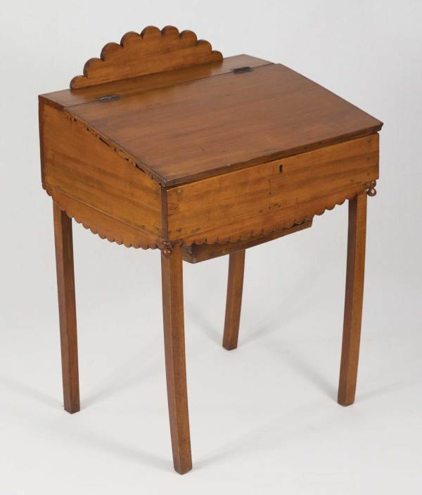
Included in his investigation of the life, tools and a detailed look at the furniture of Jonathan Fisher (1768-1847), a rural Maine minister and craftsman, author Joshua A. Klein also presents an overview of 38 pieces built by this Harvard-educated renaissance man. Below is number 10, a charming child’s desk, from “Hands Employed Aright.”
Wood(s): maple or birch; legs are an unknown hardwood (possibly beech)
Inscriptions/stamps: sticker on cubby lid “Desk made by Rev. Jonathan Fisher Blue Hill, ME. (1791-1847) Lonnie E. Davis got it in 1948-9 fr. James Fisher bequest to MA Dodge 1955”
From the collection of: Jonathan Fisher Memorial
Construction: The desk is made of butted and nailed construction. The legs protrude up through bottom as corner reinforcement and were nailed from the outside. Everything is nailed together through the adjacent face. The nail holes appear to have been puttied. The top has a hinged scalloped decoration. The apron also has scalloped decorative pieces nailed to the undersides of the front and sides. The desk lid’s hinges are face mounted. The writing surface end grain is covered by a 1⁄4″-thick decorative carved strip. There are turned balls on the front corners. The top-hung drawer is butted and nailed with cut nails. The drawer runners are nailed from the bottom up into the desk with cut nails. The inside cubby is divided into four compartments. The small hinged cubby door is on wire cotterpin hinges. The writing surface has a lock attached with nails. The bottom is nailed in place from all sides. There is yellow paint residue in cracks and dark yellow putty in the nail holes. On and around the hinges are remnants of red paint. Red pigment is visible on the drawer underside. The desk underside has pink chalky residue.
Tool Marks: There is considerable tear-out on the inside of one of the legs. There are some sash sawmill marks on the desk bottom. The bottom was planed with a fore plane. Most surfaces are smooth (perhaps due to later sanding during refinishing). The apron scallops have chisel facets and there is a saw kerf visible between scallops. There are divider center points on the scalloped details on the aprons. There are fore plane marks on the drawer face. The drawer bottom is rough and irregular. There are chisel facets on the top scalloped detail.