Two of our new sliding bevels, plus a early design prototype that Josh Cook printed out.
As a chairmaker, a small sliding bevel is essential to my work. The tool guides most of the joinery. It also is a companion when I explore historical chairs to understand how they work.
When we completed work on the Crucible Type 2 Dividers, designer Josh Cook and I wondered if we could adapt that tool’s ingenious tension/locking mechanism for a sliding bevel. The answer is yes. And thanks to tool designer and machinist Craig Jackson, we have a bevel in the works that exceeds any expectations I had for the tool.
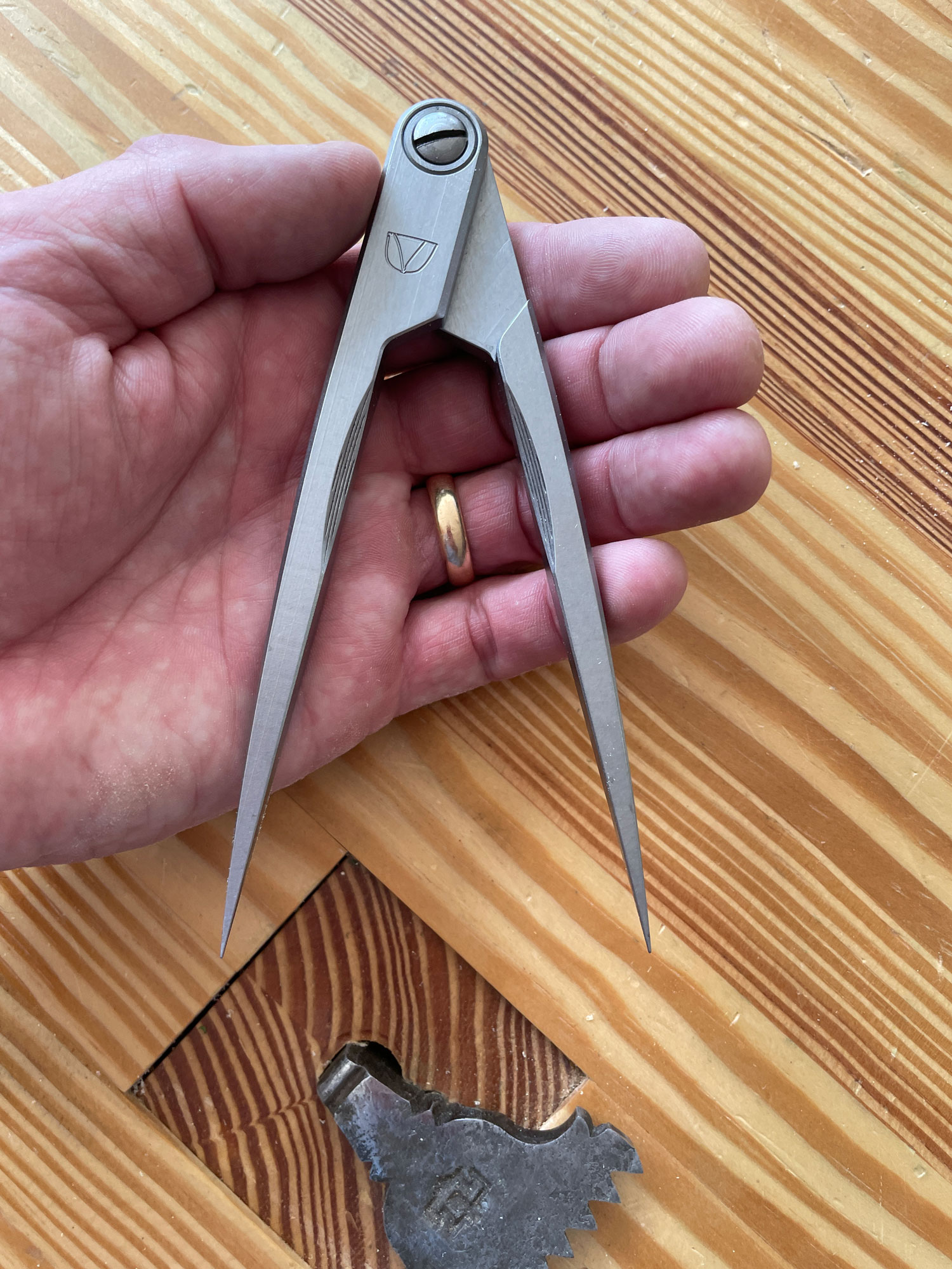
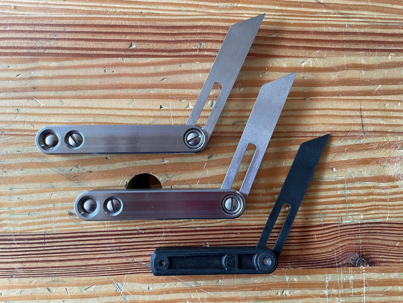
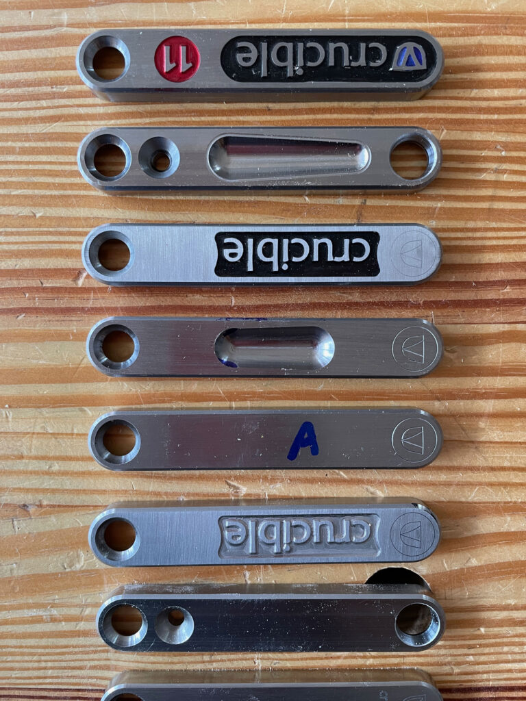
The Crucible Sliding Bevel is unlike any other sliding bevel I know of. It locks the blade position so tightly that you have to be quite strong to get the blade to move off your desired setting. And if that’s all it did, I’d be happy. But it does something else, too.
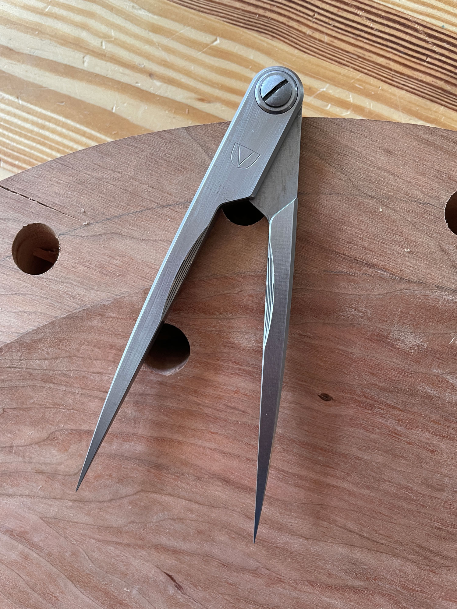
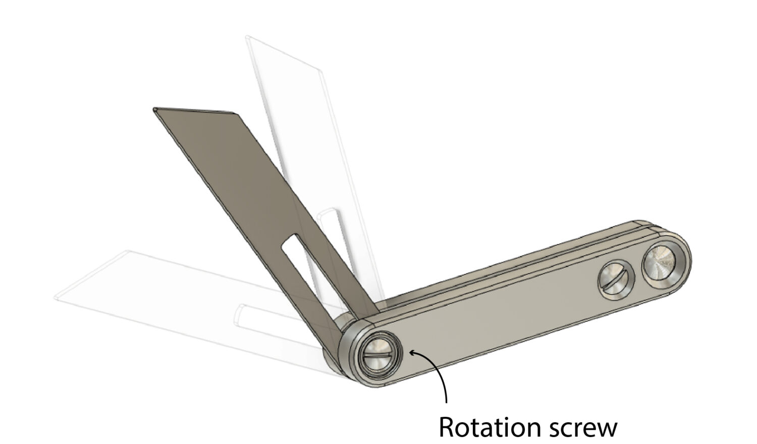
Thanks to Craig, the Crucible sliding bevel has dual controls that allow you to do some helpful things. The screw up by the blade controls the rotation of the blade. It works like the adjustment mechanism on any sliding bevel. You can use it to lock the blade, loosen the blade or set the tool’s tension so the blade rotates but with some effort.
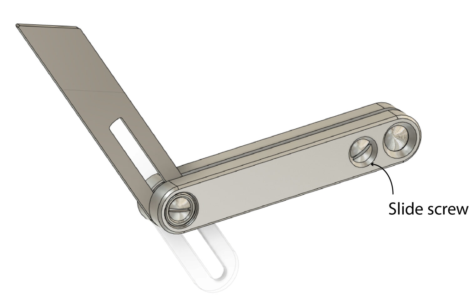
The second screw near the back of the tool is used to adjust how the tool’s blade slides in its slot. You can use these two screws to control separately the rotation and the sliding of the blade. That means you can:
Lock the rotation of the blade and then slide the blade to a different position in the body of the tool.
Lock the blade so it won’t slide, but it will rotate.
I know this might sound complicated, but it’s not. Much like the dual controls on the Tite-Mark, my favorite marking gauge, these become second nature within a couple minutes. Also good to know: You don’t have to use the dual controls. You can simply use the control at the pivot point to work the tool – bringing in the second control only when necessary.
Some of the many tool bodies that we experimented with. The colors in the backgrounds of the engravings is marker or metal dye – just experiments. The No. 11 is because this tool is our 11th tool.
Some Specifications
We are making the bevel in alloy steel with a 4″ blade, which is my favorite size. The blade is 3/32″ thick, so it is impossible to mangle. The body of the bevel is 11/16″ x 3/4″ x 4-3/8″ and weighs a nice 10 ounces. The bevels are being made in Kentucky. The control screws are the same size as the screw on our dividers (so perhaps we’ll make a screwdriver soon).
One of the other nice things about this tool is that it is extremely easy to assemble and disassemble. So we will offer a 7″ blade that fits in this tool’s body in early 2022.
So when will these begin selling? We are waiting on a large steel order. The production fixtures have all been constructed and the programming is complete. Depending on when the steel arrives, there is a chance we will offer the first batch right before Christmas.
And the price? This is the most complex tool we’ve made so far at Crucible, and there is a lot of milling to make the custom parts. The retail will be $200, and I think the tool is worth every penny. (As always, if you’re feeling salty about the price, I encourage you to give small-scale domestic toolmaking a go. I love it, but sheesh – making stuff is hard.)
I don’t know if we have enough margin in these tools to offer them through our foreign and domestic retailers. But a few months of production will give us that answer.
In the coming weeks I’ll make a video that shows how the bevel operates.
— Christopher Schwarz
In the end, we went with an understated logo, which matches the look on our other tools.
Today I reviewed a big batch of Crucible dividers for quality control problems and sent them on to our warehouse in Indiana. Barring some delivery stupidity (it happens), they should go on sale on Saturday.
These dividers are the most complex tool we make and are difficult to manufacture, especially considering the $110 price tag. If they were $300, we could lavish a couple hours of polishing and tuning on each tool and still come out in the black. But that’s not what we’re about.
Instead, these tools are manufactured – like our books. Yes, there is a lot of handwork, hand-assembly and tuning involved in these tools. But a lot of the skill to make them is in programming the robots and ensuring the processes are foolproof so that even I can assemble them – even though I’m not a skilled machinist. And so far, I’ve assembled quite a few of them.
Because I’m not a fan of hype, I’ve tried to downplay these dividers quite a bit (maybe too much). They aren’t like an infill plane or a blacksmith-made fretsaw. But when I pick up our dividers and use them – as I have every day for the last six months – I am tickled by their presence. Despite the fact that my personal dividers aren’t cosmetically perfect, I carry them around all day like a nice pen. I hold them when I’m thinking or on the stupid phone.
I open them and shut them over and over, and think about the mechanism inside. It looks so simple, but the angles and tolerances have almost broken my head a few times. But still they make me think. And now that we have the mechanism (almost) perfected, we’ve been designing other tools that use it.
(EDIT: When I say “almost” perfect, I mean that we are improving the hinge to make the assembly process easier. Right now we have to do a couple extra steps to get the hinge working perfectly. Nothing leaves our hands that isn’t 100 percent functional and meets our standards for fit and finish.)
Books have authors, but there is always a team of people behind them that makes the thing look good and read well. Tools are the same way. And so I will continue to call out the people who have made this tool really work: Craig Jackson at Machine Time and Josh Cook, a mechanical designer. Thanks guys.
So look for the dividers on Saturday. And if we sell out, know that we now are making hundreds more. Our goal is that everyone who wants one can get one.
Work in progress. Partially finished elevation of the north wall, showing the planned corner unit and set of narrow drawers to the left of the stove.
After a long hiatus from shop time thanks to Indiana’s stay-at-home directive, I’ve been back in full force over the past two weeks. Sure, I could have kept working on the kitchen — my shop is next to our house. But why turn my work area into a life-size game of Tetris with cabinets as playing pieces a moment before that crowding was really necessary? Better to leave the roughsawn oak and sheets of plywood flat until we could firm up the schedule for delivery and installation.
Every kitchen I’ve worked on has entailed a few changes along the way. I do my best to help clients make the most important decisions early on. I also encourage them not just to order their plumbing fixtures and appliances, but to have them on hand before I start to cut materials, because reworking cabinets can get expensive quickly.
On this job we’ve done a lot of things differently because of the ongoing pandemic. With no clear idea how long the stay-at-home directive was going to last, my clients, Jenny and Ben, were in less of a hurry to order appliances, etc. and have them delivered — they’ve been working full-time from home in the company of their three children, whose schools were closed for in-person classes. Ordinarily we would have met to discuss a few questions that have cropped up; instead, we’ve hammered things out by email and phone. I’ve dropped off samples of milk paint at their back door. Everything has been slightly off — at times, surreal.
Soapstone slabs at Quality Surfaces near Spencer, Indiana
Our only recent meeting in person took place at a local stone yard, where Jenny and Ben fell in love with a slab of medium-gray soapstone. Compared to other stone, such as granite, this one is relatively soft, so I wanted them to be aware of how it would likely age. I sent snapshots from our kitchen, which has pale gray soapstone counters, and emphasized that even though we treat our counters with care, there’s significant wear along the front edge at the sink. This stone would require extra coddling.
They weighed my warnings. Then, intoxicated by the beauty of the stone, they concluded they had to have it.
To compensate, they decided to use a different kind of sink. The plans included an undermount sink, but after seeing pictures of our counter, Ben and Jenny decided to buy an enameled cast iron apron front, to do away with the especially vulnerable strip of stone across the front. Good thing I hadn’t started building the cabinets — not only did this change the doors from full height to more like 20″; it also meant the sink base would have to be 2″ longer.
Comparing milk paint samples (which have a topcoat of the same water-white conversion varnish we’ll be using on the cabinets) to colors in the stone
The second major change has been to the kitchen’s inside corner. In our earliest discussions I’d gone through my usual reasons for recommending a simple stack of drawers instead of attempting to use the blind space that would otherwise be wasted, but Ben and Jenny decided to go with a corner optimizer.
The unit holds four baskets — two on the left, and two on the right, with one above the other on each side. Here Tony is modeling the unit closed, with only the lower left basket in place.
Full disclosure: I had never installed one of these units, which I first learned of thanks to Craig Regan. It seemed like a better choice than the half-moon blind corner pull-out I once experimented with in my own kitchen (more about this in my forthcoming book); it’s sturdy, better looking and smooth in operation. But once I had it in the cabinet I could see trouble down the line: Unless you’re meticulous about pulling the unit straight out and extending it fully before you pull the second half forward, the face frame of the corner cabinet and the face of the cabinet next to it would get scratched and banged up in short order. For a family of five who really use their kitchen, it seemed like a bad idea.
The first step: pull the primary pair of baskets forward. You have to pull them all the way out before attempting to move them over so that you can pull the secondary baskets out.
Fully open. The primary side [only one basket is installed on each side here] pulls over to the side of the cabinet opening, freeing it up so you can pull the secondary baskets forward.I thought through every likely scenario with the corner optimizer and decided to recommend we nix it in favor of some intelligently-designed, fully-functional drawers; depending on what we discover during demolition, the blind area in the corner will probably become a storage cabinet in the wall flanking the stairs to the basement.
A set of four capacious drawers on full-extension slides will take the place of the original corner optimizer and the 12″-wide drawers that would have flanked it.
To those who complain about old-timers being unwilling to change/jump on the bandwagon of The Newest And Greatest Thing, I offer this story as one reason why some of us whose livelihood depends on this kind of work prefer to recommend the products we know well. We’re not being lazy, fearful or unimaginative. We might have learned something over the decades from our mistakes. In the future, if clients ask me about the advisability of using a corner optimizer such as this one (and I am aware that this is not the only style available), I will factor what I know about how they use their kitchen into my response, as I do with every other detail of kitchen design.
If anyone would like to buy this 15″ blind corner unit at a discount (it makes a great climbing frame/nap place/carnival ride for a cat), let me know in the comments.
Krenov’s passport picture from the late 1970s, when he began traveling to promote his woodworking books. Image courtesy of the Krenov family.
For many American craftspeople (including many I interviewed who had a close relationship with James Krenov and his work), it appeared that Krenov emerged from Sweden a fully formed writer and cabinetmaker. That’s an understandable position; before the release of “A Cabinetmaker’s Notebook,” Krenov’s foothold in America consisted of a few short appointments at Rochester Institute of Technology’s School for American Craftsmen and Boston University’s Program in Artisanry, and a single article in Crafts Horizon in 1967, “Wood: ‘… the friendly mystery…’”. Many of his students in California, even from the earliest classes, assumed that Krenov’s career began with the success of his books, or that he had been relatively obscure before their publication.
Inversely, looking at Swedish magazines, furniture histories and newspapers, you might get the impression that Krenov’s story ends after his meteoric rise to fame and his departure from Sweden in 1981, just after the release of his books. While a few of his closest friends and colleagues in Sweden wrote about Krenov or included him in their writing on modern Scandinavian furniture, the line goes pretty silent there after Krenov’s resettlement in California.
A rewarding part of writing “James Krenov: Leave Fingerprints” was understanding and marrying these two disparate careers, and looking for the through-line to Krenov’s successes in both places. While this constitutes at least a few chapters’ worth of writing in the biography, I think it’s worth examining in a shorter piece as a means of understanding why James Krenov was a touchstone in the two different craft contexts in which he rose to renown.
Carl Malmsten (left), a student and Krenov (right) examine a scale model at Malmsten’s school in the late 1950s. Photo courtesy of the Krenov family.
When Krenov came to cabinetmaking in his late 30s, he was an outsider in Sweden and its crafts scene. He attended Carl Malmsten’s Verkstadsskola from 1957 to 1959, and it was there he impressed his first, and maybe most influential, pair of advocates.
The first was Malmsten; by this point in his career, Malmsten was perhaps the best-known figure in Swedish craft, having risen to his stature by designing a huge volume of furniture that blended the honest construction of the English Arts & Crafts movement with a strong Swedish vernacular aesthetic. Malmsten designed for the simplest homes and the most luxurious Swedish state houses; he was a household name.
Georg Bolin in the office at Malmsten’s Verkstadssskola. Photo by Kjell Orrling.
More behind the scenes, but no less influential among the tight circles of Stockholm’s art and craft scene, was Georg Bolin, the principal teacher at Malmsten’s school. Bolin was, by that time, an influential furniture maker and technician of the highest degree. He went on, through the latter half of his career, to design everything from fine furniture to novel “alto guitars,” and even a piano played for many years by Abba, Sweden’s second-largest monetary export, only outpaced by Volvo (until the arrival of IKEA).
As a student, Krenov impressed both Malmsten and Bolin. Shortly after his schooling, both men helped Krenov find a place for his work in the craft galleries and exhibitions of Stockholm, at a time when the Swedish craft scene was casting off functionalism for a more craft-oriented, holistic aesthetic that put craftspeople and handwork at the center.
While Krenov enjoyed minor successes in small shows and galleries (which any craftsperson would be proud to count on their resume), his inclusion in the 1964 exhibition “Form Fantasi,” at the Liljevalchs Kunsthall, was his big break. The exhibition was touted as a point of inflection in Swedish furniture and craft, and at the center of it were two of Krenov’s pieces, a wall cabinet and a silver chest. Krenov got into the juried show as a relatively unknown name (a newspaper article a few months prior misspelled his surname), but his friendship with Bolin and Malmsten certainly helped prime the judges for his work. (Both Bolin and Malmsten were also featured in the exhibition). When the Swedish newspaper Dagens Nyheter reported the event, Krenov’s “Silver Chest” was chosen for the feature photograph out of the 2,500 pieces from 250 craftspeople. After this show, Krenov won the favor of influential critics and curators, including Dag Widman, director of the exhibition and editor of the publication FORM from the Svenska Slöjdföreningen (Swedish Society of Industrial Design). This led to a solo exhibition, “Liv i Trä” (“Life in Wood”) in 1965, and a cavalcade of features, press and exhibition opportunities, as well as a stipend from the Swedish government given to artists and craftspeople deemed to be doing work important to Swedish culture.
The April 10, 1964, article in Svenska Dagbladet that featured Krenov’s “Silver Chest” (here called a syschatull, or sewing chest) in its coverage of the “Form Fantasi” exhibition. Image courtesy of the Krenov family.
While his cabinetmaking opened the door to his success, there is significant evidence that Krenov’s strong voice as a critic and singular personality helped him rise in the ranks of Swedish craftspeople. He started appearing at public conversations about craft at the Nationalmuseum (which appointed Dag Widman as its chief superintendent in 1966). At the time, Sweden was wrestling with the position of the designer-craftsperson; for a long time prior to the 1960s, Swedish craft had largely followed the trends of continental Europe, with a distinct separation between the designer and the person executing the work. With the revival in craft, Sweden saw an explosion of craftspeople who designed and made their own work, more akin to artists than potters, silversmiths, weavers and woodworkers.
Krenov did not see himself in either of these groups. His education had been technical, focusing on exacting execution according to measured drawings. Krenov eschewed this rigid process after his graduation, but did not swing all the way to the more free-form position of craft as art, which eschewed historic context and technical skill for expression and artists’ statements. His unique position between the two led to a lonely post as an advocate for designer-craftspeople working with traditional joinery and historic forms that were distinctly furniture. He focused on solid construction, graceful form and a distinctly functional intention, but made no attempt to divorce his influences and personality from a piece’s execution. Alongside his appearances at public discourses, Krenov also began writing for FORM, where he took on the voice of an advocate for craft against the bulwark of both unchecked artistry and functionalist design.
By the mid-1970s, Krenov was at the top of Swedish crafts; he was a featured presenter, author and craftsperson in many of the museums and galleries. Few could aspire to more, but his feelings of under-appreciation in Sweden (spurred on by his unique position between two trends) left him looking to the other side of the ocean for greener pastures. In 1966, Craig McArt, a student from RIT, studied with Krenov for several months and persuaded Krenov to share some of his writing. McArt brought an essay back to the United States – the one published in 1967 by Craft Horizons. This first contact with America, and specifically McArt’s advocacy, led to his appointments at RIT and BU. These were combative but engendered a small but enthusiastic following of U.S. students and colleagues. Krenov would have had no problem in Sweden publishing his first book, an extensive elaboration on Craft Horizons essay that became “A Cabinetmaker’s Notebook.” But he thought that in the States, unlike Europe, there existed a strong independence around craft, so there would be an eager generation of students who would be receptive to his philosophy – so he wanted his book published in English for an American audience.
And so, with the help of the RIT administration and McArt, Krenov published “A Cabinetmaker’s Notebook” with Van Nostrand Reinhold, a publisher of art and craft books based in New York. After its publication, Krenov’s reputation in the United States exploded (which surprised his publisher; it had hardly promoted its release). Three more books came in just five years, as did invitations to present and teach stateside, and a few particularly motivated craftspeople on the West Coast established a school based on Krenov’s idiosyncratic approach. It was the school that ultimately convinced Krenov to make his move across the Atlantic, but by 1981, it is clear (in his writings and correspondence from the time) that he had been looking for a landing pad in the States for the better part of a decade.
Krenov and Britta, his wife, walking the headlands of Mendocino in the late 1970s during one of their first trips to California. Photo courtesy of the Krenov family.
So, in truth, Krenov entered the American context at a particularly high moment in his career – it was among an American audience that he passed from renowned furniture maker to celebrated author, teacher and influential craftsman. In Sweden, his advocates called for the books to be translated into Swedish. They wanted Swedes to read the philosophy and sensitivity that both Swedish aesthetics and opposition thereto engendered in Krenov. The books were not translated, however, and while there are echoes of Krenov’s influence in Sweden’s woodworking trends (particularly in Malmsten’s schools at Capellgården and Krenov’s alma mater, the Verskstadsskola), his move to the States also largely closed the book on his lasting influence in Sweden.
Krenov’s aesthetic and technical approaches, however, were certainly born in his nearly four decades in Sweden. I would argue that his arrival and warm reception in America constitutes a potent reverberation of the European Arts & Crafts movement’s influence on American woodworking, with Krenov’s direct lineage from Malmsten, who had visited Gimson and the Barnsleys in the Cotswolds in the 1920s. Krenov rose from the plateau of fame he had reached in Sweden to an even higher perch in America, on the back of both his writing and the establishment of his school. If nothing else, he was a singular presence in both countries; his resonance with the curators and critics of Sweden was matched by his reception among the dedicated woodworkers of America – those who were looking for a different approach than the technical manuals that dominated American woodworking publications in the middle of the 20th century. Neither country can claim Krenov as their own; certainly it was Sweden that fostered his development, but it was the United States that gave him his biggest audience, an appreciative student body and a warm reception.
Krenov’s passport photo from the 1950s, before his American passport was revoked by the United States Government for not returning stateside after five years (a legal requirement for naturalized citizens that was overturned in 1964). Photo courtesy of the Krenov family.
But Krenov never found exactly what he was looking for. He was a Russian-born, American expatriate living in Sweden for decades, including the first two decades of his career as a woodworker. For several years in the 1960s, before the Schneider v. Rusk decision on the status of naturalized U.S. citizens living abroad, he was even a stateless person, having lost his naturalized American citizenship after not returning to the States for several years. While he regained his citizenship in the mid-1960s, it is perhaps most fitting to consider Krenov a stateless craftsperson; it suits his position as an independent force in both countries, someone who never settled for the successes he won.
A story that might sum up his tireless, even contrarian, position was told to me by Tina, Krenov’s youngest daughter. She recalled that in Sweden, when she was growing up, her father insisted that they find turkey for their Christmas dinner, something he remembered from his teenage years in Seattle. But upon the family’s resettlement in California, where turkey might have been much easier to procure, Krenov insisted on ham for their holiday dinner, as the Swedes had preferred. It might be this resistance to comfort that gave Krenov the drive to look to the next opportunity. It is certainly a factor of his success in Sweden, and the driving force behind his relocation to California. With this lens, we can see the continuity in Krenov’s seemingly separate careers in Sweden and the United States, and we might better understand how the perceived loneliness or isolation of his approach ended up bringing him a wider audience and community than any one group or country could have provided.
This post is a continuation from a series of posts following a “read-along” or book club of sorts. This week, I’ll be discussing a third chunk of “A Cabinetmaker’s Notebook” by James Krenov, up to page 69. Next week, we’ll read up to page 78, and you can leave comments and questions about pages 70-78 in the comments section below, which I’ll answer and incorporate into next week’s post. This is a short passage, but it makes the most sense for dividing up the reading. There’s a lot to talk about in those two passages!
We are halfway into Krenov’s first book – and only just getting into what this book was about. Up to now, we’ve been wrestling with his words, but he was a cabinetmaker. So, maybe we should look at some of his work.
After all, Krenov was as much a cabinetmaker as a writer. It’s a funny thing to say, to split his identity one way or the other. By 1976, he’d been writing since he was just a teenager and had published several stories and travelogue. He’d only been working with wood for 18 or 19 years. In some ways, Krenov was a writer all along, but it’s clear that his life focused on and rallied around his craft once he discovered it. “Cabinetmaker Laureate” is the term I’ve been using for a while, and I think it’s apt. I spend a lot of time thinking about this stuff.
So, let’s look at some furniture. I particularly like the three pieces that were detailed in last week’s reading, which is why I wanted to draw your focus to his work in this part of the book. They span his career up to this point, they’re aesthetically varied, they’re stunning work and I have some great details and even “fact-checking” for each of the three.
The “Violin Cabinet” (date debatable) in Oregon pine, larch, pearwood and beech.
The first of the three is the “Violin Cabinet.” Now, usually, I follow the name of the piece with a date – so perhaps I should have written “Violin Cabinet” (1969), which bears the date Krenov assigns the piece in the book. But look at the image below:
Okay, there’s a lot to unpack in that image. First, on the far right (and cropped off on the far left, maybe) is a bizarre piece I’ve never seen of Krenov’s, a “cabinet on a shelf” form – news to me. And speaking of “news” – in the distance, there are two trios of near identical pieces, in scale and form. Was he making multiples? Once again – news to me. The “No-Glass Showcase of Lemon Wood” (1962) is centerstage out on the floor, and on the left, we can see the “Violin Cabinet.”
The reason I present this photo to you: it was taken in 1965, at Krenov’s first solo show, “Liv i Trä” (Life in Wood), in the Hantverket gallery in central Stockholm. You may recognize the plain walls and nondescript carpet – many of the photos of Krenov’s work in his later books, especially those in “Worker in Wood,” were taken at the gallery, because Krenov held several shows here over his time in Sweden.
But again – the photo is from 1965. You can see the “Violin Cabinet” there on the left wall. There’s even a violin inside it, though I doubt it’s the Guaneri that Krenov mentions in “Worker in Wood,” where he provides some more details about this piece. So, the date is wrong, only off by a few years, maybe five. Not a big deal.
But, knowing that the cabinet is from before 1965, more of its features and peculiarities begin making sense. The simple shaping, almost completely rectilinear, was more common in his “early years” (I might define that time period as before his first solo show in 1965). He also used many more softwoods in these years – this could have been his interest at the time, and he may not yet have found the access to the exotic woods that would dominate his “middle years” (the 1970s or so, in my book). The pulls are simpler, and very smooth, with none of the carved facets his later work would have.
So, while the date hardly matters for the sake of “truth,” knowing that this is actually among the earliest work in the book helps us look for a few trends, and understand a bit of how his tastes and practices matured.
The piece is crisp. Larry Barrett noticed in his reading that the reveal around the doors was askew in one photo, but I’m sure it was either age or the angle – the photo above shows how svelte and careful the shaping and polishing was on this piece. Douglas fir is not as soft as pine – but getting such nice burnished edges, what Krenov would refer to as “friendly,” is not so simple. It’s a favorite piece of mine, in spite of it being so simple. Perhaps it’s because it fulfills a purpose so neatly – I need a place to put my violin, here it is. The fine-grained softwoods complement the spruce top of the violin, which is perfectly displayed above shelves for its accessories. It makes me wish I played the violin, so that I could make a cabinet like this.
“Chess Table” (1970), playing surface of pearwood and Rio rosewood, body of secupira and drawer of maple.
The second piece covered in this section of the book is the “Chess Table” (1970). I have no arguments for that date. But, this time there are more details about who designed the piece, not its date. In fact, this is the only piece I know of where another designer worked with Krenov to make a piece of furniture.
Craig McArt was a central figure in Krenov’s career. McArt encouraged Jim to write a book, got his first essay published in Craft Horizons in 1967, and suggested him as a teacher to RIT in 1969 (and again in 1972). McArt had first met Jim in Stockholm in the 1966, while on a Fulbright scholarship to study abroad. McArt worked with Jim in the summer of 1966, in Krenov’s basement workshop. While he was there, he worked on a number of small furniture pieces, including a small piano stool for one of Georg Bolin’s pianos. But, toward the end of his residence in the shop, Krenov asked McArt to design a few pieces. Maybe it was just as an exercise, but McArt was much more technically capable a designer than Krenov was, or wanted to be.
By McArt’s memory, Jim never tried any of his other designs – except for a chess table. None of McArt’s drawings or plans exist any more for this piece, and he didn’t specify which details might be his influence or Krenov’s in this piece – but, this is the only example I know of where Jim solicited any outside design help or work. It’s a vague detail – but nonetheless singular and novel.
A later “Chess Table” made in 1978. Krenov made this piece again so he could detail its construction and process for his third book, “The Impractical Cabinetmaker.”
There’s a lot to say about the piece, but I think it’s easiest to focus in on the piece as an example of Krenov’s ability to show intention with every decision. There are so many little details. He sorted through the little squares before joining them and find those with the darker tones or color variation and arranged them accordingly. Look at the play surface above. Sapwood in the pearwood squares is arranged just so along the outer edges, the lighter rosewood pieces are in the middle, and so on. Now look at the wedges on the four tenons poking through the top. Two are dark, two are light, again echoing the playing surface.
What’s nice about this isn’t the gimmick – “The wedges are different colors! Cool!” What’s sweet is that every decision about color and grain is intentional, had some thought behind it. I’m never sure where my tastes lie with Krenov’s tables – they are, I would say, the most dated of his work (this is just me talking, not the biography). They tend to be a bit “bell-bottomy,” which I like in some of the cabinet stands, but less so here. But, you can look at every piece making up the table and know that he thought it through. When you start seeing flat sawn and quartersawn legs on the same face of a table (you can’t unsee it now that you know to look for it) you’ll know that not everyone pays attention to it, especially not with the eye that Krenov had. His consideration of grain is exceptional.
Before we look at the last piece, I think it’s important to bring to your attention the writing on pages 58-60. I’d say read it again, if you just scanned. It is, I think, my favorite passage in the book.
But it isn’t my favorite passage because it’s the most inspiring, or the most poetic. I like it because it’s frank. It’s a passage where Krenov shows a side of himself that he didn’t often display in person – nuance and self-reflection. He was famously irascible in his interactions, but a lot of the people I’ve talked with also mention his nuance a reservation, a self-awareness that only a few people really encountered. I can hear some of that in this passage. He’s talking about doubts, discouragement, his own luck, his old age – it’s like a few pages of a memoir, one I wish were much longer. I’ll excerpt a particularly good passage, which was also called out by Merle Hall last week.
“… I am a very lucky person. When I feel lucky in the total sense, I also feel very much ashamed for my weaknesses and the times when I have doubted, the instances when I’ve wasted a bit of what is most valuable in life. Time has passed, and I’m somewhere on a hill now. Anywhere I look around is down. Along the rest of the way, I must be less afraid. And more grateful.”
“Music Stand” (1963) in lemonwood, the first of four Krenov made. The one pictured in “A Cabinetmaker’s Notebook” is the third or fourth of the stands Krenov made – something about it was compelling enough to encourage so many iterations.
The last piece pictured in detail in this section of the book is his “Music Stand,” in pearwood. In his larger body of work, this is a piece unique for its specificity in use. Later in his career, when he was able to do speculative pieces without a specific buyer or intended use, he gravitated to cabinets, which provided the forms he may have most enjoyed making. But his music stands, of which he made at least five over his career, are purpose built for a pair of players sitting opposite each other.
The pearwood stand pictured in the book is now in the collection of the Nationalmuseum in Stockholm, which has the largest number of Krenov’s pieces of any museum. Still, that collection is only five pieces – Krenov never made enough pieces to be collected in a volume that other makers could muster.
Here, while the intention of wood selection and form is just as salient as the chess table, what I see carefully explored in this piece is his penchant for shaping and fair curves. The legs have a complex set of facets that ground them neatly, one he accomplished with his planes and a spokeshave. The drawers can be pulled from either side, with a pull that is carefully shaped and “let in” to the two drawer fronts in a particularly graceful way. It’s a sweet piece.
Bernard Henderson, a woodworking student in the class of 1987, and Marcia Sloane, a cellist in the local “Symphony of the Redwoods,” play at Jim’s last iteration of the music stand.
Music played an important role in Krenov’s life. His mother was a deep appreciator of opera and classical music. Krenov was fond of musical analogies, and it’s clear that, in music, he found a lot of similarities to his own creative practice. “The cabinetmaker’s violin” is what he called his handplanes. In the photo above, Bernard Henderson and Marcia Sloane played for the class of 1987 when Jim made his last iteration of the music stands. Marcia Sloane would also play for Jim in his last days, bring her cello into his hospital room in 2009. His compulsion to make five of these stands must have had some deeper tie to this relationship with music. The intimacy of their design, too, being made for two players sitting opposite each other, shows a preference for the sensitivity and familiarity required when playing in a duet.
As I’ve been writing this biography, it’s been easy to forget to look at his work, not his books and relationships. Krenov’s personality was terrifically complex. His writing makes that clear enough, and his relationship with the world could be both contrarian and optimistic in the same breath. But, looking at his work, his ability to be present in the execution of a piece of work is clear. The presence of mind to carve a pull and position it to be comfortable for a reaching hand shows a consideration of the user that I don’t see present in much furniture. While my biography does not stray too deeply into a critical analysis of his work, his furniture had so much of him in it that it almost makes up a secondary set of primary sources.
I was excited by some of the comments in last week’s post. Scott, I’m thrilled with all of the remembrances and encounters you’re sharing. A lot of the writing in this book is a slow burn – it’s fun to follow along as you read through with us, and I’m enjoying your notes!
Next week, we’ll read just a few pages, up to page 78. It’s a short read, and it features two distinctly different passages – one about cats, one about Krenov’s process. There’s a lot to unpack, and I have a lot to add about Krenov’s life with animals. So, I look forward to the next post! As before – if you want to join in and read along, please do, and use the comments section below to ask any questions, highlight a passage or make a comment on this next section of the book or the photographed works therein.
I hope everyone is doing well with their time at home, or for those working in essential roles in these crazy times (like my amazing wife), a big thank you. Another week down, and another week ahead, with the hopes that we’ll find some silver linings in all of this.