
This is an excerpt from “The Anarchist’s Design Book” by Christopher Schwarz.
All of the pieces in this book were designed using dirt-simple techniques that rely on photos of old furniture, a pencil, scraps of wood and wire clothes hangers.
The method allows you to stand on the shoulders of successful designs and alter them to fit a particular space in your home, to remove ornament or to even change the purpose of the piece (you can turn a stool into a desk).
It begins with finding a piece of furniture with an attractive form or, as I like to say, “good bones.” It doesn’t matter in what style or period the piece was built. What matters is that the piece’s proportions and lines hit you in the gut.
The chair and backstool in this book both began with a piece from Victor Chinnery’s classic “Oak Furniture: Fine British Tradition.” I liked the rake of the legs, the four evenly spaced spindles and the smallish crest rail.
But there’s a problem when starting with a photograph. As a photographer friend says, “Photos are lying bitches.” Well-designed furniture looks good from almost every angle, and a photo shows only one view-point. The solution is to make a quick digital model or small mock-up.
To do this, you need some dimensions. I use a pair of dividers and a ruler to work these out. For example, I knew that the seat of the back-stool in Chinnery was about 14″ from the floor. That allowed me to figure out the width of the seat and the other relevant dimensions. Some dimensions, such as the depth of the seat, I guessed at using ranges from “Human Dimension & Interior Space.”
If I’m building a case piece, I then make a quick 3D model in a computer-aided design (CAD) program. No joinery. No details. Just boxes that reflect the mass and major components of the piece. Then I rotate the piece and look at it from all angles to see if the photo was lying.
‘Modeling’ Projects in ‘Wireframe’
Modeling chairs or any staked piece in CAD, however, is stupid. OK, “stupid” is a strong word. It’s much faster to make a half-scale model using scraps and wire.
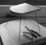
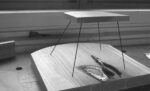
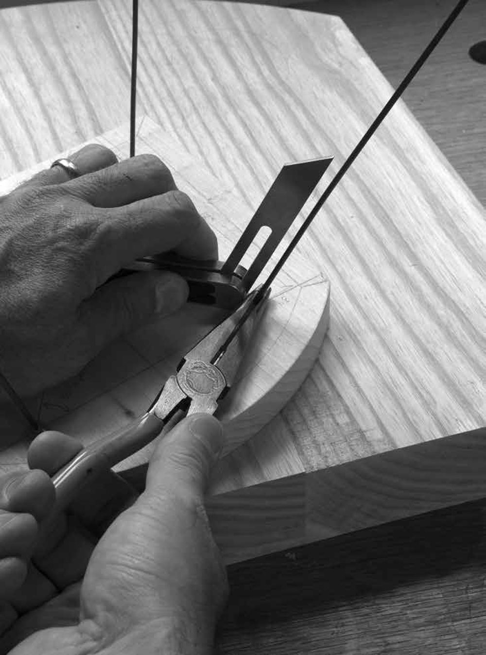
I epoxy the wire legs into the plank seat and bend them into position with pliers. As you’ll see in the next section on staked furniture, this modeling process will also solve the geometry problems for you when building the piece.
Then I put the model on a table and walk all around it. I bend and snip the wire legs until the piece hits me in the gut the same way the original photograph did.
At this point I’ll do one of two things: If I have the time, I build a quick full-size prototype from junk wood. This allows me to work out some of the joinery and construction problems that I might not have anticipated.
If I’m in a hurry, I take a picture of my wire model, print it out and draw on the printout. I might add bulk to the legs, scalpel bulk from the seat, add spindles and other details.
Then I head to the shop and build what I pretty much know is something that will work.

If this process sounds arduous, you might not be ready to design your own pieces of furniture. Stick to plans – there’s no shame in that.
Design, like anything in woodwork, takes a little effort. I’ve never met anyone who can design a piece using pure inspiration and nail it on the first try. The process outlined above, however, is the shortest distance I’ve found between desire and satisfaction.
— MB
 We’ve had several readers inquire about getting a T-shirt with “The Anarchist’s Design Book” logo on a long-sleeve shirt, in a particular large or small size that we don’t carry, or on a thong (I made that one up).


