I’m finishing up the editing on “To Make as Perfectly as Possible: Roubo on Furniture.” On Wednesday it goes back tot he translation team to review our edits. Then to the printer. We are shooting for a November 2016 release of the standard edition. (Details on a deluxe edition to come.)
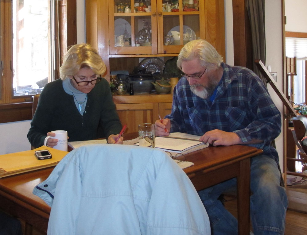
It was a grueling week at the Appalachian Shangri-la as Michele and I spent more than 40 hours reviewing the page proofs of “Roubo on Furniture Making;” me reading aloud every jot and tittle (including punctuation and typography), while she followed along in my replica of the original French volume. It was a paradoxical sprint and marathon as we raced to review in minute detail each word, number and illustration of the new almost-450-page book. We stopped frequently to clarify the meaning or context of a word, phrase, or sometimes even a whole paragraph, leaving approximately a bazillion notations on the pages, mostly about capitalization and italics.
One thing is certain – it does reinforce the assertion that “l’Art du menuisier” was a work for the Ages and can serve as a vital part of any contemporary woodworker’s tutelage, now and for the conceivable future.
Consuming the entire manuscript in one stretch gave us, for the first time, the so-called “view from 40,000 feet.” And what a magnificent view it is! Not only did our appreciation grow through this high-altitude panorama, but we also began to notice subtle and not-so-subtle themes emerging, concepts and phrases we had not noticed before when we were focusing on much smaller units of the whole. This new appreciation was so affecting it provided us with the impetus to actually change the name of the book.
For our first volume, “Roubo on Marquetry,” I chose the lead portion of the title, “To Make As Perfectly As Possible,” from a phrase that Roubo used as exhortation throughout those sections of his original masterpiece. Never mind that it brought about perhaps the most unwieldy title of any woodworking book anywhere, ever. “To Make As Perfectly As Possible: Roubo on Marquetry” does not roll effortlessly off the tongue or the keyboard. Our expectation was that this lead phrase would serve equally well in the title for “Roubo on Furniture Making” and any subsequent volumes, which it would have done admirably, but after this week we are heading in a new rhetorical direction.
Throughout the often lengthy, detailed passages – and “Roubo on Furniture Making” is almost twice as long as “Roubo on Marquetry” – the Master invoked the sentiment and phrase, “with all the precision possible,” and we are eagerly purloining it as our own for this book.
So, I will be hand-delivering our marked-up copy of the proofs of “With All The Precision Possible: Roubo on Furniture Making” to Lost Art Press this coming Thursday at the Crucible Tool premier.
Plate 286. Different Sorts of Sections Appropriate for Infilling Panels
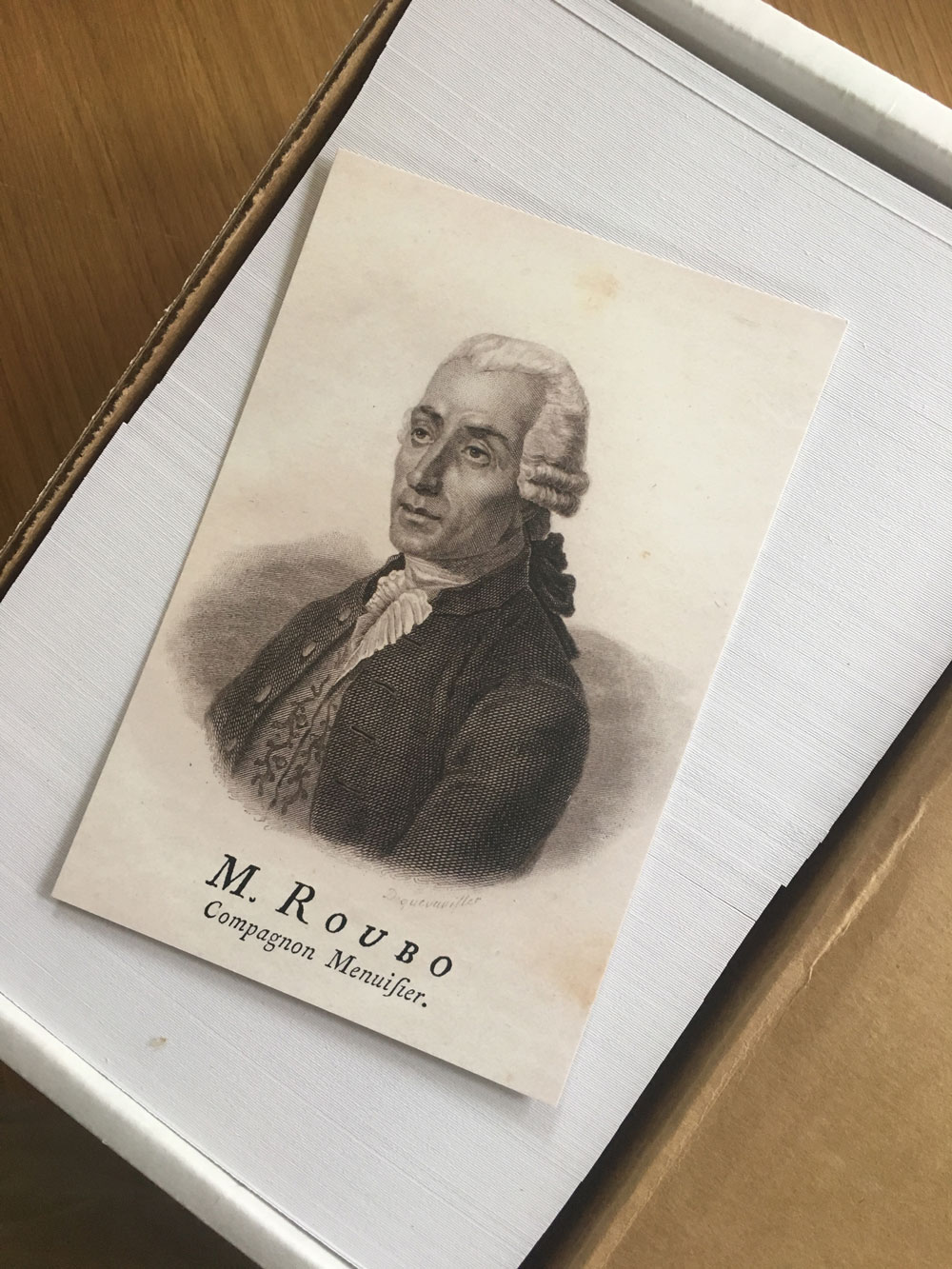
This is an excerpt from “Roubo on Marquetry” by André-Jacob Roubo. Translation by Donald C. Williams, Michele Pietryka-Pagán & Philippe Lafargue. The translators’ additions to the text are in brackets. Roubo’s asides are in parentheses.
Figure 4 represents a composition with dice or cubes, placed on a background of whatever color; these dice or cubes are hexagons, placed side by side, in a manner such that their points touch each other, as you can see in this figure.
Each of these hexagons, or figures with six sides, is composed of three lozenges of any colors assembled together to make the dice or cubes appear in relief. Lozenge C (which is the daylight side) is an example of the shape in question and is made in rosewood. Lozenge D, which is the top of the cube, is of grey or yellow wood. Lozenge E, which is the shade side, is of violet wood. The remaining space [unmarked but primarily horizontal] is of some other wood that one judges appropriate, provided that it differs in the color of wood that forms the cubes. The cubes should not only differ in color from that of the bottom, but also each lozenge comprising the cube should all be different from each other. One accomplishes this by choosing pieces darker in color from one side to the other, or even by passing them over hot sand, as I will teach later.
Figure 5 represents another section, which does not differ from that of which I just spoke, except that it does not have any remaining space or background like the last one. To the contrary, all the dice or cubes fit one inside the other without leaving any void space, which works quite well. However, it is good to observe when making this last type of section, to make a space or background between the cubes on top and on the bottom, as I have shown in this figure, which works much better than to see the ends of cubes cut up, as one does ordinarily, and which I have indicated by line F–G.
In general, whether the sections of which I am speaking are with a background as in Fig. 4, or without a background, as in Fig. 5, it is necessary to take great care when making the section that a whole number of cubes is found on the length, and that the uppermost end of these same cubes reach the banding or stringwork that surrounds them, as I have shown here. This is very easy to do since it is only necessary to adjust the proportions of the cubes according to the need, it not being absolutely necessary that the hexagon of the cubes be perfectly regular. Whatever way it can be done is the better way, and is so much easier to do when the three lozenges that compose the hexagon are of a similar shape, which does not ordinarily happen when the hexagon is of an irregular shape.
If one does not wish to make dice or projecting cubes, as in Fig. 5, one could make sections of cubes to fill the lozenges in a unified wood, which does not work badly when the joints are well made, as one can see in this figure. [This is in fact my favorite manner of preparing a composition such as this. I find the subtlety much more to my taste, especially when using a wood with a fine grain pattern with a noticeable difference from early wood to late wood, such as bald cypress on the radial plane.]
Figure 6 represents a section with mixed stars, which is a section that is very complex in appearance; however, it is only hexagons, as that of H, I, L, M, N, O, which approach and penetrate each other, so that the point of whichever star, becomes the center of another. It is necessary to observe in making these sorts of sections that one finds, as much as possible, a number of hexagons complete in height as is found in this figure, so that the bottom or void remaining at the points of the stars be similar at the bottom as at the top, which could not be if the section bordered by the line P–Q , of which the distance to the top-most stringwork of the section, contains only one-and-a-half hexagons in height. As for the length of this type of section, taken in the direction that is represented in Fig. 6, it is not important only that the number of hexagons be complete. It suffices that no points of the stars be cut along the same line, so that this section be as perfect as is possible to be.
These sorts of sections can be made with a projecting appearance, or be filled with segments of the same wood, which is equal for the form and disposition of the joinery, which is always given by the parallel lines, horizontal and perpendicular, and [rather than being comprised of lozenges] by equilateral triangles, of which the tops are opposite one another. Inspecting this illustration alone is by itself better than all the explanations that one can give.
Figure 7 represents another section, composed of octagons or figures with eight sides, placed in stars with eight sides, which all come to a point in the center. The stars that compose these sections touch each other on their perpendicular and horizontal faces at two points, which produces between them a squared space. This space is filled with the point of a diamond, as in the height of this figure, made from the background veneer. The other squared voids, which produce the return of the points of these same stars, being larger than those of which I just spoke above, are filled in by other stars with four points or some other element placed on the base, which distinguishes them from the rest of the work, as I have shown in the upper part of this figure, of which the stars as much as the points of the diamonds have an obvious [apparent] relief.
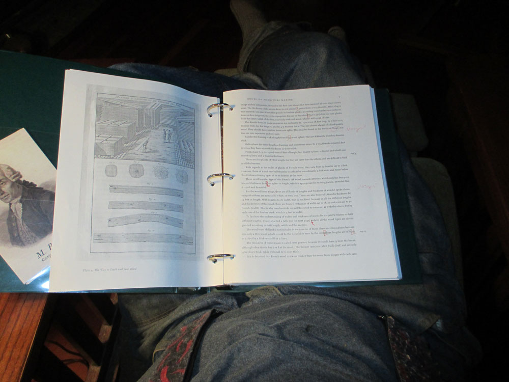
Just as expected the UPS truck arrived this afternoon with a hefty box, inside of which was the three-ring binder with the 434 pages of text from the next offering in the “Roubo” series. Once we are done reviewing it word-by-word, line-by-line, illustration-by-illustration, I will send it back to Chris and the next time I see it will be when the book is received from the bindery.
This is the view that will dominate my next ten days. The remainder of this week I will read and review the editorial comments thus far, and starting Sunday or Monday we will begin our limited engagement of the dramatic reading of the pages. I’ll be reading it out loud in its entirety including any punctuation of typesetting features while Michele follows along in the original French, consulting occasionally with her notes on her laptop or grabbing for one of her inventory of dictionaries going back several centuries.
Here we are (above) engaging in the same exercise 3-1/2 years ago for “Roubo on Marquetry.” The only difference this time is the likelihood some of the work will be done from rocking chairs on the front porch, reveling in the crisp mountain air and trying to not be distracted by the scenery.
As I noted recently in a comment to a blog post on this site, I look forward to completing the final final final review before this puppy gets to press. It has been a long road to this point.
I remember when Chris was visiting us in 2012 and my wife said something like, “If Roubo is so important, why hasn’t anyone done this project before?”
Chris: “Well, how long have Don and Michele been working on it?”
Wife: “Oh, several years, maybe four or five.”
Chris: “That’s why.” Probably unsaid, “Because nobody else was crazy enough to get it done.”
So now we are almost 10 years in and perhaps another 10 to go. By then Michele and I (and our indulgent spouses) will be ready for a rest. But for now, 10 days of Roubo Boot Camp await us.
This Saturday we’ll be opening up the Lost Art Press storefront for business and for making a little bit of history.
We are in the final throes of editing “To Make as Perfectly as Possible: Roubo on Furniture” and are asking anyone who can rub two participles together to help. Come to the storefront (837 Willard St. Covington, KY 41011) at any time between 10 a.m. and 5 p.m.
We’ll give you some pages to edit and a red pen. You’ll get to read the text, look for typos and help us make this project as perfect as possible. Everyone who helps with the project will get free coffee, doughnuts, beer and pizza. And for every plate you edit we have a special Roubo postcard for you.
You are welcome to help edit the text for just one plate or even edit all day (that’s what we’ll be doing).
As per usual, we’ll also have all our books there, plus blemished books (50 percent off – cash only), T-shirts, posters and free stickers. Plus you’ll be able to check out the new Roman workbench I just completed and tinker with its workholding.
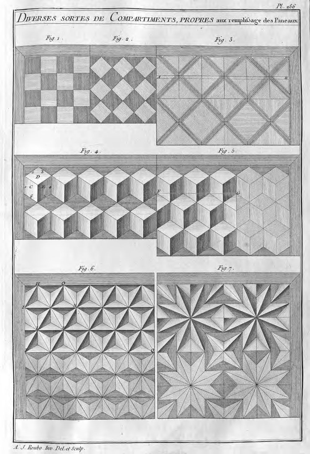
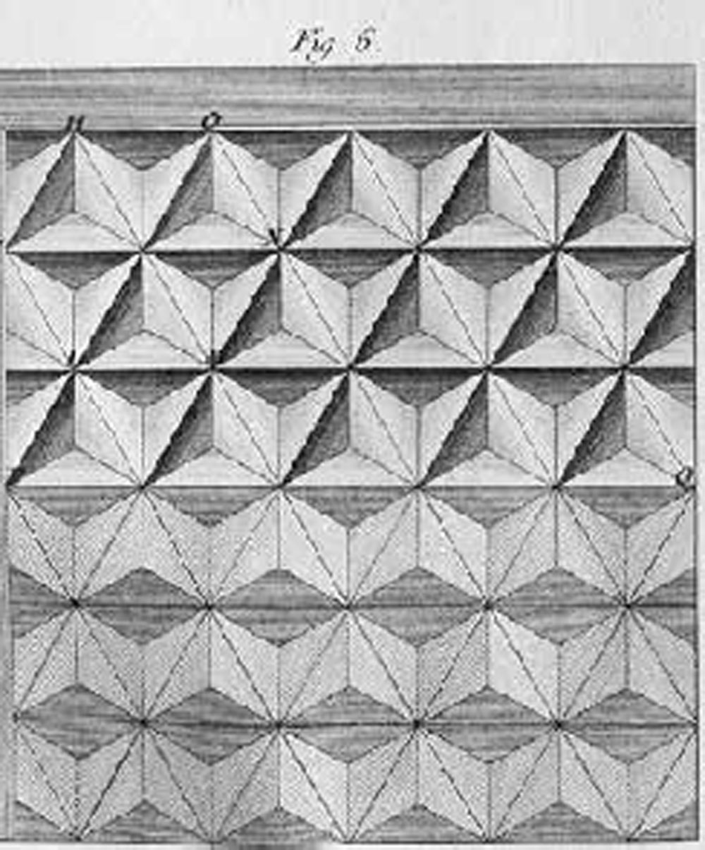
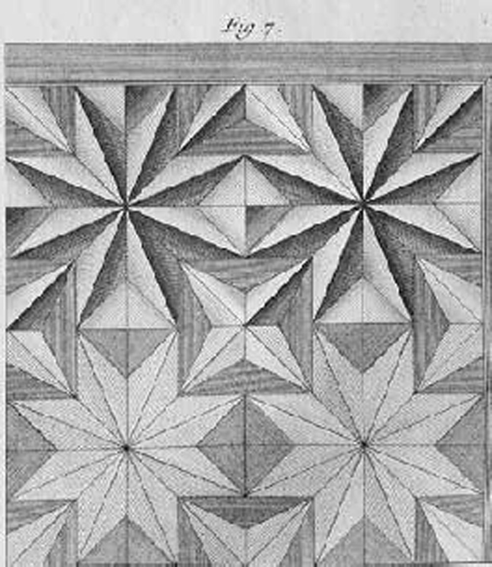 Figure 7 represents another section, composed of octagons or figures with eight sides, placed in stars with eight sides, which all come to a point in the center. The stars that compose these sections touch each other on their perpendicular and horizontal faces at two points, which produces between them a squared space. This space is filled with the point of a diamond, as in the height of this figure, made from the background veneer. The other squared voids, which produce the return of the points of these same stars, being larger than those of which I just spoke above, are filled in by other stars with four points or some other element placed on the base, which distinguishes them from the rest of the work, as I have shown in the upper part of this figure, of which the stars as much as the points of the diamonds have an obvious [apparent] relief.