While I mostly use the sector for doing design and layout work in my shop, I realized recently that it’s also a great tool for showing someone (especially your kids) an intuitive approach to understanding fractions. Here’s how I’d describe what’s going on in the drawing above:
Because I want to find out where a point four-sevenths of the width of a board would come to, I set the legs of the sector to touch each edge of the board to denominate (i.e. to name) the kind of divisions I’m looking for. Here, that would be seven – the denominator. Now I want to enumerate (i.e. give a number) to how many of those sevens I’m looking for – in this case the numerator is four. The job of the dividers is to grab this numerator above the denominator value on the legs of the sector in order to transfer the setting to the face of the board. For me (and my kid), this drawing offers a decent visualization of why the numerator goes over the denominator. You can learn more about the sector in excruciating detail in “By Hand and Eye;” and in a somewhat less excruciating matter in “By Hound and Eye.”
Palladio suggested a rule of thumb for establishing the casing around a window opening. Divide the space into five or six equal parts, and use one-fifth or one-sixth as the casing.
This is an excerpt from “By Hand and Eye” by Geo R. Walker and Jim Tolpin.
Punctuation to Establish a Border Punctuation acts like a visual warning track in a baseball outfield. As the outfielder races to catch a fly ball, the warning track signals that the field is about to end and the home-run fence is fast approaching. Punctuation tells the eye that one part is ending and another is beginning. Our eye doesn’t like to suddenly hit a wall or slip over a cliff. That’s why printers format a text with margins to make words easier to read. Borders help us locate transitions and play an important role. A door frame is a good example. It plays no functional role yet plays a vital visual role of highlighting the opening. Note that on a tall vertical space such as a window or door frame, we don’t use the height to establish our punctuation. That could result in a heavy band if wrapped all the way around. Tall vertical shapes (doors) are punctuated across the width (east and west), while long horizontal shapes (drawer fronts) are punctuated along the height (north and south).
We selected the border for one of the smaller drawers to punctuate all. That border ties all the others together in a unity.
This brings up another practical issue. A series of drawers, doors or spaces in the same composition with multiple sizes would call for different-sized banding or border elements for each space. Yet that’s seldom the case in built work. Select one door or drawer front from the mid-range and use it for all. It’s more important for all the composition to display a unity through similar borders. Graduated drawers that get larger toward the bottom of a case are a good example. If you choose to incorporate a punctuation with banding or inlay, work up a border for several of the smaller drawers and trust your eye to select which border will complement all.
Adding 1/6 to the height or width of a door opening is a way to tweak it to your eye. This double square was tweaked taller by adding 1/6 the width to the height. Period guide books described this as “two squares and a sixth.”
Tweaking a Design Using Punctuating Ratios It used to frustrate me to hear someone with a creative bent opine about making the smallest tweak to hit some mythical sweet spot. Somehow they seemed to magically know that adding 1⁄4″ to the width of a door frame would spell Nirvana. I might agree that the door frame did seem to look better, but it all seemed like magical guesswork or voodoo. Part of clearing through the fog is to gain some understanding of how elements harmonize or punctuate. Using these principles, we can unpack examples to help develop that inner sense. Secondly, we need a practical approach to make small adjustments to an element or shape. We already established that a small series of simple ratios (1:2, 3:5, etc.) can cover a range of simple shapes to define a form. Classical designers often used punctuating ratios to make a small tweak. These are large enough to make a visual difference without looking forced. The top diameter of a column shaft is one-sixth smaller than the shaft diameter at the base. If we want to bump a square just a bit wider without making too dramatic a shift, we bump it just a little wider by one-sixth. A long 2:1 rectangle can be tweaked just a bit longer using a sixth of the width.
This principle applies to tweaking border elements. If 1:5 seems too bold, try 1:6, 1:7 or 1:8. We are always concerned that the border element has a relationship with element it’s linked with.
Here’s a page from a forthcoming pamphlet I’m working on about the geometric truths that underlie – and led to the development of – all our layout tools, including (and ending up at) the sector. If you have kids around the house, you might find it interesting (maybe even enlightening) to put the sector into their hands to show them how they can physically (by hand and eye) manipulate a tool to illustrate the basic intuitive concept of the fraction.
As you’ll see when I get the pamphlet done, you can use every one of your layout tools to illustrate – that is, to perform – the reality behind the geometric math they are being injected with at school.
If you don’t have a sector, you can download (for free) a template to make one from the “shop” page at By Hand & Eye. Click here to visit that page. There you’ll find a manual for using a three-scale sector on the page as well…for a small fee to help George and I keep the lights on and the electrons flowing.
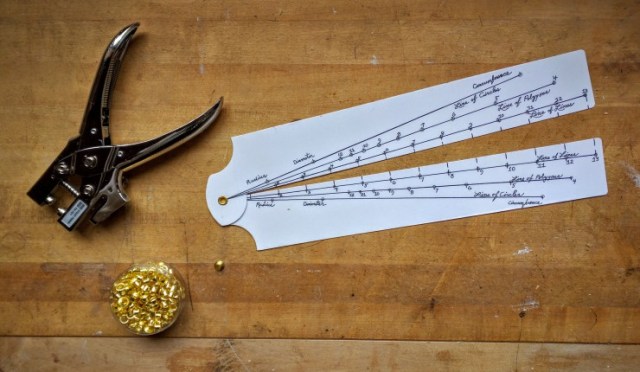
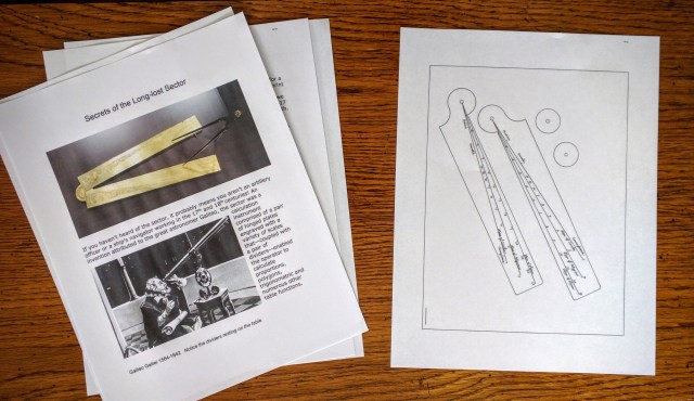
If you haven’t heard of the sector, it probably means you aren’t an artillery officer or a ship’s navigator working in the 17th century. An invention attributed to the great astronomer Galileo, the sector was a calculation instrument comprised of a pair of hinged plates engraved with a variety of scales that – coupled with a pair of dividers – enabled the operator to calculate proportions, polygons, trigonometric and numerous other table functions.
By the late 1700s, documents show that the sector was also taken up by architects and artisans to lay out designs based on the once ubiquitous whole-number segmentation and ratio-proportioning system of their trade. However, as 19th century machine-based manufacturing eclipsed the traditional practices of the artisans, their design and layout tools – dividers, sectors and applied Euclidian geometry in general – faded almost entirely from use.
I have discovered, however, that a simple version of the sector can be an incredibly useful and efficient tool for creating scaled drawings (or even doing direct layouts on the stock) when working within traditional design and layout systems. As you may know, George Walker and I describe this system in excruciating detail in our hard-bound book “By Hand and Eye,” and somewhat less-so excruciating in “By Hound and Eye” – the workbook.
With this three-scale sector in one hand and a pair of dividers in the other you’ll find that you can, literally in seconds, create equal segments between two points; derive harmonic proportional relationships along a line or between dimensions; generate angled lines to certain rise-to-run pitches; set out the facets of polygons (up to 12 sides); find the radius to draw arcs of these polygons between any two points; determine the circumference of a circle knowing its radius; and find out what your brother-in-law really does for a living.
Once you start working with our variant of this ancient calculator, you’ll wonder how you ever made do without it.
If you go to the “Shop” page of our By Hand & Eye website you’ll have access to a free-to-download template to make your own sector to play with. Here you’ll also discover a downloadable 40-page pamphlet on using the sector (offered for a small fee to defray expenses and keep George and me off the streets). For those who don’t want to cut out and assemble (i.e. hinge) the template, we also offer an assembled sector (with the “bonus” of being hand signed by George and myself).
The ancient “geometers” believed that geometry was the key to comprehending the incomprehensible; that an understanding of its inherent truths was the key to unlocking the mystery of how the “Gods” created order from chaos. The development of geometric constructions (the truths rather than proofs) became the foundational tool of the artisans to create a built world of inherently sound, durable and pleasing forms.
And it all started from nothing:
Across the Ionian Sea, a gentle wind blows from the West with the fading of winter–the breath of the God Zephyr, a harbinger of spring and the bringer of light. A God whose name would, as we will see, appropriately evolve to produce the word “zero.” The geometers did not use or represent zero as a number, but rather as a notation to show the location of the focus of a circle. Like the true center of a wheel, it is the only place that does not rotate, for it is a place of no dimension. There is nothing to rise, nothing to fall. All revolves around it. And like Zephyr, the renewer of life, the zero of the ancient artisans served as the seed of all shape and form. website
— Jim Tolpin, reprinted from the byhandandeye.com website, which explores artisan geometry
 While I mostly use the sector for doing design and layout work in my shop, I realized recently that it’s also a great tool for showing someone (especially your kids) an intuitive approach to understanding fractions. Here’s how I’d describe what’s going on in the drawing above:


 By the late 1700s, documents show that the sector was also taken up by architects and artisans to lay out designs based on the once ubiquitous whole-number segmentation and ratio-proportioning system of their trade. However, as 19th century machine-based manufacturing eclipsed the traditional practices of the artisans, their design and layout tools – dividers, sectors and applied Euclidian geometry in general – faded almost entirely from use.