“The Anarchist’s Workbench” is covered under a Creative Commons license that allows you to use the information any way you wish for non-commercial purposes.
I am thrilled to see people take advantage of this license. Here are two (no, three) good examples that also help the woodworking community at large.
‘The Anarchist’s Workbench’ Audiobook
Ray Deftereos of the Hand Tool Book Review podcast did a remarkable thing. He recorded an audiobook of the entire work. Every chapter. You can download and listen to them for free here at SoundCloud.
I am most appreciative of Ray’s work because this helps reach people who don’t learn as well via the written word, or those who have imparied eyesight, or parents are so busy with their families that reading a book takes a back seat to diapers and homework.
Ray does a great job in general in reviewing books on handwork. And he’s not all afraid to cut a book to ribbons when it deserves it. Check out his podcast and subscribe here.
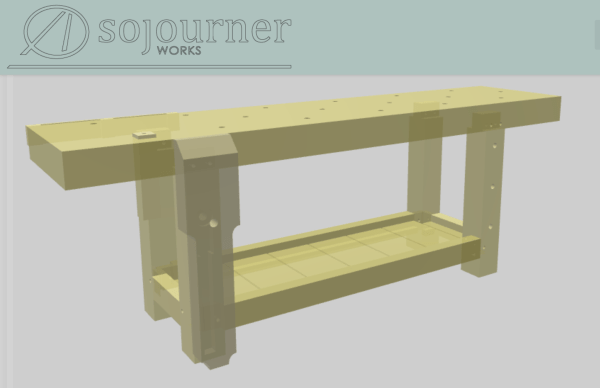
3D Model of the Workbench
Jeremiah Dillashaw of Sojourner Works has made a great 3D model of the bench you can download. It’s a .3dm file he made in Rhino, which will open in Fusion and other programs. You can read more about the file here and download it (for free, of course).
If you know of other resources that use the book and might help others, please let us know. Oh, I almost forgot. The most Banjo-tastic Mattias Hallin is documenting the bench’s construction process on his blog here. He’s doing it all by hand, so it should be fun.
— Christopher Schwarz


