In “Saws, Planes, and Scorps,” David Heim celebrates contemporary makers of quality woodworking hand tools and workbenches, from one-person shops that specialize in one or a few tools, to four larger toolworks that offer a wide range of tools.
It’s a who’s who in the hand tool world, with interesting vignettes of the makers and pictures of their tools, arranged by tool type (and some makers appear in more than one section), and an introduction by Joshua Klein.
I could have simply included a picture of the table of contents…but it was more fun to test my memory of “toolworks vs. tool work vs. tool works” for various companies. (If I got one wrong, apologies.) The chapters are as follows:
“Prominent Toolworks:” Lie-Nielsen Toolworks, Lee Valley Tools/Veritas, Bridge City Tool Works and Woodpeckers.
“Workbenches:” Benchcrafted, Plate 11 Woodworking, Frank Strazza, RE-CO BKLYN, Lake Erie Toolworks, Acer-Ferrous Toolworks, Texas Heritage Woodworks, Blum Tool Co. (includes sidebars/profiles on Christopher Schwarz, the French Oak Roubo Project and the Japanese approach).
“Squares, Gauges, Marking Knives, and Awls:” Colen Clenton, Vesper Tools, Blue Spruce Toolworks, Bridge City Tool Works, Sterling Tool Works, Shenandoah Tool Works, Blackburn Tools, Glen-Drake Toolworks, Florip Toolworks, Hamilton Toolworks, DMF Tool Works, Seth Gould and Czeck Edge Hand Tool (includes a sidebar on the sector).
“Hand Saws:” Skelton Saws, Bad Axe Tool Works, Florip Toolworks, Tools for Working Wood, with sidebars/profiles on Marco Terenzi and Blackburn Saws saw kits.
“Hand Planes:” Holtey Classic Hand Planes, Sauer & Steiner Toolworks, The Lazarus Handplane Co., Daed Toolworks, Brese Plane, Bill Carter, BJS Planes and Woodworking, Old Street Tool, M.S. Bickford, Philly Planes, J. Wilding, Voigt Planes, Red Rose Reproductions, Blum Tool Co., Bridge City Tool Works, HNT Gordon & Co., Scott Meek Woodworks, Benedetto, and Walke Moore Tools (includes sidebars/profiles on St. James Bay Tool Co., Ron Hock and James Krenov).
“Hammers, Mallets, and Chisels:” Old Soldier Toolworks, Blue Spruce Toolworks, Crucible Tool, Shenandoah Tool Works, Sterling Tool Works, HNT Gordon & Co., Blum Tool Co., Brent Bailey Forge, Barr Specialty Tools and Brese Plane (includes sidebars/profiles on GreenWood, Seth Gould’s embellished hammers and Elkhead Tools screwdrivers).
“Spokeshaves, Drawknives, Scorps, and Travishers:” Caleb James Maker, Dave’s Shaves, Moberg Tools, HNT Gordon & Co., Cariboo Blades, Barr Specialty Tools, Old Soldier Toolworks, Claire Minihan Woodworks, Elia Bizzarri Hand Tool Woodworking, Crown Plane and The Windsor Workshop (includes profiles on Peter Galbert and Russ Filbeck).
“Adzes, Hatches, and Knives:” Jason A. Lonon Toolmaker, Start Raven Studios, Cariboo Blades, Brent Baily Forge, North Bay Forge, Drake Knives, Craft Lab, Pinewood Forge, Preferred Edge Carving Knives & Supplies and Deepwoods Ventures.
Heim’s selection of “exceptional woodworking tools and their makers” is informed by his experience as a woodworker and former associate editor for Fine Woodworking magazine, and for the most part, I agree with his choices, but in a book that features mostly what are arguably “boutique” hand tools, the inclusion of Woodpeckers is curious. I’m not dissing their tools, but when I think of that company, I think red, anodized table saw fences and drill press tables (and a few marking and measuring tools). And I was kind of surprised that Tools for Working Wood didn’t show up under “Prominent Toolworks” given the company’s range – or at least appear in multiple categories. Also, why include Bridge City in both prominent tool works and hand planes, but not Lie-Nielsen or Veritas in any of the categories? Still, I’d be hard pressed to choose and sort all the makers I know into categories, either – and no doubt someone (many someones) would take issue with my choices.
I do think this book belongs on the shelves of woodworkers. It’s fun to learn a bit about who makes the tools you use, and it’s not a bad shopping list, either!
“Saws, Planes, and Scorps” (Princeton Architectural Press) has a cover price of $27.50, and is available now from bookstores.
A family case. In the kitchen of Fritz Lieber and Donald Maxwell we used architectural butt hinges salvaged from Fritz’s grandparents’ house. In partnership with architectural knobs, which we used for doors and drawers, the over-sized hardware gives the design a vaguely Alice-in-Wonderland look. Spectrum Creative Group
If you had told me in 2007 that Lost Art Press was going to publish a book on kitchens, my 2007 self would have been skeptical. Kitchen books are usually put out by imprints that specialize in home and interior design. They require both a deep knowledge of the topic, plus a deep photographic well of example kitchens.
Plus these books encourage readers to be shamefully wasteful: Let’s rip out your five-year-old kitchen and put in a spectacular new one.
After talking to Nancy Hiller for a few minutes about her thoughts on a kitchen book, however, I was immediately sold. Nancy laid out a book that was in opposition to most kitchen design books on the market.
• She encourages you to explore clues in your house to create a kitchen that looks correct in your home’s historical context.
• She shows how you can work with existing floorplans, cabinets and materials to make your kitchen beautiful without sending hundreds of yards of waste to the landfill.
• And she provides professional and practical information on how you can do this work yourself.
“Kitchen Think” is the culmination of Hiller’s life as a professional furniture maker, cabinet maker and kitchen designer. It’s a sprawling, 369-page look at an important (and expensive) room in your house from a perspective that is rarely heard.
And readers have responded to Nancy’s voice. Though the book has been out since only June 2020, it has become one of our bestselling books of all time (see the list here).If you have been thinking about ripping out your entire kitchen, you might want to think again.
— Christopher Schwarz
The following is excerpted from “Kitchen Think,” by Nancy R. Hiller.
Hinges are more than a means of hanging doors. They contribute significantly to a kitchen’s look. In principle you can use any type of hinge for kitchen cabinet doors, but this section will focus on those that are most common.
Butt Hinges Doors on traditional kitchen cabinets were inset and typically hung on butt or butterfly hinges. Let’s start with the former. Butt hinges come in several varieties. There are extruded brass butts (known in Britain as solid drawn brass butts) with fixed pins and loose-pin butts that allow you to separate a door from its cabinet by simply removing the pin, leaving the hinge leaves in place. All traditional butt hinges are made to be mortised into the edge of the face frame (if there is one) and door, though in British cabinetry it is not uncommon to find them let only into the door; in these cases the cabinet leaf is simply screwed to the face frame stile.
Two kinds of butt hinge. An extruded butt with a fixed pin, right, and a butt hinge with loose pin, left.
Alternatively, you can use salvaged architectural hinges that were originally made for use with full-size house doors. Yes, they’re over-sized for most kitchen cabinets, but there are times when this kind of exaggerated scale packs a stylistic punch that no conventionally sized hardware can.
Easier going. Loose-pin butt hinges are easier to use, in many circumstances, because they allow you to remove a door without removing the entire hinge. One leaf stays on the door, the other on the cabinet, while you take the door to your bench (or outside, if you’re working on a jobsite) to plane off an extra 1/32″.
Another kind of butt is the adjustable, no-mortise hinge. This hinge is designed to resemble a traditional butt, with or without decorative finials, but is screwed to the surface of the door and face frame, the idea being that it is far quicker to install and requires fewer tools and lesser skill. The drawback, at least in my opinion, is that these hinges are a poor imitation of real butts; they look under-scaled. And to any craftsperson, they suggest an easy way out. That said, they do offer a relatively decent traditional butt hinge look and can make a set of cabinets significantly more affordable when the client or homeowner is on a tight budget.
Easy way out. Many cabinetmakers use adjustable surface-mounted butt hinges to save on labor.
Butterfly Hinges In the early 20th century, as companies turned out large numbers of cabinets, it became clear that inset doors came with their own built-in problems, the greatest being that they require a bit of skill to install well. On any cabinetry supplied with doors already hung – Hoosier cabinets are an ideal example – the tendency of doors to bind when cabinets were delivered to real-world locations became an even more pressing issue; the cabinets were sold with the claim that they were readily affordable and ready to use. So it was not surprising to me, as a cabinetmaker, to find in the course of my research on Hoosier cabinets that the largest manufacturer of these kitchen furnishings pretty quickly switched to half-inset (also known as half-overlay) doors. They marketed this as an improvement on the grounds that the resulting lip would keep dust from getting into the cabinet through the gaps in traditional inset doors.
Fill the gap. half-inset doors on a reproduction Hoosier cabinet.
Butterfly hinges have been used since the 19th century, if not before, and were widely used into the 1930s. Their popularity comes and goes with changes in decorating fashions. For a decade or so in the early 2000s there was a wide range of designs and finishes available, but ever since mid-century modern became the new “it girl” and gave “old-house” styles the boot, those of us who appreciate early 20th-century architecture have been reduced to choosing from a few reproduction designs offered by reputable manufacturers. One solution to this diminished variety is to look for antique hinges at salvage yards, antique shops and online.
Surface treatment. A fold-back hinge on a cabinet I made for our former kitchen, based loosely on details from Hoosier cabinets. The hinges came from Kennedy Hardware (kennedyhardware.com). Spectrum Creative Group
A variant on the older-pattern butterfly hinge is the offset butterfly hinge, designed for use with half-inset doors. And there are other variants on this one, some Art Deco-inspired, others the fold-back hinges used on certain Hoosier-type cabinets.
Deco detail. These streamline-style hinges are a Deco-era classic, though historically they were most often plated with chrome. Photo courtesy of House of Antique Hardware
3/8″ Inset Hinges From the mid- through late-20th century another type of hinge was widely used for kitchen doors. The “3/8″ inset” hinge came (and is still available) in a few patterns, the most distinctive being a sort-of bullet/streamline design. This type of hinge is available in free- or self-closing forms. It is extremely simple to install, with one caveat: You must allow enough space in the rabbet around the door’s perimeter to account for the distance by which the hinge will push the hinge stile away from the face frame. The only circumstances in which I would recommend using these hinges today are when replacing a broken hinge or adding new doors to an existing kitchen full of cabinets hung on them or, of course, if you are recreating a period-authentic kitchen in movie set or a house that originally had them.
Cabinets for everyman. Many mass-produced kitchen cabinets in the 1940s and ’50s had doors on half-inset hinges such as this one, still produced today.
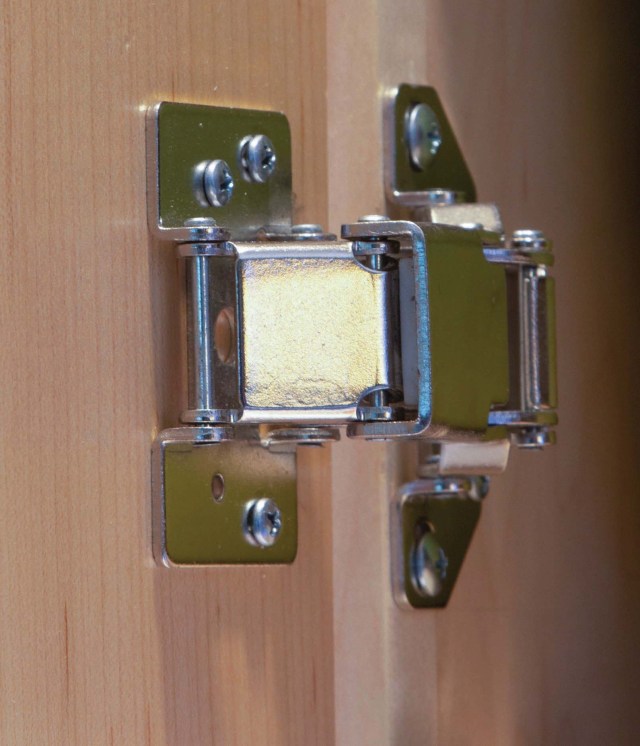
European Hinges European hinges were designed for use with European-style cabinets, also known as frameless cabinets. Underlying this system of cabinet building and installation is a desire to maximize efficiency by standardizing components based on 32mm (approximately 1-3/8″) increments.
European hinges come in a vast variety, each designed to work in a different application. Even so, most consist of just two basic parts – a hinge and a mounting plate.
A no-show hinge. To keep his cabinets as clean-lined as possible, Bruce Chaffin used hidden European hinges. The doors open and close by means of touch latches.
To make a simple matter slightly less so, European hinges also come in a variety specifically designed for use on cabinets with face frames; these have an integral mounting plate. But you don’t have to use this “face frame” hinge to use European hinges on cabinets with face frames; you can just as well use the two-part variety, provided that you choose the correct combination of hinge and mounting plate for your application.
Depending on which combination of hinge and mounting plate you use, these hinges can work with doors that are inset, half-inset or full overlay. And there are even more variations! A full-overlay door may overlay the cabinet face by 1/4″ or 1-1/4″, depending on the mounting plate you use. Doors can open 95° or as much as 165°. They can be free closing (these do not hold themselves closed but require a catch) or self-closing. Some are even available with a soft-close feature that shuts the door for you once you give it a gentle push. (Aside from their undeniable coolness, these are useful for keeping children from slamming their fingers in cabinets.)
Just the ticket. Lynette Breton found the best solution for her full-overlay doors is the XXI surface mount concealed hinge .
Despite the huge variety, all of these hinges have the same pattern for drilling the hinge cup mortise in the door: a hole drilled to the depth of the cup (about 1/2″) with a 35mm Forstner bit. There are two good reasons to choose European hinges in select applications. First, being invisible when a door is closed, they offer a clean look. If not seeing the hinges is important to your design, these may be your guys. Second, they offer adjustability in three planes, which makes fitting any kind of door – inset, half-inset or full overlay – ridiculously simple compared to using traditional butt hinges.
Specialty Hinges If knife hinges are your thing, there’s no reason why you can’t use those or any other type of hinge less commonly used for kitchen cabinets. In some applications where none of the conventional options will work, you just have to go looking for a special hinge.
I am a biased reviewer. I’ve read and loved all of Nick Offerman’s previous books, and have laughed uproariously at his comedy shows. I’ve watched “Parks & Rec” all the way through several times, and think “Devs” is brilliant. I greatly admire the work Offerman and the rest of the crew do at the Offerman Woodshop. He is an altogether nice fellow. So, I was wholly prepared to enjoy his new book, “Where the Deer and the Antelope Play: The Pastoral Observations of One Ignorant American Who Loves to Walk Outside.”
The book – a response to a challenge from one of Offerman’s heroes, writer Wendell Berry – is in three parts, each exploring a different type of relationship to the land, and our relationships to one another. Throughout, Offerman asks us to confront uncomfortable truths that have helped shape much of the land as we know it today – and he’s not shy with his opinions on racism, strident Christianity, agribusiness, Fox News and more. I sing in the same liberal choir, so I found myself nodding in agreement, but I expect some who are (still!) expecting Ron Swanson will be disgruntled. But perhaps Offerman’s sardonic and self-deprecating humor, and the genuine delight with the natural world that pervades every page, will be enough to keep them reading.
The first part shares a tourist’s relationship with nature – getting out in it through a “bromance brothers” trip to Glacier National Park with Offerman, singer Jeff Tweedy and writer George Saunders. While hiking, rafting, and navigating a couple of scary incidents that could have ended Wilco, the friends had serious and enlightening conversations ranging from food production to Aldo Leopold, and from race relations to how not to be an asswipe. By the end of the trip, writes Offerman, “We three middle- aged white guys, ever aware of our privilege, had taken pretty full advantage of the recreation available in the glorious acreage that some other white guys had set aside for just that purpose.”
In the second part, Offerman helps to shape nature in a small way as he works alongside Cumbrian sheep farmer and writer James Rebanks in a number of flying visits. In this section, Offerman focuses on labor, how agriculture has shaped the land, the ethics of farming and the necessity of ecological stewardship. “We must understand that we are not passive passengers on this mothership Earth, but instead we must participate in the journey, whether that means grabbing an oar and helping to row, or feeding the crew, or holystoning the decks. Only then will we be able to help steer this venerable vessel away from the shopping mall/ Amazon.com and toward the woods and the meadow and the beck.”
The first two sections took part prior to the pandemic, and while Offerman ambles metaphorically through many topics therein, both are (mostly) located in one physical place. Part three is more of a ramble of both place and political topic. With time on their hands due to Covid-19, Offerman and his wife, Megan Mullally (and their dog, Clover), spent the fall of 2020 traveling with an Airstream trailer through West, Midwest and Southwest, safely visiting friends and family, and hiking the trails in some gorgeous locations. (He would like you to know, however, that “Sedona blows” and you shouldn’t bother.) I couldn’t find one quotation I felt summed up the section, but the following is a decent distillation of the book as a whole: “Mother Nature is not an American, and she is not proud. She is all creation, so her vibe encompasses all experience, in every size, shape, and color, from the high to the low. Her economy and its successful evolution thrive on diversity, and her children never rest in their glorious participation, reproducing and adapting, so as to grow ever stronger.”
The above makes the “Where the Deer and the Antelope Play” sound altogether serious – and there is no doubt that Offerman cares passionately about nature and our role in it – but it’s also a funny and entertaining travelogue. And in case I haven’t made it clear: highly recommended.
Katherine heads back to college on Monday, and could use a little pocket money – so she made another big batch of Soft Wax 2.0. It is now up for sale in her etsy.com store. Today’s jars are brought to you by Wally – the second-most friendly of the cats. Bean is downstairs to greet me almost every morning; Wally pops down most days for his elevenses – he knows I keep treats in my top chest till.
I use Katherine’s soft wax on many of my projects, including the tills in the chest on which I’m currently working. Katherine cooks it up here in the machine room using a waterless process. She then packages it in a tough glass jar with a metal screw-top lid. She applies her hand-designed label to each lid, boxes up the jars and ships them in a durable cardboard mailer.
Instructions for Soft Wax 2.0
Soft Wax 2.0 is a safe finish for bare wood that is incredibly easy to apply and imparts a beautiful low luster to the wood.
The finish is made by cooking raw, organic linseed oil (from the flax plant) and combining it with cosmetics-grade beeswax and a small amount of a citrus-based solvent. The result is that this finish can be applied without special safety equipment, such as a respirator. The only safety caution is to dry the rags out flat you used to apply before throwing them away. (All linseed oil generates heat as it cures, and there is a small but real chance of the rags catching fire if they are bunched up while wet.)
Soft Wax 2.0 is an ideal finish for pieces that will be touched a lot, such as chairs, turned objects and spoons. The finish does not build a film, so the wood feels like wood – not plastic. Because of this, the wax does not provide a strong barrier against water or alcohol. If you use it on countertops or a kitchen table, you will need to touch it up every once in a while. Simply add a little more Soft Wax to a deteriorated finish and the repair is done – no stripping or additional chemicals needed.
Soft Wax 2.0 is not intended to be used over a film finish (such as lacquer, shellac or varnish). It is best used on bare wood. However, you can apply it over a porous finish, such as milk paint.
APPLICATION INSTRUCTIONS (VERY IMPORTANT): Applying Soft Wax 2.0 is so easy if you follow the simple instructions. On bare wood, apply a thin coat of soft wax using a rag, applicator pad, 3M gray pad or steel wool. Allow the finish to soak in about 15 minutes. Then, with a clean rag or towel, wipe the entire surface until it feels dry. Do not leave any excess finish on the surface. If you do leave some behind, the wood will get gummy and sticky.
The finish will be dry enough to use in a couple hours. After a couple weeks, the oil will be fully cured. After that, you can add a second coat (or not). A second coat will add more sheen and a little more protection to the wood.
Soft Wax 2.0 is made in small batches in Kentucky using a waterless process. Each glass jar contains 8 oz. of soft wax, enough for at least two chairs (or 30+ ATC tills).
This week I am building a Hobbit-y chair for a customer in black cherry instead of white oak. Is cherry strong enough for a stick chair such as this? Of course. How do I know? I added 1/8” in diameter and thickness to some key components. So now I can sleep without worry.
If the above paragraph makes little sense, then you haven’t read my chapter on wood in “The Stick Chair Book.” No, this isn’t an advertisement to twist your arm into buying the book. Instead, I hope to help you think about the strength of wood in a different way.
First, I think we can agree that when we increase the thickness of a tenon, that it will be stronger. Right? So let’s say we have a 1/2”-thick tenon and we decide to double its thickness to 1”. Because we have doubled the thickness, that should double its strength. Right?
Wrong.
When we double the thickness of that 1/2” tenon, it can increase the strength of the component by four-fold or eight-fold. How much additional strength you get depends on the component – whether you are testing its “modulus of rupture” or its “shear strength” (this is covered in detail in the book – this is still not a commercial, I promise!).
The bottom line is this: small increases in the size of components can increase their strength dramatically. This is hugely important when building chairs, stools, benches, workbenches or any object that will see abuse.
Let’s get back to this Hobbit-y chair for a moment. Cherry is weaker than oak. But if I increase the diameter of the leg tenons or the thickness of the seat by a mere 1/8”, I will more than make up for the difference between the two species. And the 1/8” added thickness isn’t really noticeable to the naked eye.
Take a look at these charts for some details.
These formulas are not my doing. They are created using the formulas from the “Wood Handbook” from the U.S. Department of Agriculture (a free download). For me, they help me design furniture that is strong without being bulky. I know that I can increase the thickness of a tenon by 1/8” and get a disproportionate increase in strength. I can do the math to prove it to myself.
Or, as I discussed before, I can prove it with a sledgehammer.