If you’re traveling through Covington for the holiday weekend and planning to stop in at the Lost Art Press storefront, please do – on Friday between 10 a.m.-2 p.m. We’ll be closed on Monday, Sept. 1, for Labor Day.
Regular hours resume on Wednesday, Sept. 3 (M-W-F 10 a.m.-2 p.m.). The storefront is located at 407 Madison Ave., Covington, Kentucky.
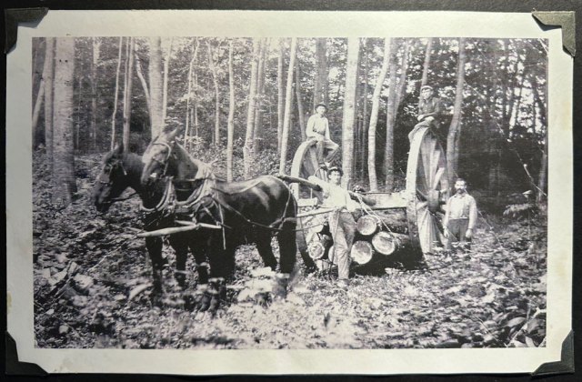
A great exhibit on early Michigan logging I found recently during a trip.
Almost every week – especially during the summer – we get messages from readers who want help with an upcoming trip. They are headed to Kalamazoo, Michigan, and would like a list of woodworking stuff in the area that they can visit.
For me, answering these questions is time-consuming. I have to go back and consult my notes, my blog and my photo library. Then I have to find the websites for these places and write a sentence or two about why this place is important.
Well, I’m not going to answer these questions anymore. Instead, I’m going to send readers to the blog entry you are reading that explains how I research an area for woodworking sites before I visit it.
And we’re also not going to publish a woodworking travel guide. Most published travel guides are for people who are too lazy/clueless/disconnected to do a little research themselves. And we don’t have the resources (or desire) to publish such a guide.
(Apologies if I sound salty. I’m not.)
Note that my woodworking interests are different than yours. I don’t get goo-goo eyes for veneer mills, ornate palace furniture or places that sell only exotic hardwoods. I like to look at furniture made for normal people, old workshops, factories and museums that specialize in vernacular furniture and architecture.
Anyway, here’s what I do before I travel.
Many open-air museums have relaxed rules about examining the furniture.
House Museums, History Museums & Open-air Museums
This should be obvious. Seach for the name of the place you are going, <place name>, plus the word “museum.” Remember that Americans tend to think of cities as places. Other cultures might think in terms of provinces or regions. Usually this sort of search will call up a lot of the high-class places that feature oil paintings and sculpture. If they have any furniture, it’s likely to be fancy.
And that’s why my next search is <place name> plus “history museum.” Every little town with more than 100 people is bound to have a local history museum. And these hidden gems almost always have furniture pieces that were owned by the founders or made in the area. Plus, the volunteers who work there are almost always a fire hose of information about the area. Searches on the internet don’t always turn up every museum or installation because some of them are too obscure.
Next search: <place name> plus “open-air museum.” Or start here. This list is huge, but most of the open-air museums I have visited are not on it. What’s an “open-air museum?” Typically it’s a place where a bunch of buildings from different eras have been gathered. (Usually the buildings were going to be torn down.) Most times, these building are filled with furniture and wooden decorative objects – spoons, plates, goblets, racks, buckets and on and on.
You get to see pieces in context. A visit to one of these museums can fuel a lifetime of research.
If I’m headed to a big city, I’ll try <place name> plus “decorative arts.” Some museums lower themselves to have a decorative arts wing. And one of the decorative arts is furniture.
Or I’ll look for museums of “farm life” or agriculture.” You might have no interest in farming, but the exhibits will be filled with handmade woodwork. I think you need to see handmade hayrakes and pig benches and dough bowls.
Finally, I’ll look for “house museums.” Sometimes the words “house museums” don’t call up what you want. These places might be called the “Aiken-Rhett House” or the “Nathanial Russell House” (two of my favorites in Charleston, S.C.). Sometimes these house museums are masquerading as a history museum or a museum about a person, such as the Harriet Beecher Stowe House in Cincinnati, Ohio. So when you look for <place name> plus “museum,” scan the list for museums that are the “Fancy Lord & Lass House.” They’ll have furniture. It might be fancy. But they probably also had servants. And their furniture can be quite compelling.
Craft Fairs & Craft Galleries
Most towns and cities have craft fairs and farmer’s markets on the weekends. There you will find woodworkers: carvers, turners and furniture makers. You might also find a blacksmith or two (for hinges, hooks and nails). Go to Germany during November and December, and you’ll find endless amounts of woodworking at each town’s Christmas market. And you’ll find woodworkers to talk to as well.
Antique Malls & Galleries
I love antique malls when I’m looking for tools and oddball furniture ideas. And I love antique galleries when I want to see expensive stuff (even if it is expensive vernacular stuff, like at Robert Young Antiques). Also, if you are going to Europe, look for “folk art” galleries or “art brut” galleries. Over there, “folk art” is not just “art,” it also encompasses furniture and decorative objects. And Europe has a ton of it.
Factories Old & New
I love visiting factories that make furniture, tools and almost anything else (paper, paint etc.). While visiting Holland, Michigan, a few years ago Lucy and I found a lot of old Arts & Crafts factories in the area. Plus the corporate headquarters for Herman Miller. What, they don’t offer tours on the website? Don’t be shy. It doesn’t hurt to walk in, be nice and ask if someone could give you a quick tour. (I’m always happy to give a warehouse tour to visitors who ask.)
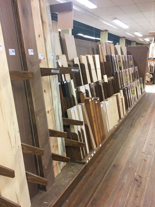
A crazy selection at Keim.
Lumberyards & Mills
Another obvious one. If there are interesting lumberyards or mills in the area, I’m going to pay them a visit. And if it’s a mill or a kiln, I’m going to ask nicely for a quick peek or tour. Plus, I just love looking at wood. While at Keim Lumber in Millersburg, Ohio (Amish country), I spent an hour looking at their wood selection. They specialize in domestic species that other mills won’t cut, dry or sell. Have you ever seen Tree of Heaven for sale? They have it.
Silviculture & Forestry
If <place name> has trees or public forests, those are a great way to connect with an area. What sort of trees live here? (I use my “Picture This” app on my phone to explore the different species if they aren’t labeled). Botanical gardens can be awesome, or they can be all about flowers.
If you don’t like walking amongst the trees, you probably haven’t tried it.
Curiosity on the Ground
Most of all, talk to people while you’re at <place name>. Tell them you make furniture. Most people will be fascinated and helpful in your search for things relating to furniture, tools and wood.
I think that the internet is incredibly lacking when it comes to exploring the real world. A smile and an honest question can go a long way.
Editor’s note: Our Mind Upon Mind series is a nod to a 1937 Chips from the Chisel column (also featured in “Honest Labour: The Charles H. Hayward Years”), in which Hayward wrote, “The influence of mind upon mind is extraordinary.” The idea being there’s often room for improvement.To that end, we’ve asked you what else you have thought of, tried out and improved upon after building projects from our books.
Send us your own ideas! Email kara@lostartpress.com. You can read more about the submission process here.
I used a wire brush all over the chair to wear down the softer earlywood, to give it some texture.
Then a lot of burnishing with a deer antler and a smooth rock, especially near the hands and at the back of the head rest.
Then, a mix of BLO (boiled linseed oil) with some earth pigments, more like a wash than a paint, just to get a consistent deep color underneath.
Then I made a thick mix of Old Fashioned Milk Paint in Lexington Green, and globbed it on and wiped it off, mostly around sticks. The oil was dry, but I didn’t want it to cure because I wanted to be able to wipe some of the paint off.
John Porritt uses a heat gun to get the paint to peel, but I didn’t want to light mine on fire yet (with the layer of BLO underneath), so I just tried to let it dry a bit before rubbing it off. That helped it come off in patches.
Then I did the same with Real Milk Paint Co. Arabian Night on the top. I had to use a 3M pad with a little water in places where the paint needed to be blended better.
Then, I mixed a little burnt sienna pigment with BLO again on the top (like a wash), rubbed that in, then some Liberon Black Bison wax in dark oak.
The following is excerpted from Matthew Bickford’s “Mouldings in Practice.” In this book, Bickford shows you how to turn a set of complicated mouldings into a series of predictable rabbets and chamfers that guide your hollow and round planes to make any moulding that has been made in the past or that you can envision for your future projects.
The first half of the book is focused on how to make the tools function, including the tools that help the hollow and round planes – such as the plow and the rabbet. Bickford also covers snipes bills and side rounds so you know their role in making mouldings. Once you understand how rabbets and chamfers guide the rounds and chamfers, he shows you how to execute the mouldings for eight very sweet Connecticut River Valley period projects using photos and step-by-step illustrations and instruction.
The term “moulding plane” is an inclusive one. Dedicated moulding planes (also called “complex moulders”) have soles that consist of multiple curves, flats, quirks, steeples and anything else centuries of art have imagined. Dedicated planes create one profile and do it well.
Fig. 2-1. Ovolo with two fillets. The profile this plane creates is similar to that of a window sash.Fig. 2-2. Cove with two fillets. Take note of the angle at which these planes are held relative to the wood. These planes are sprung; the angle at which they are held is the “spring angle.”Fig. 2-3. Ogee with fillet. Like the other planes, this ogee plane creates this single profile at a single location relative to the edges of the board, at a single angle.
These planes, when small, are easy to push and are often much quicker to produce a profile than any router bit, if only because the router surface needs to be sanded. A 1/8″ side-bead plane creates a bead along an edge that is ready for finish after 10 quick strokes. A thumbnail plane creates a convex ovular shape and adjoining vertical fillet, and can consistently and quickly cut profiles along 20 edges of five drawers in a dressing table. A 4″-wide crown moulder, with help from a few friends (and perhaps a horse), creates a complex cornice that is completely uniform from piece to piece across splices and from wall to wall and through mitered corners.
The profiles these planes create are precise, uniform and consistent. Therefore, any time a uniform profile is needed, but the mouldings cannot be cut from a single long piece, a dedicated plane is desirable. A drawer, after all, has four sides – and the lips of individual drawers may sit a mere 1/2″ apart – so efficient consistency is required.
There are dedicated planes that execute just about any moulding, including all those already mentioned. Many of these dedicated planes are also desirable for the craftsman who produces the same edge many times, such as a harpsichord maker who adds a small quirked ogee to the bridge of multiple harpsichords made months apart.
Fig. 2-4. Dedicated harpsichord bridge. This common profile in Italian and German harpsichord bridges will always be 5 minutes away from completion for the user – less if the tool remains set up.
These dedicated, single-profile planes, however, serve little purpose to the craftsman who produces numerous small lengths of moulding in an ever-changing portfolio. These single-profile planes are dedicated to one profile and, like most router bits, they do only one thing. Though the profile these create can often be manipulated to some degree (by removing a fillet, for example) specialty planes are without value if you need to control the details of a profile, or create something with major or even minor differences.
To fresh eyes, the complex profiles integrated into these planes’ soles are apparent; the integral fences and depth stops the planes often include, however, are not. The fences require the plane to contact the edge of a board as a reference, limiting the plane’s angle, spring and location. The depth stop ensures a consistent depth of profile, but often makes it impossible to use the plane to create part of a larger, more complex moulding.
Fig. 2-5. A complex moulder. The width of the iron is the same as the cutting edge illustrated above. No portion of the iron is present at the fence and depth stop. When the plane has progressed to the extent that the depth stop registers against the face of the stock, the iron will stop contacting the wood.
Most dedicated planes also demand proper setup steps to be performed prior to their use.
Without the minimal rabbeting setup in the example in Fig. 2-6, significant edge maintenance will be required because the edge closest to the fence takes dozens of passes more than the edge closest to the depth stop. When the edge nearest the fence deteriorates, the entire blade profile will need to be sharpened in order to keep the iron matching the sole.
Fig. 2-6. The rabbets required. The minimum number of rabbets desired for using a complex moulding plane is similar to those created when using hollows and rounds. You, the user, will need to determine how much stock removal is necessary for each profile. I imagine there are times when preempting a complex profile with a rabbet plane, plus hollows and rounds, is ideal. After all, these few planes with individual curves are easier to maintain than a highly complex profile.
Fig. 2-7. Many passes required. The portion of the iron that is closest to the fence may take 40 passes before the edge farthest away takes one. When it is time to sharpen, the entire edge must be addressed, despite only a small portion needing it.
The genius of dedicated moulding planes is in their absolute consistency, made possible largely by their integrated fences and depth stops. However, these same features also limit the versatility of the planes, and make them poorly suited to address many people’s primary motivation for investigating moulding planes: eliminating excess tooling.
The planes we will discuss in the pages to follow do not share these limitations. We are going to focus on rabbets, hollows, rounds, snipes bills and side rounds. Each of these planes serves a different function. All these planes, however, share a similar characteristic: They have neither integral fences nor depth stops. Without these two characteristics the planes are remarkably versatile. And by using simple stock preparation techniques, the user can impose steering and depth control on the planes to direct and focus their versatility to create all manner of profiles precisely and simply with just a handful of planes. These planes have no fences. We will make guides. These planes have no depth stops. We will make gauges.
But how do these tools work? These planes cut specific portions of an arc in a profile. Each size cuts a segment from a circle of a specific radius. While a plane’s cut matches the circumference of a specific circle, the percentage of the circumference is up to the user. There are no fences that need to be registered on the work, no spring lines to obey and no depth stop to adjust.
Fig. 2-8. The limits of side beads. A 1/8″ side bead can efficiently establish that profile on the edge of the board. It cannot make a bead set in from the edge or the convex portion of an ogee as the No. 2 hollow does above.
With hollows and rounds, the plane that cuts a side bead on the edge of a board is the same plane that cuts the convex portion of an ogee set 1″ from the edge of a complex waist mould. Unlike a dedicated moulding plane or even a Stanley No. 45 plane, these planes do not need to reference an edge while being held at a specific angle.
Whether the specific arc created by these planes falls along the narrowest edge of a board or onto the widest portion of a linenfold panel, the arc’s location is not predetermined. If the arc you need is a minimal 60° of a circle or more than 180°, that function is not determined by a depth stop. Whether the arc stands alone or in a sequence is a decision made by the user, not the planemaker.
These planes do not have predefined purposes other than cutting an ideal radius. Executing any moulding along a straight edge is achievable with these planes – whether you are making moulding on a board that will be applied beneath the top of a piece or even to the top itself.
Fig. 2-9. Geometry of the sole. The sole of this hollow and this round is one-sixth of a circle. The sole’s width is equal to the radius of the circumference it creates.
The soles of hollow and round planes represent 60° of a circle. Thanks to basic geometry and the properties of an equilateral triangle, we know that the width of each plane’s sole is equal to the radius of the circle each creates.
These hollow and round planes generally come in pairs, one convex sole (round planes) and one concave (hollow planes). The pairs vary in radius, which means they also vary in width. There are several numbering systems used when describing these planes, some dependent upon the maker, some on the origin of the tool. For this book, the following numbering system will be observed.
In this system, the plane’s number (usually stamped on its heel) designates its radius in 16ths of an inch up to 3/4″, or 12/16″. The numbering system then breaks, as subsequent planes increase in radius by 1/8″ instead of 1/16″.
There are a few other planes we need to learn about that assist the hollows and rounds – snipes bills, side rounds and rabbet planes.
Hollows are to rounds as snipes bills are to side rounds: The first has a concave sole and cuts a convex shape, while the second has a convex sole and cuts a concave shape.
Fig. 2-10. Other planes. Snipes bills (left) and side rounds are helpful planes for some profiles.
Fig. 2-11. The rabbet. A rabbet plane is rectangular in form and cuts square rabbets.
Many people look at the above planes and, for good reason, do not recognize their purpose. But you soon will.
Visit the store page of “The Anarchist’s Tool Chest: Revised Edition” to get a free copy of the book’s PDF. There are two links to download it in the first paragraph – the paragraph in italics – on the sales page. No need to give us your name, your number or your firstborn. Just click one of the two links.
– Fitz
p.s. If you find any errors, send them my way: fitz@lostartpress.com. (I do have the few already sent following the earlier subscriber PDF from The American Peasant substack and will be making updates before we reprint.)