After numerous requests from Roy Underhill fans, we are now offering a limited edition 18” x 24” poster of the cover of “Calvin Cobb: Radio Woodworker!”
The poster is printed on #80 lb. recycled stock with a matte finish – much like the dust jacket of the book itself. The poster is printed in the United States and ships in a heavy-duty protective tube.
The price is $15, and that includes domestic USPS shipping. You can order your poster here.
The print quality is gorgeous. Every detail from Jode Thompson’s original cover is produced in crisp detail, right down to the stubble on Calvin’s cheek. (If you’d like to read about the development of the cover image, check out this blog entry.)
Note: If you purchased one of our letterpress hammer posters, please know that this is not the same paper. For this project we used a typical high-quality poster paper – not the card stock for the last project.
As long-time readers know, we have resisted getting into selling posters – it simply wasn’t something we knew enough about to make sure we didn’t lose our shirts. Well thanks to John, we have a reliable service that will package and ship these. I found a good printer that does work that doesn’t remind me of an out-of-register “Heavy Metal” poster.
So we are putting another toe into this water. And, with any luck, we might be able to produce a gorgeous poster of the H.O. Studley tool cabinet in 2016.
When I finish writing a book, I send the manuscript to about a dozen people for comment, criticism and a typo hunt (and yet mistakes are like weeds).
With “The Anarchist’s Design Book,” about half the reviewers made a similar comment: Why don’t you expand the book’s seven brief sections on design philosophy and workshop ethics?
My answer is difficult to put into words, but here goes: My eyes glaze over when I read books, articles or blog posts that are entirely about the philosophy of the craft. I’ve read a good number of books on craft philosophy during the last 30 years. My dad had a bunch of them on our family’s bookshelves in the 1970s, and this type of literature is now experiencing a renaissance.
Here’s what goes through my head when I read this stuff: Hmmm. Good idea, but you already said this in a slightly different way 20 pages ago. Why do you have to use PhD-level language to describe this simple thing? OK, I think you’re writing in circles. Wait, maybe I’m just dumb.
Perhaps it’s my newspaper training, but I attempt to write for an 8th-grade audience and to be as laconic brief as possible.
Plus, I don’t think ideas about craft are particularly suited for words. My feelings about the craft are evident when I’m at the bench, not sitting on the couch with a book or a laptop. So I try to make my books work like a road sign that tells you what’s ahead. The road sign isn’t the thing – a construction zone, grooves in the pavement or a mountain switchback. It’s only a brief idea, a symbol, representing the experience ahead.
Reading the road sign or the book isn’t enough to know what’s really ahead. You have to pick up the tools or put your foot down on the accelerator to really get it.
The best I can do is this: Give you a peek at the rich tapestry of illiterate ideas and convince you that you can build seemingly complex things that you thought were out of your reach. If you read it and then do it, then you’ll get it.
The first line of 2011’s “The Anarchist’s Tool Chest” was “disobey me,” a Russian paradox that challenges the ideas of authority and submission. How can you follow the advice without disobeying the text or obeying the speaker?
“The Anarchist’s Design Book” begins with a quote that no publisher should use in a book. It’s a segment of a sermon by a 13th-century Parisian preacher that I encountered years ago in an essay about early European printing.
“What knowledge is this which thieves may steal, mice or moths eat up, fire or water destroy?”
Your fingers don’t speak English, French or Dutch for that matter.
— Christopher Schwarz
P.S. While editing and photography of “The Anarchist’s Design Book” is complete, we still have a few plates to make. So we are aiming for a late February release.
When my family asks me what I want for Christmas, my response is: What I want is for you to buy me nothing.
They listen. Sort of. This year I might receive a couple of interesting beers and some underwear to replace the elastic rags I pull on each morning.
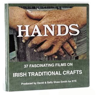
But this year, I did purchase one gift for myself, the “Hands” DVD by David and Sally Shaw-Smith. This remarkable collection of 37 films shot during the 1970s and 1980s capture many of the disappearing traditional crafts in Ireland.
Each short movie focuses on a particular craft, from building Regency furniture to carriage making to stone cutting to leatherwork. If you work with your hands, you will be captivated by the stories, the filming and the people who are trying their best to keep these skills from vanishing.
The DVD set is sold by the good folks at Benchcrafted, and I’ve caught glimpses of it at the different shows during the last few years, including Handworks. I once had a set of the DVDs, but they have disappeared into my basement. So I purchased a replacement set this year. Yes, it’s a pricey set, but I know that you and your family will enjoy these films.
While I was an editor at a woodworking magazine, I received a lot of questions about the projects we published. Here are two questions that were tricky to answer:
How much does that project weigh?
How much does that project cost to build?
These aren’t really questions that I ask myself as a builder unless I’m making something for NASA or a customer on a crazy tight budget. But readers deserve an answer better than, “I dunno.”
So here’s how to spitball both.
Weight There are lots of published statistics of the average weight of each species. Usually this is listed as the “weight per cubic foot” of that wood. Let’s take koa as an example. A cubic foot of koa is 38 lbs. If you divide that by 12, then you know the weight of one board foot of koa – 3.16 lbs.
Note that this an average weight at an average moisture content.
Here’s a list of species and their weights that I like to use.
Now you need to know how much board footage of wood is in the project. Luckily, there are lots of nice web-based board-footage calculators out there. You simply punch in the dimensions of each part and they spit out how much board footage is in there.
For example, a tabletop that is 3/4” x 26” x 96” is 17.33 board feet.
So if I build that tabletop out of koa, it will weigh 17.33 x 3.16 or 54.88 lbs.
Cost This is tricky, because every lumberyard is different. I can buy ash for $1/board foot. Perhaps you cannot. So I use WoodFinder to look up average prices. Type in the species and it will call up places that carry that species. One of the places I looked at tonight had koa at $36/board foot.
So I can use the board footage calculator to determine that 17.33 board feet of koa will cost me $623.88.
Mike Siemsen’s “The Naked Woodworker” has inspired thousands of new woodworkers to get off their duffs, buy a basic set of tools and get down to business building sawbenches and a dang-straight workbench.
What has been surprising for us at Lost Art Press is how the DVD continues to sell and pick up new woodworkers. When we went to Minnesota two years ago to film the DVD we had a great time hunting for rust and building stuff with Mike, but we didn’t expect the response to his DVD to be this strong today.
We think it has a lot to do with his wacky van. But that’s another story for another round of beers.
Check out these two recent blog entries on “The Naked Woodworker:”
Bill “Woodnerd” Traynor writes about how the DVD inspired his first workbench and “birthed a new woodworker.” No foolin’. Check it out here.
And even if you are a more experienced woodworker, check out how the DVD inspired Greg Merritt to build the sawbenches and bench featured in the DVD. Good stuff. It’s here.
We hope to get Mike to do another video on some upgrades he’s made to his bench that he was showing off at Woodworking in America. So stay tuned.


 When my family asks me what I want for Christmas, my response is: What I want is for you to buy me nothing.
