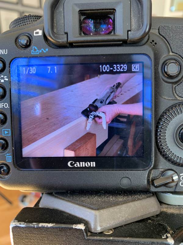
My biggest stumbling block in getting started on my forthcoming Dutch tool chest book was (and remains) the camera. At Popular Woodworking Magazine, we had a fancy camera (we took our own step photos), but I always used it on the fully automatic mode. And I haven’t taken a photo with anything other than my phone since 2017.
Neither fully automatic mode nor phone snaps will fly for a book. I had to learn how to use at least a few of the bells and whistles on Christopher Schwarz’s Canon 5D, make friends with his ARRI LED light setup and, perhaps most important for me, learn how to zoom in on a particular spot to set the focus in live view (I have bad astigmatism and need new glasses).
It’s all so fancy (to me).
Chris was kind enough to give me a crash course and answer many inane (and repeat) questions as I got started. A week later and I’m having fun playing around with depth of field, shadows and blithely switching between a 2-second delay and a 10-second delay as needed. And yesterday, I learned how to hook up and use the remote shutter release! (I realize that doesn’t sound at all impressive, but the last time I used a remote shutter release it was a threaded shutter release cable for my father’s circa-1960 Asahi Pentax SLR that I used in college. And it was about three decades old by then.)
But I think I have it under control. With all but the lid finished on chest No. 1, I’ve managed to reduce the number of not-quite-right shots and the time to get a good one. On day 1, it took me at least 15 minutes to get the “right” image. I’m now down to about 5 minutes per. But at 5 minutes per, it sure takes a lot longer to build things than simply, well, building (a fact I’d managed to forget in my three years since PWM).
My plan is to discuss every reasonable approach to building these chests (and in the offing teach many techniques applicable to all kinds of builds), so no matter a reader’s tool kit, skill set or penchant for pre- or post-industrial woodworking, there will be a technique that appeals. That means I’ll be building quite a few chests (both large and small)…or at least parts of chests for close-up photography.
So I hope to get faster still with the photos – and better at deciding what to shoot and what not to (right now, I’m shooting almost every step). Otherwise, I’ll be done before the book is.
Chest on chest. The top one has fewer dovetails and more woodworking lessons.
Krenov’s passport picture from the late 1970s, when he began traveling to promote his woodworking books. Image courtesy of the Krenov family.
For many American craftspeople (including many I interviewed who had a close relationship with James Krenov and his work), it appeared that Krenov emerged from Sweden a fully formed writer and cabinetmaker. That’s an understandable position; before the release of “A Cabinetmaker’s Notebook,” Krenov’s foothold in America consisted of a few short appointments at Rochester Institute of Technology’s School for American Craftsmen and Boston University’s Program in Artisanry, and a single article in Crafts Horizon in 1967, “Wood: ‘… the friendly mystery…’”. Many of his students in California, even from the earliest classes, assumed that Krenov’s career began with the success of his books, or that he had been relatively obscure before their publication.
Inversely, looking at Swedish magazines, furniture histories and newspapers, you might get the impression that Krenov’s story ends after his meteoric rise to fame and his departure from Sweden in 1981, just after the release of his books. While a few of his closest friends and colleagues in Sweden wrote about Krenov or included him in their writing on modern Scandinavian furniture, the line goes pretty silent there after Krenov’s resettlement in California.
A rewarding part of writing “James Krenov: Leave Fingerprints” was understanding and marrying these two disparate careers, and looking for the through-line to Krenov’s successes in both places. While this constitutes at least a few chapters’ worth of writing in the biography, I think it’s worth examining in a shorter piece as a means of understanding why James Krenov was a touchstone in the two different craft contexts in which he rose to renown.
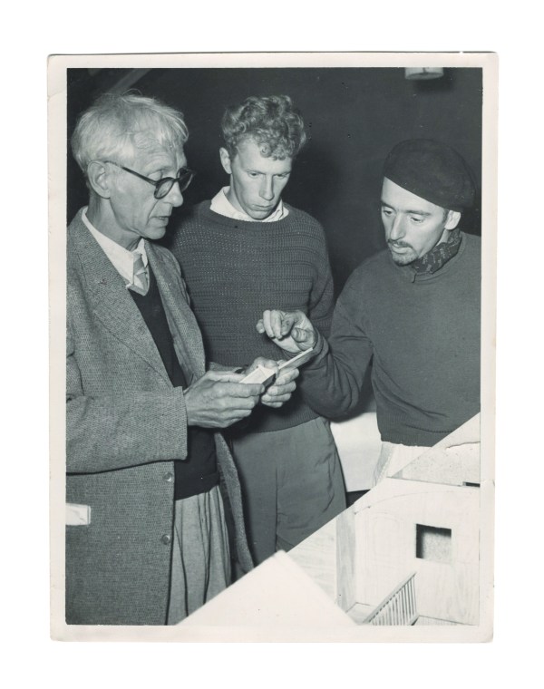
Carl Malmsten (left), a student and Krenov (right) examine a scale model at Malmsten’s school in the late 1950s. Photo courtesy of the Krenov family.
When Krenov came to cabinetmaking in his late 30s, he was an outsider in Sweden and its crafts scene. He attended Carl Malmsten’s Verkstadsskola from 1957 to 1959, and it was there he impressed his first, and maybe most influential, pair of advocates.
The first was Malmsten; by this point in his career, Malmsten was perhaps the best-known figure in Swedish craft, having risen to his stature by designing a huge volume of furniture that blended the honest construction of the English Arts & Crafts movement with a strong Swedish vernacular aesthetic. Malmsten designed for the simplest homes and the most luxurious Swedish state houses; he was a household name.
Georg Bolin in the office at Malmsten’s Verkstadssskola. Photo by Kjell Orrling.
More behind the scenes, but no less influential among the tight circles of Stockholm’s art and craft scene, was Georg Bolin, the principal teacher at Malmsten’s school. Bolin was, by that time, an influential furniture maker and technician of the highest degree. He went on, through the latter half of his career, to design everything from fine furniture to novel “alto guitars,” and even a piano played for many years by Abba, Sweden’s second-largest monetary export, only outpaced by Volvo (until the arrival of IKEA).
As a student, Krenov impressed both Malmsten and Bolin. Shortly after his schooling, both men helped Krenov find a place for his work in the craft galleries and exhibitions of Stockholm, at a time when the Swedish craft scene was casting off functionalism for a more craft-oriented, holistic aesthetic that put craftspeople and handwork at the center.
While Krenov enjoyed minor successes in small shows and galleries (which any craftsperson would be proud to count on their resume), his inclusion in the 1964 exhibition “Form Fantasi,” at the Liljevalchs Kunsthall, was his big break. The exhibition was touted as a point of inflection in Swedish furniture and craft, and at the center of it were two of Krenov’s pieces, a wall cabinet and a silver chest. Krenov got into the juried show as a relatively unknown name (a newspaper article a few months prior misspelled his surname), but his friendship with Bolin and Malmsten certainly helped prime the judges for his work. (Both Bolin and Malmsten were also featured in the exhibition). When the Swedish newspaper Dagens Nyheter reported the event, Krenov’s “Silver Chest” was chosen for the feature photograph out of the 2,500 pieces from 250 craftspeople. After this show, Krenov won the favor of influential critics and curators, including Dag Widman, director of the exhibition and editor of the publication FORM from the Svenska Slöjdföreningen (Swedish Society of Industrial Design). This led to a solo exhibition, “Liv i Trä” (“Life in Wood”) in 1965, and a cavalcade of features, press and exhibition opportunities, as well as a stipend from the Swedish government given to artists and craftspeople deemed to be doing work important to Swedish culture.
The April 10, 1964, article in Svenska Dagbladet that featured Krenov’s “Silver Chest” (here called a syschatull, or sewing chest) in its coverage of the “Form Fantasi” exhibition. Image courtesy of the Krenov family.
While his cabinetmaking opened the door to his success, there is significant evidence that Krenov’s strong voice as a critic and singular personality helped him rise in the ranks of Swedish craftspeople. He started appearing at public conversations about craft at the Nationalmuseum (which appointed Dag Widman as its chief superintendent in 1966). At the time, Sweden was wrestling with the position of the designer-craftsperson; for a long time prior to the 1960s, Swedish craft had largely followed the trends of continental Europe, with a distinct separation between the designer and the person executing the work. With the revival in craft, Sweden saw an explosion of craftspeople who designed and made their own work, more akin to artists than potters, silversmiths, weavers and woodworkers.
Krenov did not see himself in either of these groups. His education had been technical, focusing on exacting execution according to measured drawings. Krenov eschewed this rigid process after his graduation, but did not swing all the way to the more free-form position of craft as art, which eschewed historic context and technical skill for expression and artists’ statements. His unique position between the two led to a lonely post as an advocate for designer-craftspeople working with traditional joinery and historic forms that were distinctly furniture. He focused on solid construction, graceful form and a distinctly functional intention, but made no attempt to divorce his influences and personality from a piece’s execution. Alongside his appearances at public discourses, Krenov also began writing for FORM, where he took on the voice of an advocate for craft against the bulwark of both unchecked artistry and functionalist design.
By the mid-1970s, Krenov was at the top of Swedish crafts; he was a featured presenter, author and craftsperson in many of the museums and galleries. Few could aspire to more, but his feelings of under-appreciation in Sweden (spurred on by his unique position between two trends) left him looking to the other side of the ocean for greener pastures. In 1966, Craig McArt, a student from RIT, studied with Krenov for several months and persuaded Krenov to share some of his writing. McArt brought an essay back to the United States – the one published in 1967 by Craft Horizons. This first contact with America, and specifically McArt’s advocacy, led to his appointments at RIT and BU. These were combative but engendered a small but enthusiastic following of U.S. students and colleagues. Krenov would have had no problem in Sweden publishing his first book, an extensive elaboration on Craft Horizons essay that became “A Cabinetmaker’s Notebook.” But he thought that in the States, unlike Europe, there existed a strong independence around craft, so there would be an eager generation of students who would be receptive to his philosophy – so he wanted his book published in English for an American audience.
And so, with the help of the RIT administration and McArt, Krenov published “A Cabinetmaker’s Notebook” with Van Nostrand Reinhold, a publisher of art and craft books based in New York. After its publication, Krenov’s reputation in the United States exploded (which surprised his publisher; it had hardly promoted its release). Three more books came in just five years, as did invitations to present and teach stateside, and a few particularly motivated craftspeople on the West Coast established a school based on Krenov’s idiosyncratic approach. It was the school that ultimately convinced Krenov to make his move across the Atlantic, but by 1981, it is clear (in his writings and correspondence from the time) that he had been looking for a landing pad in the States for the better part of a decade.
Krenov and Britta, his wife, walking the headlands of Mendocino in the late 1970s during one of their first trips to California. Photo courtesy of the Krenov family.
So, in truth, Krenov entered the American context at a particularly high moment in his career – it was among an American audience that he passed from renowned furniture maker to celebrated author, teacher and influential craftsman. In Sweden, his advocates called for the books to be translated into Swedish. They wanted Swedes to read the philosophy and sensitivity that both Swedish aesthetics and opposition thereto engendered in Krenov. The books were not translated, however, and while there are echoes of Krenov’s influence in Sweden’s woodworking trends (particularly in Malmsten’s schools at Capellgården and Krenov’s alma mater, the Verskstadsskola), his move to the States also largely closed the book on his lasting influence in Sweden.
Krenov’s aesthetic and technical approaches, however, were certainly born in his nearly four decades in Sweden. I would argue that his arrival and warm reception in America constitutes a potent reverberation of the European Arts & Crafts movement’s influence on American woodworking, with Krenov’s direct lineage from Malmsten, who had visited Gimson and the Barnsleys in the Cotswolds in the 1920s. Krenov rose from the plateau of fame he had reached in Sweden to an even higher perch in America, on the back of both his writing and the establishment of his school. If nothing else, he was a singular presence in both countries; his resonance with the curators and critics of Sweden was matched by his reception among the dedicated woodworkers of America – those who were looking for a different approach than the technical manuals that dominated American woodworking publications in the middle of the 20th century. Neither country can claim Krenov as their own; certainly it was Sweden that fostered his development, but it was the United States that gave him his biggest audience, an appreciative student body and a warm reception.
Krenov’s passport photo from the 1950s, before his American passport was revoked by the United States Government for not returning stateside after five years (a legal requirement for naturalized citizens that was overturned in 1964). Photo courtesy of the Krenov family.
But Krenov never found exactly what he was looking for. He was a Russian-born, American expatriate living in Sweden for decades, including the first two decades of his career as a woodworker. For several years in the 1960s, before the Schneider v. Rusk decision on the status of naturalized U.S. citizens living abroad, he was even a stateless person, having lost his naturalized American citizenship after not returning to the States for several years. While he regained his citizenship in the mid-1960s, it is perhaps most fitting to consider Krenov a stateless craftsperson; it suits his position as an independent force in both countries, someone who never settled for the successes he won.
A story that might sum up his tireless, even contrarian, position was told to me by Tina, Krenov’s youngest daughter. She recalled that in Sweden, when she was growing up, her father insisted that they find turkey for their Christmas dinner, something he remembered from his teenage years in Seattle. But upon the family’s resettlement in California, where turkey might have been much easier to procure, Krenov insisted on ham for their holiday dinner, as the Swedes had preferred. It might be this resistance to comfort that gave Krenov the drive to look to the next opportunity. It is certainly a factor of his success in Sweden, and the driving force behind his relocation to California. With this lens, we can see the continuity in Krenov’s seemingly separate careers in Sweden and the United States, and we might better understand how the perceived loneliness or isolation of his approach ended up bringing him a wider audience and community than any one group or country could have provided.
The legend that is Jogge Sundqvist precedes him. I’d heard of him (and of his father, Wille) through Drew Langsner and Peter Follansbee, as had Chris Schwarz and John Hoffman. They’ve had the great good fortune to meet him. I, alas, have not. Yet.
Chris was teaching at the Marc Adams School of Woodworking at the same time as Jogge a few years back, and John was helping out in the class. “I was absolutely blown away by the guy. I didn’t know what to expect,” says Chris. “He’s almost magical when you meet him; he gives off an aura like he’s from another dimension. I got to see his work, and I finally got the whole sloyd thing.”
Chris says he and John would sneak off from their class at every opportunity to hang out in Jogge’s room, to listen to him and watch him teach. “He’s mesmerizing and charming,” says Chris. Jogge says he gets his magic powers from his apron; it transforms him into “surolle,” his artist alter ego. “He’s like a Swedish wood spirit,” says Chris.
After both their classes were over, Jogge asked Chris and John if Lost Art Press would be interested in translating and publishing “Slöjda I Trä.” They didn’t even blink before saying yes.
It took a while to get the contract negotiated with Jogge’s Swedish publisher, but when they did, Chris sent Jogge a note with the good news that “Sloyd in Wood” would be published in the United States. “I’m so happy that if my wife offers me a glass of wine tonight, I will not say no!” Jogge responded.
The following is excerpted from “Slöjd in Wood,” by Jögge Sundqvist.
Peg Board
In my county, chair rail mouldings are common in older, traditional houses. Local people would make peg boards from leftover moulding material. A peg board is a piece of moulding with several pegs. The peg’s tenon must be seated very tightly in the moulding.
If the pegs are very dry, 4 to 5 percent moisture content, and the moulding is 10-12 percent moisture content, the hole shrinks and strengthens the joint. To control the moisture there are pin-activated moisture meters that are handy and time-saving. This construction method, together with the wedge and the shoulder, creates a very strong joint if it is done accurately.
Tools Axe or froe, drawknife, gouge, knife, chip carving knife, V-tool, brace and bit, and smoothing plane
Material Dry, straight-grained birch (Betula) for pegs. Hard, deciduous wood for wedges. Green, straight-grain birch for moulding.
The moulding Split out the peg board from the green blank. Shave it flat with a drawknife in the shaving horse or use a scrub plane and a jack plane at a workbench.
The moulding’s profile should be roughly hollowed out with a gouge in green condition because the wood is easier to work. When it has dried to 12 percent, plane and carve the moulding again to remove any raised fibers or distortion. Decorative carving can be added at this point, for example, a V-shaped notch made with chip carving knife or V-gouge. (See page 47 for more on moisture content.)
Use a rubber band for spacing the peg holes. Mark lines on the rubber band with a ballpoint pen at intervals of approximately 1cm (3/8″). Stretch the rubber band so the markings are evenly distributed across the moulding. Mark holes for the nails or the screws, preferably between the two outermost pegs on each end.
Suggestions for moulding designs and profiles.
Drilling the holes Bore from the front of the board, using a brace and bit or a twist drill. In order to bore straight you can tape a line level, which is a small spirit level, on the bit and fasten the moulding horizontally in the workbench. Position your body to align the bit at a 90° angle to the moulding. Bore, checking for level now and then. Stop when the tip of the bit goes through to the back. Turn over the blank and bore from the other side. That way, you avoid ugly tear-out.
Use a line level on the drill bit to easily maintain a 90° angle.
Pegs The peg design can vary. It is a good idea if they are bent up at the tip to prevent the bag or jacket from sliding off. There should be a shoulder on the tenon to make it stronger. If you want, place the shoulder at the lower edge only. If you choose this option, you need a rectangular blank.
You can read more about carving methods and knife grips in the previous chapter. Decorate the moulding before you fasten the pegs. (See Chip Carving, page 96.)
Examples of pegs. If you want a curved peg, you must make sure that fibers are unbroken from the tenon to the tip to avoid breaking under stress.
Wedging Cut out the wedge material from a piece of hard deciduous wood (see page 43 for the properties of woods). The wedge angle should be between 3° and 4° with a secondary bevel at the tip. The wedge mustn’t be concave or convex.
Saw off the tenon, flush with the backside of the moulding. Make a scoring mark on the tenon with the knife at a 90° angle to the fiber direction of the moulding. Make sure it “responds,” that is, that the tip of the peg supports itself on a firm foundation. Add a small dab of wood glue near the tip of the wedge and drive it in firmly until it doesn’t go any farther. With the tip of the knife, scribe a line on each side of the wedge and break it off.
If the tenon is too small, there is a risk of splitting in both the moulding and the peg. Cut the tenons flush to the moulding with a knife or a flat gouge. Carefully choose colors and take the time to paint your peg board using a thin coat of artist’s oil paint.
Bevel the back end of the wedge so it doesn’t split when you drive it with the hammer.Peg board for jewelry using knobs for necklaces and nails for rings and earrings. Shelf brackets made from small crooked branches.
Throw a spanner in the works, and even the smoothest-running machinery will come to a stop. Most of the time you can diagnose the problem, make a quick repair and get back to business with minimal delay.
But when the spanner takes the form of a pandemic, not so much. You can moan and groan, lament lost income and opportunities, retreat into a funk. If you’re lucky, you may reach a point where you recognize yourself as weirdly liberated from the everyday grind and be open to new directions.
This is how I found Australian woodworker Bern Chandley when we spoke at the end of September. Ordinarily a prolific and highly focused designer-builder of contemporary chairs, Bern, based in Melbourne, has spent much of his time over the past few months laboring over a single piece of furniture: a small settee in blackwood. “I’ve had very limited time in the workshop this year,” he says. With schools closed, he has been helping his wife, Alice, home-school their 9-year-old son, Flannery. Since March, Bern has had just two or three short days a week to work in the shop; a curfew has kept him from staying into the night.
Detail of the settee
The settee is a commission, the form and joinery – Nakashima meets Wegner, with staked legs (both curved and tapered), steam-bent spindles, a hand-scooped seat and stretchers that swoop up to support the arms – a new paradigm in the Chandley repertoire. There are more jigs than usual, as well as more machines, including a PantoRouter. There’s not a single right angle. Even though he’s getting paid well for the piece, the pay won’t cover the investment required to puzzle out the making. “But because it’s a new design,” he reasons, “it’s going to give me a whole lot of other chairs.” The sculptural piece of seating will become a mainstay of his build-to-order portfolio, so he’s putting in the work to make all of the processes readily repeatable. “I want them all down pat,” he says, because efficient production is important to how he makes his living.
A slightly larger view of the current commission, with a prototype visible in the background.
Family & Starting Out
In July Bern turned 50. “Aging has never been something that has particularly preoccupied my thoughts,” he wrote in an Instagram post. “I’ve always felt birthdays were a good excuse to draw in close the ones you love and that the warmth of their returned love is a reflection of the happiness I’ve achieved in life. I don’t care how old I am each time I feel it, just that I’m feeling it. It is life affirming.
Bern at age 50.
“Today as I turn 50, in this time of physical isolation, I count myself incredibly lucky to spend the day on remote learning with my son Flann Brian Chandley, Grandson to Brian Frederick Chandley, my beautiful Dad, who we lost just a little more th[a]n 6 months ago today. Every time I think of him I’m flooded with longing to see him and speak with him. We miss him an enormous amount. He was and is, along with Mum, my greatest inspiration to be as good a person as I can be. As I look at my son, as he looks at me, as we talk to each other I’m aware of how lucky I am to have had such brilliant role models. Dad’s in my thoughts daily but I feel him especially close today.”
Bern with his father, sister and brother.
You can chart how important Bern’s family is to him in his voice. Nothing in our conversation makes him more animated than the stories he tells about family members, each anecdote filled with detail and color. Most of his ancestors came to Australia from Ireland. Some arrived against their will, he notes, referring to the British practice of exporting convicts to penal colonies in the late 18th century. Others came as farmers looking for opportunity. Farming remained central to the family for generations. Bern’s father, Brian, was one of nine children born on a farm near the port city of Geelong (pronounced “Ja-long”) in the state of Victoria, about 50 miles southwest of the capital, Melbourne.
Bern’s father’s family. Brian is at the back right.
The family lost the farm during the Great Depression and had to move into Geelong to look for employment. His paternal grandfather, Bill Chandley, went to work at a factory. Bern has fond memories of Bill, who was “already quite on in years” by the time Bern came along. Bill had one leg that was longer than the other, due to a bout of polio he suffered as a child. The family didn’t own a car, so he got around by bus. “He knew all the bus drivers in Geelong by their first name. He rode on a bus with a little airline bag and his rollie (handrolled) cigarettes. He was a very warm, lovely fellow,” Bern remembers, then adds in the kind of detail especially important to a child: “My nana” – her name was Nellie – “made a sponge cake for everyone’s birthday.”
Readers of a certain age will recall the airline bags Bern mentions.
Bern’s mother was a nurse-midwife, his dad a diesel mechanic fitter and turner. “You call them engineers over there,” he offers, “like toolmaking – working with heavy machinery.” Geelong being a port town, many businesses were involved with shipping.
Bern (center, in yellow) with his family, left to right: sister Teresa; Brian; baby sister Jennifer; brother Paul; and mother, Anne.
In 1986, at the age of 16, Bern left school to start an apprenticeship as a carpenter and joiner. “I’m from a big working-class family,” he says. “I’ve got a million cousins who are all tradesmen. I’m one of four kids; my older brother was the first in our extended family to go to university.”
It was meant to be a four-year apprenticeship, with time alternating between coursework at trade school and work for a boss who ran a house framing business. At school Bern studied building methodology – stairs, joinery techniques and traditional handwork with dovetails and mortise and tenons – not because there was a market for that kind of work (there wasn’t), but because the curriculum hadn’t been updated in years, for which he gives thanks. On the job, they framed houses; Bern has vivid memories of building pitched roofs in eucalyptus, “big, tall, straight-grain trees used in construction.” The roofs would then be topped with weatherproof corrugated steel. That way of roofing is long gone, he says; these days builders simply install trusses.
Bern finished his apprenticeship early, at the age of 19. Typically an apprentice would stay on with the boss who’d sponsored the training, but these two didn’t get along. “He was a bit of a hammer thrower,” Bern says – “a good carpenter, but always the most hated person on the site. The day I finished my apprenticeship, I quit-slash-he fired me. We had a big fight on the site.”
After a few more carpentry jobs he was ready to leave Geelong. His older sister was training to be a nurse in Melbourne, so he moved there. For two years he worked as a hospital orderly, an experience he found fascinating. “I was suddenly confronted with life and death. I was still a silly young bloke. I had to come to terms with people dying on a regular basis…and form an understanding of it…. Nurses are amazing. They’ve just got to carry on, no matter what.” He worked in the emergency room. “You’re on the front line,” he says. “There are some horrific injuries. People were thrashing around, semi-conscious, and you had to hold them down.” Part of his job was to help the nurses wrap cadavers in plastic and take them to the mortuary. “It knocked the immaturity out of me, which I’m very thankful for.”
Bern in Göttingen, Germany, a destination he sought out on account of its many timber-frame buildings. He traveled alone and loved meeting people, some of whom became good friends.
In his 20s he did some traveling around Europe. On his return, he found his way into building sets for television, theater and American movies that were being filmed in Melbourne. Each gig lasted almost a year. One of these productions was set in the Second World War; when the crew couldn’t find a specific piece of period-authentic furniture, they brought him a picture and he figured out how to make it. “I was just knocking the [props] out, out of MDF and pine,” he says; the painters on the set “were magicians” who made the stuff look like it was built of mahogany.
“The thing with set building is, it’s very good for problem solving. The designers are notorious for giving you the easy measurements” while leaving the challenging stuff involved in curves and angles for the set builders to work out. “Depending on the job, there could be nary a right angle. ‘Star Wars’ had the most curves and angles. That’s space ships for you!” He points out that this was before CNC routers, so you couldn’t just pop what values you had into a computer. “You had to work it out yourself. You had to be very inventive.”
He’d always had an interest in furniture, so Bern filled the time between jobs with furniture commissions, taking on “anything and everything” – tables, cabinets, built-ins, carpentry jobs. He realized that making furniture was what he really wanted to do and started his own business, getting work by word of mouth. Without a shop, he built things in his backyard, or in the client’s. “I got it done,” he says. He persevered and learned from his mistakes.
Between 2005 and 2016 he shared space in group shops, a good way to build up a business when you don’t have the capital to tool up on your own. Needless to say, it could be trying; people had different priorities and interests. The others were building furniture part-time, whereas he was running a business. Eventually he concluded he needed a space of his own.
Alice in her studio
He got to know his wife, Alice Byrne, as a friend in 2006. It was summer, and Bern was in Paris. Alice happened to be there, too; her boyfriend, Alan, had been awarded a traveling scholarship. An oil painter, she’d been in Paris seven years before as the scholarship’s inaugural winner. She and Bern spent some time together visiting galleries. “I was smitten,” he says, “in the sense of ‘I’ve really got to meet a girl like Alice.’” After about a week, Bern went on his way, not knowing whether he’d ever see her again.
But shortly after he got home to Melbourne, Alice’s brother George called with news that Alice was back. Alan wasn’t with her; he had returned to Sydney. Soon after, Bern and Alice went on a first date, a pub meal and dancing – with George. They’ve been together ever since, and were married in 2009.
Alice, Flann and Bern in the States
Alice put her painting aside when she got pregnant, concerned about the health risks of solvents. After Flannery was born, in 2011, Bern was the family’s main breadwinner. Alice went back to work outside the home part-time when Flann was 2; she manages an art supply shop that does both retail and wholesale work, along with specialty painting services such as framing and stretching canvas. Although she still has a studio space, she has largely put that work aside while raising Flann.
The Move to Chairs
Lowbow dining chair
Like many of us, Bern started out in “bespoke” (custom) work. In retrospect, he sees custom work as “a bit of a trap you can fall into. That’s the best way to burn yourself; if you haven’t built something before, you’re not ever going to get paid enough to sort out all the preliminary stuff before you make it. But it’s the best way to learn a lot.”
Seventeenth-century-inspired cabinet in oak with Huon pine interior and ancient kauri shiplapped back
Shaker nightstands in maple
He stuck with custom work until about 2010, building tables, cabinets, whatever a client might want, while working part-time for a fellow woodworker, Alastair Boell, who had a school, the Melbourne Guild of Fine Woodworking. Alastair was eager to have Bern teach, but Bern had always hated public speaking. “It kind of terrified me.” He gave it a try. He’s glad he did. When Alastair invited Peter Galbert to teach a class on North American Windsor chairs, Bern assisted and found himself smitten with the joinery. Pete, Bern says, is “egoless. Very comprehending, very inventive as a maker… a very inspiring teacher.” In fact, so inspiring “that from that moment all I wanted to do was make chairs.”
CoCo Armchair
Pete encouraged Bern to visit the States and teach at his school in New Hampshire. They made it happen. He taught one class in 2018 and two in 2019 on a chair of his own design that he calls the “No. 14 Chair” – “after Thonet,” he laughs, “because I’m shit at naming things.”
Fifteen No. 14 Chairs
Bern with Peter Galbert on a beach in Maine.
He still makes other forms when he’s really keen on a particular piece, but chairs have become his livelihood. Here we return to the topic of efficiency. “You have to have your own product,” he believes; that way, you’ve got the jigs and processes in place. People order one (or 14!) of that thing “and you can just go straight to work, without thinking” – at least, in principle. He admits “that’s easier said than done.”
He now teaches chairmaking classes at his shop in Thomastown, an industrial area on the northern outskirts of Melbourne. With block walls and a concrete floor, it’s around 2,000 square feet in a gray brick building surrounded by old factories. Teaching has changed the nature of his business, injecting a welcome bit of variety. He keeps classes small, with no more than four students at a time, so that people with different skill levels can all keep up, and he tries to design each class so that students at any level of experience can get something from it.
Teaching has also proved a stabilizing influence in economic terms. “It’s more lucrative than general chairmaking,” he says. “It can afford you that little bit of extra time.” He’s come to regard a few teaching gigs through the year as “economic pillars” around which he can schedule the rest of his work and hopes the higher income from teaching will allow him more time to develop new designs. In Bern’s view, a good chair design combines durability, structural integrity and comfort. “I love designing chairs. Developing them is the most fun you can possibly have.”
A detail of the drawers for James Krenov’s 1977 “A Playful Thing.” Photo by David Welter.
I’m a furniture maker first and a writer second, or maybe third (after, perhaps, being a master of tangential side projects). So, when I approached writing “James Krenov: Leave Fingerprints,” my biography of the cabinetmaker who was the founder of the woodworking school I attended, it seemed appropriate to take part in retracing some of his steps as a craftsperson.
In Krenov’s body of work, there is one piece that always stood out to me for its graceful presence and idiosyncratic form: 1977’s “A Playful Thing,” detailed extensively in Krenov’s third book on cabinetmaking, “The Impractical Cabinetmaker.” The piece is a pivotal demarcation in Krenov’s output – both a reprisal of his 1962 “No-Glass Showcase of Lemon Wood” from the earliest stage of his career and a harbinger of his future output of leggy cabinets on stands. I also had the pleasure of seeing the piece in person; Krenov kept it and it is still in the family. Seeing it in person confirmed its appeal to me.
A full view of Krenov’s 1977 “A Playful Thing.” Photo by David Welter.
So, in February of 2019, I started my own version of the piece. I was happy to have both Krenov’s original drawings for the piece (published in “The Impractical Cabinetmaker”) as well as the insight I’d gained from examining much of his work. I had a pretty good footing to start on. But the understated form of this cabinet hides the complexity of its execution. Between the veneer work, the drawers that pass through both ends of the carcase, the carefully carved and chamfered legs and rails, and the drive to make every inch just right, even from unlikely views below or above, it is a real skill test. By the time I started this piece, I was five years out of the College of the Redwoods (now The Krenov School), and while I like to think my skills are always improving, the truth is that this kind of work requires constant practice and refinement of execution to be done properly and gracefully. I had some uphill battles.
Some progress shots along the way: sawing veneers, making drawers, carving stepped legs and little blackwood pulls.
Krenov’s original was made with East Indian rosewood and Andaman padauk, woods I wasn’t going to hold my breath looking for these days, but after trips up to Keim Lumber in Millersburg, Ohio, and C.R. Muterspaw in Xenia, Ohio, I came home with some stunning gonçalo alves for the stand/drawer fronts and densely figured soft maple for the veneered surfaces. I rounded those out with aromatic cedar for the drawer bottoms, hard maple for the drawer sides and African blackwood for the pulls, and I’m pleased with my choices.
The result, which I’m happy to still have in our bedroom a year and a half later (and 750 miles from Covington, Ky., where I built it), came out in the way as do many reprisals or reiterations of another maker’s design: different and telling of my process, but in the spirit of Krenov’s original, I think.
My gonçalo alves and figured maple iteration of Krenov’s “A Playful Thing.”
Are the proportions exact to Krenov’s original? No. Is the shaping identical? Definitely not. Am I James Krenov? Well, come on, of course not. But in making this piece, and walking a few months in Krenov’s shop slippers, I learned quite a bit. I noticed certain aspects of the piece’s construction that betray Krenov’s history: the dexterous use of a knife in carving the legs and the pulls recall his early life spent carving with a jackknife in Alaska; the aesthetic touch of stepped chamfers and an almost architectural composition echo his teacher, Carl Malmsten, whose roots were firmly planted in the English Arts & Crafts movement.
There is a second stream of influence the piece has exerted over the year and half since I finished building it. With an open and inviting showcase area, what Krenov referred to as a “stage,” it is too hard to resist constantly rotating and replacing small objects to showcase. I find myself picking up the objects in residence and looking them over, something I wouldn’t necessarily do if they were tucked away on a shelf or in a glass cabinet.
The cabinet in our home in Athens, New York.
And this action, the constant consideration and handling of small, fine objects, might be the most impactful effect this piece had on my consideration of Krenov’s work. Krenov often insisted that his showcase cabinets “complemented” the pieces they displayed, and while the cabinet itself might be artfully done or worthy of examination, it wasn’t doing its job well if it couldn’t elevate or showcase its contents. While I’d read Krenov’s words regarding this, actually living with something that encouraged this interaction made it clear. Throughout his lectures, personal papers and his books, Krenov mentions craftspeople from other mediums, like the potters Bernard Leach or Eva Zeisel, in that light, showcase cabinets like “A Playful Thing” make perfect sense of his role as a cabinetmaker. It may be a “chicken-and-egg” problem – whether his appreciation for small crafts came before his penchant for making showcase cabinets or vice versa, but either way, living with this piece has made it clear how Krenov saw that role.
You can’t write a book by building cabinets. Nor can you build a cabinet just by digging through lumberyards and antique stores. But if you can balance these experiences in just the right way, they might just culminate in work that is more than the sum of its parts. I can’t say I’m sure I got there with my cabinet, but the cabinet helped me consider Krenov’s life and work.