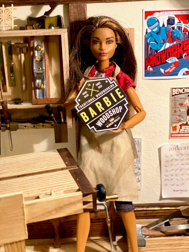
Editor’s note: I was recently intrigued to discover the Instagram feed of a young woman who is blazing an inspiring trail for others. Barbie, of Barbie Woodshop, is fearless in the face of new joinery challenges; while always ready to acknowledge the difficulty of new things, she jumps right in, understanding that the most important key to mastery is practice. She is strategic about collecting high-quality hand tools and other equipment, has a supportive partner and manages to combine genuine niceness with razor-sharp wit. I recently requested permission to publish a Q&A interview for the blog, confident that readers would be delighted and enlightened by Barbie’s thoughts on woodworking and other topics.
— Nancy Hiller, author of Making Things Work

NH: Barbie, thank you for agreeing to this interview. Let me start by asking what got you into woodworking. How old were you? What kind of shop space did you start with? (I ask because my first shop set-up was in what should have been the dining room of the house I was renting.)
BW: Thank you for having me.
I’ve been crafting my whole life. All things you do with your hands support other types of hand working. I have small hands so I guess they excel in detailed working.
I started woodworking before I went to school. I spent my summers in my family’s summer house. I was always outdoors whittling and tinkering. I especially liked working with pine bark because it was soft and easy to work with, and I didn’t know how to sharpen my tools. Later I discovered power tools. At some point I thought a power router and a pocket screw jig were the most fantastic tools ever.
Before I moved in with Ken, I was first living with two of my friends in a shared flat. We had a shared kitchen and bathroom and we had our own small bedrooms. My room was always filled with tools and dust. I made all kinds of things using all kinds of materials – wood, MDF, aluminum, plaster, you name it. I worked on the floor because I didn’t have any kind of workbench or even a little table space. Luckily my friends were really easy-going. Sometimes in the morning they asked something like, were you sawing something at 2 am. And I was like, no… I was filing. I can’t stop when I get in the zone. I love how the momentum grabs you and doesn’t let go.

NH: How do you feel about being a role model for other girls and women?
BW: I don’t know about being a role model. I’d like for people to see me as a person woodworking, instead of a woman woodworking. Chromosomes have nothing to do with your abilities or potential in a woodshop. I believe many of my IG followers are kids or parents who show their kids what I’ve been working on. I hope to see more kids, both boys and girls, get into woodworking instead of only gaming and consuming social media. When you get into making things, you won’t ever feel bored in life.
At first I cleaned the shop before taking pictures but changed that pretty quickly as I felt it was the wrong approach. It’s the easy way out, to make things look a bit better than they actually are, on social media. A real role model wouldn’t do that. So, I stopped cleaning. It’s like an American ninja warrior track in there but with sharp objects.

NH: In one of your posts, Ken was delivering dinner to you in your workshop (or perhaps it was lunch?). You said it was because he knew better than to disturb you when you were working. He seems extraordinarily supportive! Can you tell us a bit more about how he encourages your work?
BW: It’s not like I eat all my meals in the woodshop, but from time to time Ken brings me lunch or dinner or a cup of coffee when I’m on a roll. I fed him once like a baby when he was working on his car and he was all covered in grease and filth.
What would you have thought if it was Ken who was working in the woodshop and I brought him dinner? Life should be a balance of give and take, wouldn’t you agree?
NH: How did you and Ken meet each other?
BW: Local hardware store, aisle 12, miscellaneous screws and fasteners section. We both reached for the last threaded insert. Our hands touched…
NH: Is woodworking your hobby or your profession?
BW: It’s a hobby. I wouldn’t want to do this for living. I’d starve.
I admire the makers who can support themselves woodworking, but I’m afraid only a handful of people can make a living out of handmade furniture and objects. The rest of us can enjoy it as a hobby. I’m not going to sell any of my creations, but I enjoy making gifts for friends and family. Money changing hands only creates stress.

NH: You have some really nice tools, as well as a great workbench. Those things don’t come cheap. How do you prioritize spending?
BW: She who dies with the most tools wins! I love tools. The shinier the better. I’d rather spend my money on tools than traveling.
There’s no such thing as too many tools. If you feel like you need a bigger tool cabinet or a second tool chest, get one. I’ve read you don’t need all the tools in the world, but you shouldn’t believe everything you read.
My dad always says it’s better to buy one good tool instead of a thousand bad ones. It’s true, but sometimes it hurts too much to pay the price. But then it hurts every time you use a bad tool. Everybody knows that, but sometimes we forget. The first plane I bought was a new Stanley SB-4. Later on, I sold it to someone. Does that make me a bad person? The thought still haunts me at nights.
Experienced woodworkers say that you first need to learn how to sharpen your tools and the next thing you need is a good workbench. When you buy or make a good workbench it will last the rest of your life. I love my workbench. I haven’t regretted going “all in” on that purchase.
Ken criticizes me for buying new tools, but I keep telling him it’s the tool fairy that keeps bringing me new toys. He’s not buying it.

NH: Fifty years ago, your forebears thought it was of the utmost importance to amass a vast wardrobe of stylish outfits – they had a special outfit for every occasion, whether playing tennis, horseback riding or going to the office. You seem to wear regular clothes in the workshop; I believe I even recall you working in a kilt one day. I think readers would find it interesting to hear your thoughts on this.
BW: It’s not like I choose to wear the clothes that I wear in the workshop. It just happens. A few weeks ago, we were having a night out and I thought I would just pop into the workshop for a quick visit before going to bed. I ended up applying some wood stain while wearing an evening dress. I don’t think I have any clothes that don’t have a little glue or paint here and there. My friends say it’s my trademark. I know I should wear an apron before I make a mess but I forget sometimes.

NH: Do you have a favorite style of furniture?
BW: I like anything I can make. Last year I stacked a few pallets together and called it a sofa. I was so proud of myself. I guess I’ve moved on from that now. Now I’m making my first kumiko. Maybe next year I’ll be making Louis XIV style furniture (not likely). I’m probably going to try my new dovetailing skills with a Dutch tool chest build. A greenwood chair is also high on my to-do list. What I don’t like is the look of mass-produced “perfect” furniture. That stuff lacks soul and character. And I can’t see myself ever making an epoxy river table.

NH: Do you find that men are intimidated by your woodworking skills?
BW: I hope not. The thing is that many people are scared of trying new things because of fear of failure. I boldly go where I have never gone before. I try to take my time with the first try. I’m using sharp, good-quality tools, and I’m being careful and patient. And I don’t use a pencil to mark critical cuts. A marking knife and the blue masking tape trick are the keys to my early success. If you approach the scribe lines patiently and don’t pass them, what can go wrong?
I always thought dovetails were impossible to make and only mythical creatures could make them. After watching a few YouTube videos, they didn’t seem so intimidating anymore. I must admit that before making the first attempt at dovetails I thought I needed to buy some sort of jig or sawing guide. Luckily my woodworking friend talked me out of that silly belief. I feel using a sawing guide is cheating on myself, but hey, that’s just me!

NH: On your logo, you describe the quality of your work as “mediocre,” but the joinery you show on your feed is exemplary. Do you plan to modify your logo soon, in light of your ever-increasing proficiency? It’s not that one needs to boast, but exaggerated modesty is arguably one of those traditionally feminine traits that are less than helpful to girls today.
BW: When I started to build up my woodshop, one of the first things I knew I had to make was a logo. I’ve been admiring maker logos on social media and I couldn’t resist designing a logo for my woodshop. Designing the logo was easy. I just downloaded an app and made it.
I designed the sign before I knew if I could make anything. I am happy about how my practice projects have turned out and the quality of the results have been delightful for me, too.
We can all benefit from a little humility and having a sense of humor about ourselves and the world can go a long way. I think the logo is funny and it draws attention. Just like it should.

NH: How has Instagram shaped your experience as a woodworker?
BW: I really like social media, but I’m not interested in seeing celebrity selfies or people showing off their imaginary wealth. I’m looking for inspiration and new skills. I’ve learned so much watching YouTube and Instagram content. If it wasn’t for the makers who share their knowledge or skills, I would never have found the joy of hand tool woodworking and I wouldn’t have any idea how to use them. I just want to chip in and share my story and show people that you can learn new skills if you just try. Doing beats mere intention, always.
I had no intention of posting anything to Instagram. My friends twisted my arm and so, I ended up setting up an Instagram account. I’m glad I started this. It has been a lot of fun. People are supportive, give me good advice and suggestions, which I’m more than happy to receive. Many people have offered to send me materials from their own stash. That’s really overwhelming. I really appreciate the positive vibe in the woodworking community. When I make something, I get a feeling of fulfillment when I behold the accomplishment. It’s even better when you can share the moment with the woodworking community.


