Some of the entries in this “Making Book” series are deeply personal. Others are technical. This one is all business.
Printing and woodworking share similarities. The obvious: Both use trees as the most important raw ingredient, and a knowledge of wood, moisture and finishing is critical to doing things not completely stupidly.
The other similarity I run into all the time is how we optimize parts from a board the same way we optimize the size of a book to get an efficient number of pages per sheet of paper.
Quick example: Let’s say you have a pine 1×12 (which is actually 11-1/4″ wide) and you need to rip some trim pieces out for a baseboard. If you choose to make your baseboard 5-1/2″ wide, then you could easily get two pieces of baseboard from the 1×12 with only a little waste (depending on the width of your saw kerf). But if you made your baseboard 6″ wide, you would get only one piece of baseboard from the 1×12 and have a lot of waste/leftover material.
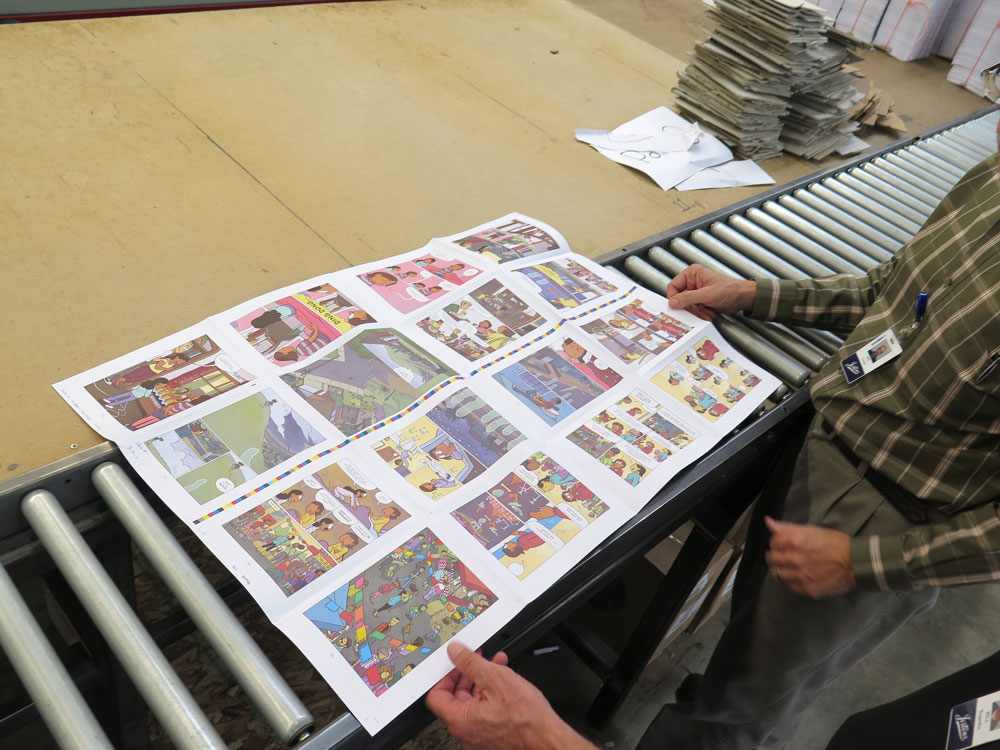
The same goes with books. The typical sheets of paper that we work with are 23″ x 35″ and 25″ x 38″. So if we order an 8.5″ x 11″ book, the press can print eight “leaves” (eight leaves equals 16 pages printed front and back) on that sheet. We print the 16 pages, fold it up into what’s called a “signature,” assemble all the signatures and trim it with little waste.

Let’s say you decided your book should be 8.5″ x 12″. That will almost double the cost of the book because of all the wasted paper involved.
If you do the math, you’ll find there are a lot of efficient sizes that can be squeezed onto this sheet of paper and produce signatures from four pages up to 64. And whether you know it or not, these sizes are also commonly paired with the type of information inside. Here’s a chart (which has been reproduced many times in my lifetime) on the sizes common to each genre:
- Fiction: 4.25″ x 6.87″, 5″ x 8″, 5.25″ x 8″, 5.5″ x 8.5″, 6″ x 9″
- Novella: 5″ x 8″
- Children’s: 7.5″ x 7.5″, 7″ x 10″, 10″ x 8″
- Textbooks: 6″ x 9″, 7″ x 10″, 8.5″ x 11″
- Non-fiction: 5.5″ x 8.5″, 6″ x 9″, 7″ x 10″
- Memoir: 5.25″ x 8″, 5.5″ x 8.5″
To some degree, this makes perfect sense. A Fabio-centric beach novel that was 11″ x 17″ would be pretty odd (though it would definitely add to the spf of your sunscreen and your knowledge of Fabio’s pore structure).
So if you want to save money on printing, pick an efficient size. Your graphic designer might be sad with your decision because odd-sized books are exciting to design, especially after you had to design 3,000 cookbooks that were 8.5″ x 11″. I get it.
You also have to pick your paper, which is a major expense in printing a book. This is more art than science. But there is some science. Paper is sold with a “basis weight.” This is why we talk about a book having #80 pages. The “#80” is pronounced as “80 pound.” And it means (broadly) that 500 full sheets (23″ x 35″ or 25″ x 38″) will weigh 80 pounds. (Paper nerds are now folding origami swords to stab me. Yes, I know there are different parent sheets for bond, book, text, index, bristol, and cover.)
Basically the bigger the number, the thicker the sheet. Paper can also be measured directly by thickness, called its “caliper” – just like woodworking!
Paper can be uncoated (like in a pulp novel or a newspaper) or coated (like in an expensive art book). Uncoated is far less expensive, in general, and more tactile. But image reproduction isn’t typically as crisp. Coated paper can be smoother, produce crisper images and have many different sheens. (What are papers coated with? It’s complicated.) Paper also has a lot of other characteristics, such as its whiteness and opacity.
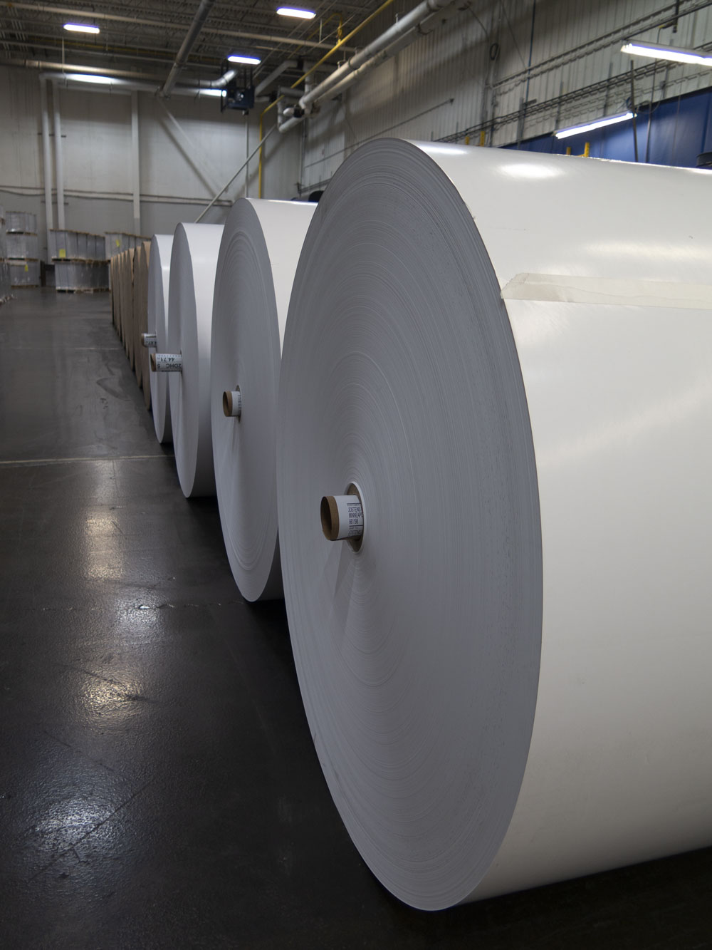
I choose papers for our books based on the type of press and what that factory is happy using. A sheet-fed press (where the pages go through individually like a photocopier) is way different than a web press (where the paper is like a giant roll of toilet paper). Before I spec a paper for a Lost Art Press book, I request printed, finished examples from the press on the different papers I’m considering.
This allows me to be dumb-ish about the whole world of paper and its characteristics. I get to see the finished result and compare it to other papers printed by the same plant.
This allows you to get away from the “expensive and heavy papers are better” problem in book production. They’re not always better. There are sweet spots in print production, where a cheaper and thinner paper gives you a better result.
This is what allowed us to use a #70 matte coated paper for “The Anarchist’s Workbench” on a web press that was inexpensive but really really crisp. When I compared it directly to the pricey #80 paper, it was no contest.
Numbers are one thing. But there ain’t nothing like the real thing.
— Christopher Schwarz
Read other posts from the “Making Book” series here.

Is there a new date when the Anarchist Workbench will be shipping?
We hope to ship the book out before the end of September.
Great. Now you’ve got me rethinking that curly Koa squatty potty I’ve been designing.
This series has been truly educational. You explain things well and with humor. Thank you for taking the time to do this.
I take issue with your assertion that uncoated paper is generally less expensive. It’s true that uncoated includes some of the cheapest options, but it also includes some of the most expensive. Mohawk, Superfine, Ultrawhite in 25×38 sheet in 80T is $682 per carton. Neenah’s equivalent is about the same. Never mind some of the cool, weird papers that I often get requests for.
Maybe this is where you should have included your caveat about paper nerds.
In general, pine is cheaper than mahogany. Except in the case of Huon pine or Prince William pine, in which case it can be six times the expense of mahogany.
Oh, come on. Wood and paper are simple. Two kinds of each. Hardwood and softwood. Coated and uncoated. Then different thicknesses. 4/4, 5/4, 8/4, etc. #60, #70, #80, etc. Surely one paragraph should be enough to describe it all in detail.
Touché. In terms of sheer volume and what the average person sees, you’re completely right. My office budget wishes I lived in a world where Accent Opaque at $350 a carton wasn’t the budget option, but bright white, opaque, uncoated is usually the minimum in my life.
Hi Chris,
This series is bringing back memories (somewhere between fond and nightmare) of when I had to write my Ph.D.. The university/library had all kinds of margin requirements. At least I had a Mac SE30 and a 40 MB hard drive to write mine on. I recall going to the library early on with some print outs as I wanted to confirm the margins were correct before I spent a lot of time working on each page to fit chemical structures into it. The library looked at it and said it was fine. When I came back 4 months later with the printer version, they suddenly were much more fussy about the examination. It actually infuriated me. Everything ended up being fine BUT had it not been, it would have required a lot of time and effort to have fixed the formatting so something silly didn’t happen on any of the pages. I would have likely said a lot of unpleasant things to them because I had taken the time to check ahead of time and it was obvious they did a shit job of being serious about it.
I also recall spending a lot of time at Kinkos picking out paper and paper weight for the hard copies. I spend a lot of money (to me then as a starving grad student) to pick out nice paper. The professional binding was easy. Everyone in my research group sent it off to one place to have it done so I chose them. I had seen over 30 PhD’s done by them and was happy with that quality.
The writing itself was a lot of fun. By that point in my life, I had found my scientific writing voice. The one thing my buddy and I vowed was that we wouldn’t have a typo on the first page as just about every Ph.D. we looked at did. I worked hard on spell checks, etc and thought I was good. Unfortunately, I mad a serious mistake on one page. It was a single page as a single document. It was so simple I did it at the last minute and I forget to spell check it. It said “This dissertation is approved.” I misspelled either dissertation or approved and since I didn’t spell check it, I didn’t catch it. Neither did the faculty members who had to sign off on that page. It is funny to this day. My friend caught it and gave me heck for it. I would have never noticed it if he hadn’t pointed it out. He was about 9 months behind me. He ended up doing something silly on page one.
I also found out then, what is true to this day. For my best writing/creative work, it happens later in the day. I can’t write or think nearly as well during the day. Wish that weren’t the case. Such is life.
Love the euphemism in your title. Reminds me of the Italian sheet cake at my wedding. Fortunately it tasted just as good as the decorative version that cost 4 times more.
I know that plant!!! I work for a utility company that provides them service. Ironic that the book I ordered is printed in “my backyard” and then has to be shipped out of state only to be shipped back to me near where it was printed. Oh well, that’s life.
Were those Komori presses at the Tennessee plant? I had a job back in the day where I had to show off one of their hi-speed web presses for the company brochure. Took a lot of lights to illuminate that massive machine well. We were at their facility outside of Chicago in Rolling Meadows. Amazing tech!
BTW, good primer on picking sheets.
I believe they are Komori (I haven’t been to the plant in a couple years). I do remember that the press plays “It’s a Small World” during every safety check. It cannot be changed and it drives the employees nuts.