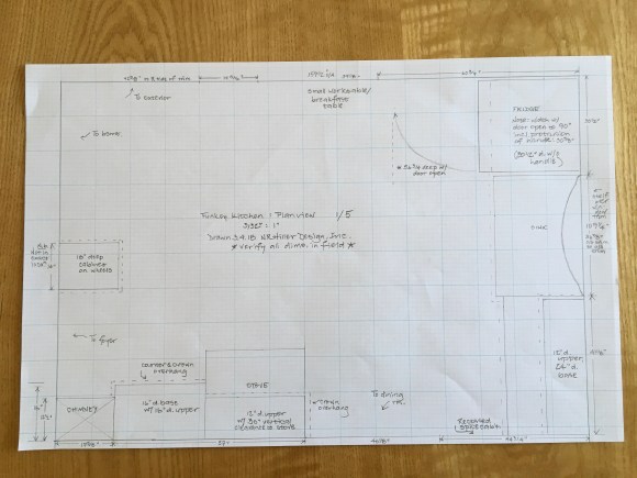
One of the many pleasing transformations described in “Kitchen Think” involves this kitchen in the home of Kathleen Funkey. Located in Michigan’s Upper Peninsula, it’s one of just a few kitchens I’ve designed without visiting the site in person — not my preferred way of working, but I do my best to accommodate each job’s constraints.
The case study in the book covers the project in broad strokes, starting with Kathleen’s initial email stating her interest in working with me, so I won’t duplicate that here. What you won’t find in the book are images of what the kitchen looked like before; this blog is the ideal place to share those. The room was furnished with a mix of cabinets, all in decrepit condition. An original recess in the wall between the kitchen and dining room (below) had had its cabinet insert removed, leaving an impractical vacant space.

Kathleen wanted a kitchen that would suit her needs and look at home in the house.


Before drawing cabinet elevations I spoke with Kathleen’s cabinetmaker, Jake Korpela at World of Wood. Having made drawings for other clients in the past who hired someone else to build their cabinets, I have learned the importance of emphasizing details – it’s galling to draw a built-in with inset doors hung on traditional butt hinges, half-inset drawer faces and a flush kick only to find that what the cabinetmaker ended up building was indistinguishable (at least, to sophisticated eyes) from something that could have come from a big-box home supplies store.


As the after images show, Jake did a bang-up job of following the drawings and building the cabinets. The soapstone counters complement the warm tone of the woodwork, and the room’s trim now matches that of other rooms in the house. The subway tile went in only recently – it wasn’t done when Matt Monte photographed the kitchen for the book.
– Nancy Hiller, author of “Kitchen Think” and “Making Things Work“


Turned out great Nancy. Giving the stand alone stove ( so common in older kitchens) a counter top work surface would have been my primary goal.
I would like to know the madness behind the stand alone stoves. Was it a holdover from the Hoosier era? Whats the deal? It makes sense to have some sort if counter or work table near the stove. Or does it?
This is just a regular stove. Usually this type doesn’t stand out visually, because in most kitchens it’s in the middle of a row of cabinets. This kitchen had multiple unusual challenges, among them the shallow depth available on the stove wall. (Why not move the stove to another wall, you may wonder? You’d have to see the case study or look carefully at the plan view drawing to answer that rhetorical question. It’s a small kitchen with very little wall space and lots of doorways. In addition, the kitchen is in full view from the front door.)
The counter that is now at the right of the stove is deep enough to serve as preparation space. The cabinet beneath it is a good place to store pots and pans, as well as cooking utensils. It’s likely that the kitchen originally had a small worktable in the center of the room, but the client made clear that she likes to have a table on the wall opposite the stove, because it’s a nice place to sit, with a view out the window. In view of the room’s small size (and its layout as an intersection for traffic between the front entry hall, the dining room, the basement and the backyard), I didn’t suggest adding a separate work table.
Finally, preserving the original walls was part of the brief. The client loves her old house and has worked hard to maintain and restore its historic character. Some people would have preferred to remove the wall between the kitchen and dining room; doing so would enlarge the feel of the kitchen, but in practical terms it would reduce the amount of functional wall space.
My copy of the printed book arrived at my doorstep here in Belgium a couple of hours ago, just in time for what looks set to be a rainy and windy weekend. Perfect timing, in other words – I am really looking forward to curling up in the Lamino with some coffee and this book!
Matthias, I hope you are enjoying the book. Thank you for introducing me to a new word, Lamino! I had to look it up. So, it’s Swedish for an easy chair, i.e. a chair in which to relax?
Hello Nancy,
Halfway through by now, I am delighted to be able to report that I am enjoying the book very much indeed! Your writing is, as always, a delight, and to my mind you manage to strike the right and very interesting and appealing balance between the practicalities of the job, the philosophy underpinning it, and the history of kitchen design and construction.
As for Lamino, though, no, not quite. It is not a generic word, but rather the name of (if you’ll pardon the expression) a “modern design classic” – a laminated bentwood easy chair, usually covered in sheep skin, that was first designed by Yngve Ekström (https://en.wikipedia.org/wiki/Yngve_Ekström) in 1956, and still produced by the company he founded, Swedese (https://swedese.com/products/lamino-0).
We have a couple of Lamino chairs, and they are one of my favourite spots in the house for reading … 🙂
Mattias
Thanks for clarifying about the Lamino! That was the design I found (after wading through a bunch of other meanings for the word), but I did not realize it applied to a particular chair, as distinct from a type.